Tuesday, April 10, 2007

Summit, Solid Designs


Summit is an Oregon based design company that creates cutting edge websites… or at least really good ones. Their portfolio is an impressive display of great designs and solutions. Before I get ahead of myself, let me say that I prefer some of their sites over others, my statements apply to most of their sites, but not all. I don’t agree with every solution they have used, but most of their sites primarily contain design elements which I am eager to appropriate.


I am stunned by the aesthetic appeal of their sites; which are sometimes for high end customers and sophisticated, other times they are fun and casual. Tastefully bright colors enhance richly colored backgrounds. Their sites always look like the products that they display.
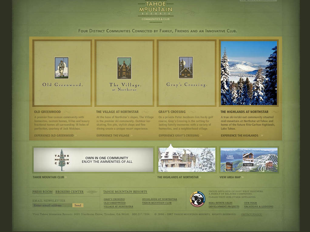


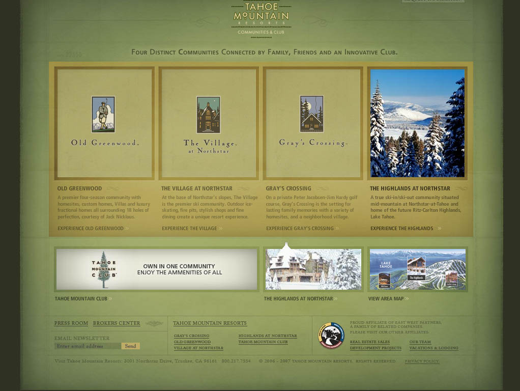
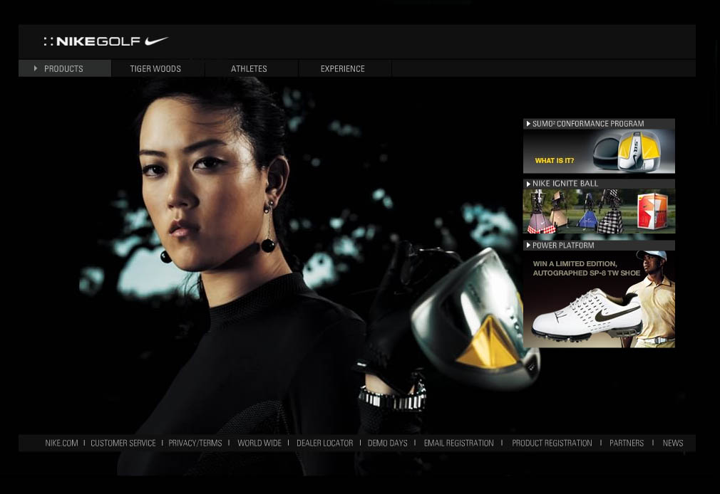
Tahoe Mountain Resorts looks like Tahoe; it’s designed in greens and tans with a lot of textures, big blocky areas, and outdoor pictures. The only thing missing is a pine scent. Nike Golf has a variety of background pictures, see others by refreshing the page. Another good element of their sites is the navigation; you always know where you are, how to get somewhere, and where you’re going to go if you click on something. There are a lot of roll-overs, images fading in and out, and creative ways of presenting information. One of my favorites is Norweigan Cruise Line's Slide Show, if only I had thought of that. On some of their sites you can even use the back button to return to pages, though occasionally it behaves unexpectedly. More variety could be used in their font choices, but I like that their fonts are typically small but readable. I suppose that all of those things combine to make a good site, but not a cutting edge site. Summit either creates new solutions to common problems or they know where to appropriate ideas from. As your average consumer and site viewer, I don’t know which it is that they do, but I like their sites and will leave the technicalities to lawyers. Hopefully those same lawyers won’t notice that my final project might bear some resemblance to a Summit website.
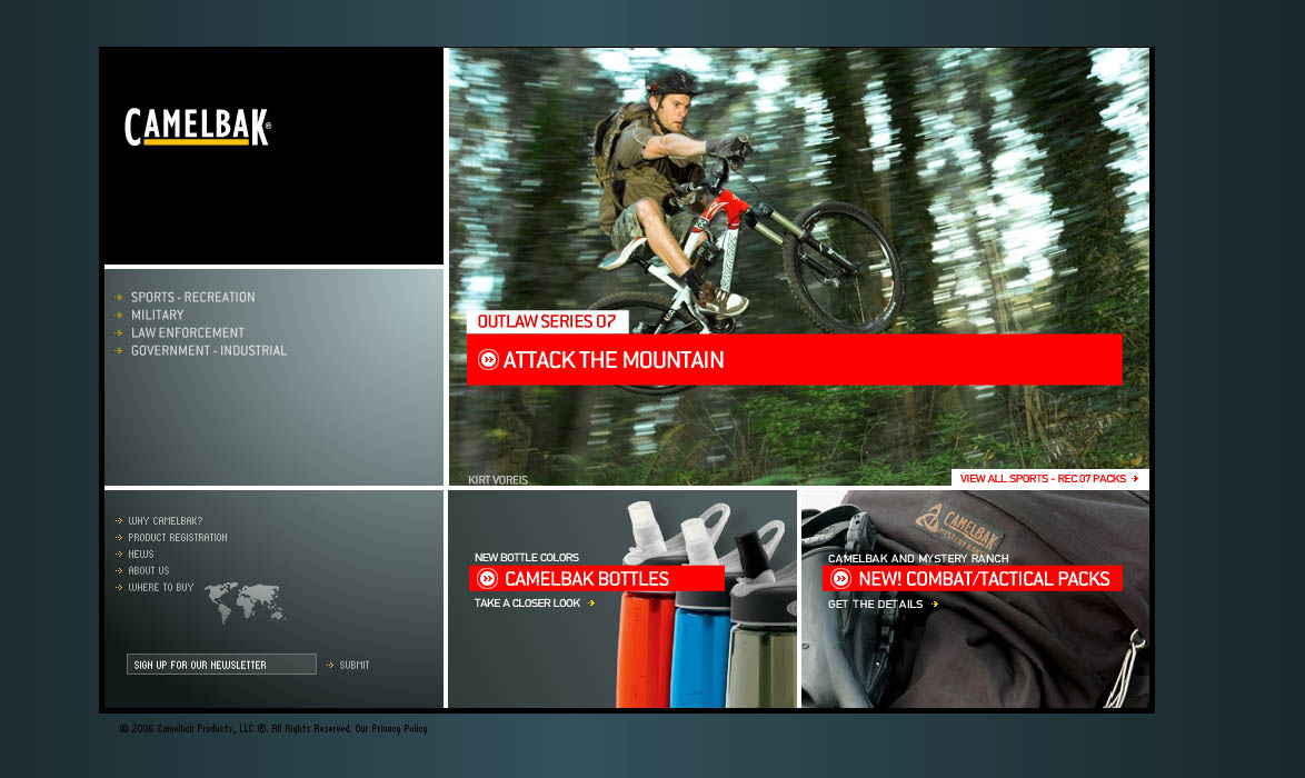


If you need to commandeer ideas:

Official-Linerider.com

Officiallinerider.com is a website with an interactive game that lets the user create the actions of the figure on the sled.
Line Rider was originally created by Boštjan Cadež, a Slovenian university student, in September of 2006. It almost immediately gathered a cult following and became the seventh quickest gaining keyword in Google. Since that time, the ‘toy’ has generated over 16 million views. Fans quickly noticed that they could create tracks, set them to music, and share them over YouTube.com. Currently, there are over 11,000 shared videos with many more to come. InXile Entertainment is extremely excited to work with Boštjan in order to reach the full potential that we feel the Line Rider application can live up to.

This website is fun and entertaining for both young and old. It seems like it took alot of Action script to create. It is a very simple to used game but very complex to make.

Tuesday, April 03, 2007

Teamironmen.com

Alright this is my first blog and I'm new to the whole blog thing.
I picked this website because I love paintball and I wanted to do something about it.
So the website I decided to explore is Teamironmen.com.
Teamironmen.com is a website for the professional paintball team Ironmen.
This is a website where people can find info about the team, team members and find where they are going to be playing next
One thing about this website is that it is made entirely with flash and it is very easy to navigate through.
The website is somewhat basic and the use of colors is easy on the eyes and go well when the theme.
When you click on the team roster, an easy to use navigation list of the team loads.
It appears it uses a preloader when going from team member to team member.
It is also very easy to get back to the home page from every part of the site, which alot of flash site don't have.
Other than that the site is pretty basic but I think it is well made with easy navigation.

Tuesday, March 27, 2007

Free sound loops and tutorials to help with projects


I thought it would be nice to have a few links listed that could help us all write the flash documents we need for this class. Everything I found is absolutely free provided it is not used commercially. There are plenty of sites with sound loops, but most of them ask you to register, or want some payment. But these are a few sites I found that provided free sound loops. The first one, Squidoo Music,actually had a great list of links to other sites with free sound loops. It has a link to Flashkit, which I had found earlier in my search. The sound loops on Flashkit can be previewed – not all sites have that option.

I really liked the music at Efiddler. It was all violin music -very nice. For some pretty offbeat music try Extreme Synth Weirdness Project. For a little eastern music try the samplings at Koan Flashzen.

Sound effects – I only found a couple of sites for free sound effects. A1 Free Sound effects has a number of good ones. Fonogeno is another good site to go to for sound effects.

Along the way I found that there are lots of great free sites with flash tutorials. I liked this site called KnowFlash. It had a nice whirling propeller video tutorial that showed how the actionscript worked. Entheos also had some free flash tutorials. As a site it was clear and easy to navigate.

Maybe one of these sites can help someone with a future assignment.

Tuesday, March 20, 2007

Juxinteractive / Studio Exploration

Juxtinteractive is a interactive marketing and design website. There are lots of different sites to explore on this site as well as updated news about the company, jobs, and live action videos. Inside the website I took a look at one site that I thought was absolutely ridiculous ) but in a good way. The title of the site is justforthefofit.com. Inside you can find tons of fun and interactive humored animation that will leave you wanting more. You can play games like fuse ball or just click a bunch of buttons and see what they do and who they affect on the screen. The website is put on by Fuse Television so it's mostly filled with different videos of bands that you can watch. There are lots of farting noises and singing melodies that are put into action once you click on a certain object or text area. The people who created this site obviously had a lot of fun.

Tuesday, March 06, 2007

*Bigspaceships and Horror Flicks*

The art design company I chose is bigspaceship.com. I'm not in love with their own site but they have designed many award winning flash sites that are really cool.
On their site I wished they would have kept the background either white or black consistently throughout. They have a few black backgrounds and then mostly white.
A nice feature on bigspaceship's site is the lab link. They have little classes online like how to optimize bitmapimages for flash, etc.Their navigation is a little disappointing to me. I don't like a bunch of new windows opening.

But let's move on to the cool stuff...
I love the site they did for the movie Grindhouse. http://www.grindhousemovie.net/They have done a lot of movie sites but I'm focusing on this one.The fuzzy, gritty feeling is haunting and nicely done. I like the way the lobby doors open into another scene.The target cursor that spurts blood and bullet holes is interesting.They have a create your own poster feature and scream machine that's fun and clever.I like the bloody loading symbol. It is all very artsy and I wish I would have designed it. For inspiration I highly recommend checking out all of the sites they have designed.

IntegralVision Design


IntegralVision http://www.integralvision.co.uk/ is a cutting edge web development company. They cover all aspects of design. There services include Website construction, Flash animation & multimedia, database development and E-commerce solutions. They make banner ads to complete interactive web sites using flash. There designers are experienced Flash game designers and often add in a unique flash game into there clients sites. They did some work for Dartmoor National Park and created a neat flash based game you can play right off your browser. They seem to prefer to stay simple in there designs, while still giving an artsy feel. http://www.dartmoor-npa.gov.uk/
IntegralVision has done work for various companies; with Coronado (a British board game) they took the game online using flash, and offered an interactive playing area where you can play against others online. http://www.cirondo.co.uk/
They also do interactive work, where you control where the website goes. In Grid magic, you control where in the house you want to go.

Spinlight Studio Artist/Studio Exploration

Spinlight Studio is a graphic and web design team that creates images and websites for clients. These websites range from product promotion to fan sites for rock bands. My favorite thing about Spinlight.com is the unique and fun navigation system. The red dice at the bottom of the page are numbered one through five, and correspond to the index on the bottom left. You can pick up those dice using your mouse and throw them around the screen, or drop them in the hole to load the corresponding page. In their portfolio, you can find a list and links to some of their products, some of them containing flash websites. The Ideas page describes the goal of the company, plus has some pieces of advice for the reader (including "Never trust a designer using a PC").


Finally, the Share page contains a forum (love the toilet paper image, by the way) and some entertaining games for when you get bored. Overall, I think this page is very professional in its presentation, but also uses the Flash to entertain its clients.

-Danielle

Studio/Artist Exploration


www.angryalien.com
artist : Jennifer Shiman, Cartoonist

She's a freelance artist for 2 years, a cartoonist/internet animator based in Los Angeles, California. She works full time creating Flash-animated shorts of bunnies who re-enact movies in 30 seconds.

What attracted me to her work was the humor on her animation with careful execution using Flash. Animations flow smoothly, like the ones you see on Cartoon Network. Very good use of scale and perspective. Very vibrant colors. There's also a lot of scene transitions. She also made most of her sound effects and voice recordings, it's really funny. The best part about her animations are the storyline. Fitting a whole movie in 30 seconds is tricky. I guess she only needed the key points of the film. Regardless how short her animation is, it has a beginning, middle and end. Overall, impressive short animations.


www.doorsoff.com/flash.html
Doors Off Flash Web Design Studio
artist : Andy Vincent

What attracted me to this site is its clean, easy navigation and simple design. Those design aspects are my basis of my own design most of the time. Animation transitions between pages are very simple and straight forward. It has enough animation to convey the message, yet not distract the viewers from the main purpose of the site. Color choice is very clean and very pleasing in the eyes, more like a relaxing mood. The fonts are very clean too, very legible and easy to read. Most of these design elements reflect very well on his projects. Very impressive portfolio. Concept is very clear in terms of the client's nature of business. Overall, the designs are professional-looking.


oh my flash!

At www.ohmyflash.com you can find great examples

of introductory flash pages.

This site shows excellent templates of

navigation menus,

photo galleries

movie clips

and wonderful flash effects,

It is worth to check some of them, they are fantastic.

In addition, they show prices of web design packages which are affordable.

From 500 dollars (five pages, static) to $5K,

that’s about 100 dollars/pages.

Miltos Manetas


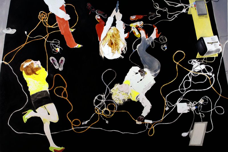
Miltos Manetas is a contemporary artist living in Los Angeles; He is originally from Athens, Greece and received formal art training in Brera-Milan, Italy. Manetas canvas based artwork generally comprises oil-paintings of wires, game consoles, various cables, computer hardware, and sometimes people using them. He has had art exhibitions at both the New York based Gagosian Gallery in 2000 and the Yvon Lambert Gallery in 2006.

Miltos Manetas also has various Flash website base artworks such as his www.maninthedark.com, www.fourfortyfour.com, www.farewelltophilosophy.com, www.antonionegri.com. Manetas website art page www.JacksonPollock.org was mentioned as one of the 50 coolest websites by Time magazine in 2006. For the website www.JacksonPollock.org, Manetas incorporates the uses of Flash to mimic Jackson Pollock’s abstract expressionist style to allow the user to use their computer monitor and mouse to emulate the painting method of Jackson Pollock.

Monday, March 05, 2007

car websites: sexy


audi.com
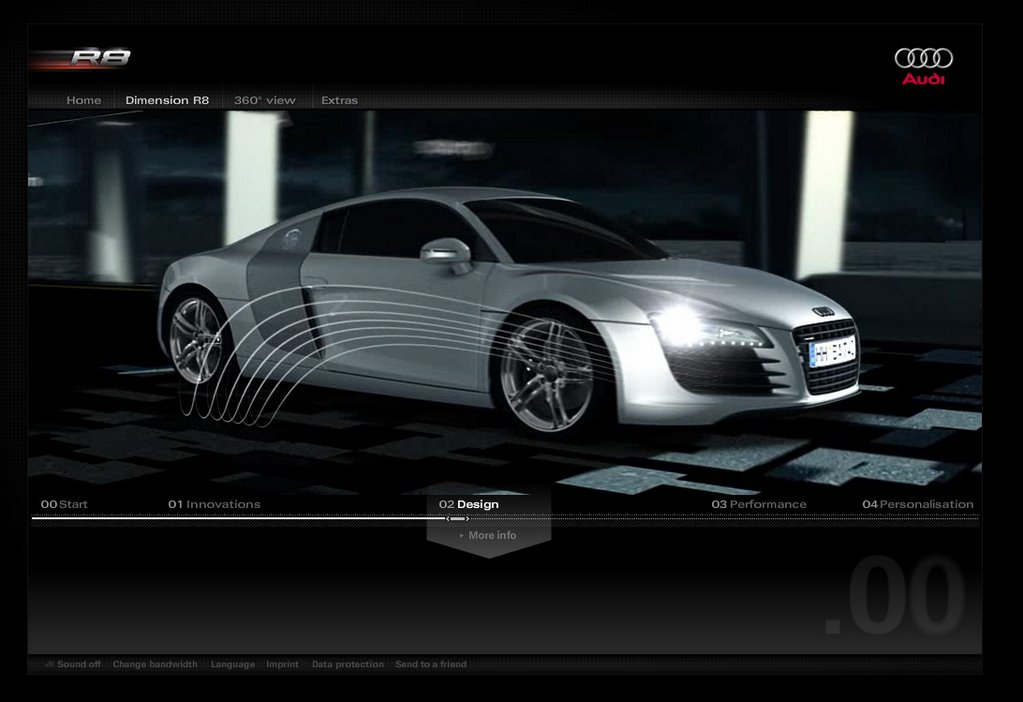
R8 movie

Audi is a German car manufacturer; the only objective of their website is to sell cars. They provide information and media to consumers in order to create interest in their product. The main website has links to interactive flash movies for each model, which is a great way to differentiate each is a mix of still images, movies, and text. The movie can play in a linear direction or the user may skip around, which is fantastic for users.

The design is crisp, clean, organized, bold, sophisticated, and looks great. In a way, the design is the embodiment of a car; similar colors, lines, shape, and style is used. Every inch of every page looks classy and expensive. The layout is clear; you always know where you’re going and what you’ll find there. Every page is consistent, but the images and graphics make it unique enough to make them stand out. The text is always short, to the point, placed exactly where it should be, and grouped with like information. In the end, some of the movies are a little long, but the website draws you in and invites you to wait and see what’s next.

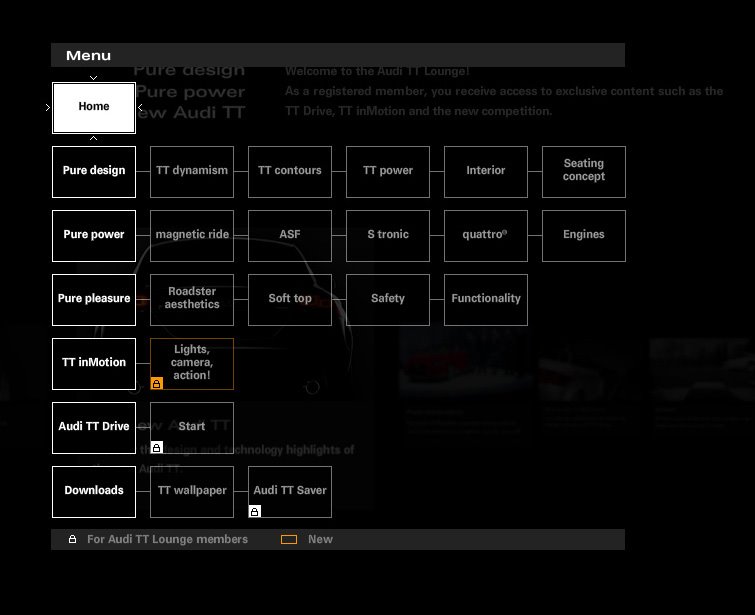
The TT movie is broken into sections; each section is a row of boxes and each box represents a screen. The navigation is basically a group of boxes aligned in rows, but it is clear what they represent and how to use the site. Between screens unique animations play, they visually lead you to the new screen and introduce the information. The screen isn’t immediately replaced with the one navigated to, which keeps the movie feel and adds sophistication. Face it, elegant animations leading you from one place to the next makes pages look primitive. This is a website that causes the pan on the stove to boil over and keeps you from picking up the kids on time.


The designers faced many challenges, but gracefully overcame. Primarily, there is a lot of information. The information is spread out over a number of pages, which keeps the user from being daunted by long paragraphs that, realistically, no one even skims. Some users may want to sit back and watch the movie and learn about the car while other users may be seeking the answer to a question. The main goal is to sell cars. Every page whispers that an Audi is a high quality car and it will fulfill all of your desires.


SUV advertisements show large families getting into cars with their luggage, dog, sports team, surfboards, and boat; they tell you that you need the car. Audi did not even attempt to take this route, which is practical agreement that no one needs their product. The script on their website is carefully manicured to keep you from being reminded that you should be comparison shopping. They do not tell you the miles per gallon gas rating, the trunk size, towing capacity, passenger room, or sound systems. Audi focuses on how well designed the car is, how beautiful it is, and what it is capable of. Overall, Audi does a wonderful job of marketing their product; few who leave their site aren’t daydreaming.


-----------------------------------------------------


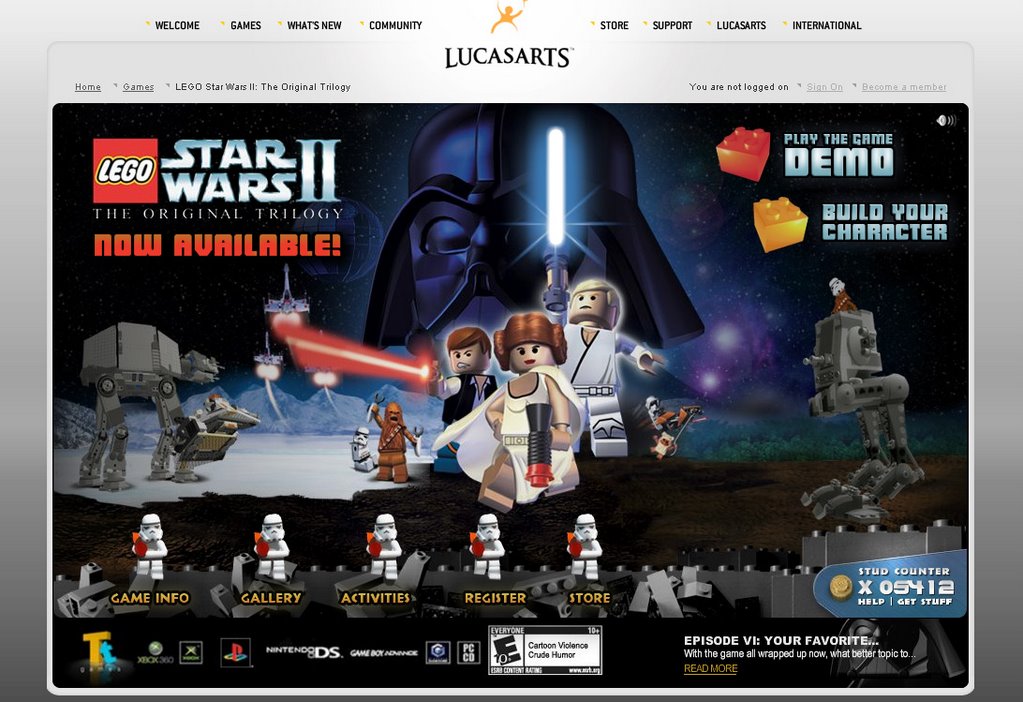
Lucas Arts is a unique website that is fun for all ages, it is dedicated to the various video games that they make. The site very easy to navigate, you always know where you can click, where you’re going and what to expect there. All of the things you can click on light up and move, some also play sounds. The design is bright and colorful without being garish, color and size is used effectively to lead your eye.

On the Lego Star Wars pages, you can build a character by choosing a head, torso, legs, and a background. At a glance, the site doesn’t appear to have a lot of information, the pages are well organized, preventing information overload. As you visit pages, you earn things such as wallpapers, screensavers, chat icons, and videos, which is an interesting concept. The animations are cute, in theme, and encourage the user to play with the site and share it with friends, creating more interest in Lucas Arts’ games. Overall, the site is fun, interesting, informational, and well designed.


Friday, March 02, 2007

Studio/Artist Exploration


Although not traitionally a studio, Albino Blacksheep (ABS) is a popular forum for which amature flash animators and other multimedia enthusiasts alike come to exchange ideas, text files, image files, and of course movies for fun.
Founded in 1999 by Steven Lerner primarily for the sake of promoting his band of the same name. After taking web desinging classes Steven Lerner decided to redesign the entire website, and ever since it has gained popularity throughout the years. The most obvious aspects that ABS shows is its wide variety of amature flash animations, some of which are collaberations between numerous animators. A good number of resources that are used for these animations usually come from an open source such as Flashkit.com which is a great place for flash developrs to not only gather ideas and tools from but also things like sound effects, all of which are free to use.
Studio/Artist Exploration

Sunnyfalsh.com is one of the sites that I have found and it's not a studio,this site is related to a company which offers high quality and affordable pre-made flash templates that will add value to any web page.This company also build web pages for its customers and give some services such as:

• Custom Web Design & Web Development
• Ecommerce Web Site Design & Development
• Logo Design and Corporate Identity Design
• HTML Services
• Shopping Cart Integration
The interesting part about this site was looking at their flash templates.These templates are really attractive and interesting.When we open each template,we hear music and we could see short intro with different options.In above the page we can find a price of that template.I want to share some of the templates with you:
Design studio flash template.


I really like the part that we choose each option and the sound we hear when we choose.In my opinion,the way that each page go to another page is good and effective.I like the color which is a mixture of gray and other colors.The only problem for me was the music because it kept going and I became tired of listening.


Dogs club flash template


The next one is Dogs club.I really like the flash in this template.The bones,and the funny sounds.Usage of flash in this template is simple,but the fact that makes this template fun is its design and color.

Xml dynamic photo gallery flash template
Is another example which is a great example of using flash.This template is about a photo gallery and their portfolio,exhibitions,bio and contacts.
Music band flash template
This one is my most favorite one.The colors,the options ,specially the intro is great.The way that each page open and start is amazing.I really like this one.

......................................................................................................................................
I searched for agency.com.They create effective interactive marketing campaigns and world-class websites.
they have 7 beliefs in their work:
1.in a world of spiralling choices and mounting overload we believe in making the complex simple 2.in a world of product parity, low attention spans and bought loyalty we believe captivating experiences create affinity 3. in a world of decisions based on the briefest of encounters we believe every touch point matters 4. in a world of disjointed and fragmented communications we believe digital interactions must fit seamlessly into the customer experience 5. in a world propelled by incredible technology we believe human behavior is the hardest code to crack 6. in a world where customers demand perfection we believe delight leads to demand 7. in a world full of brands and their noise we believe it takes insight and imagination to stand out and win in an interactive world, you need an agency.com .

They have a lot of clients such as:T-Mobile,CNN.com,Visa,British Airways,eBay,Academy of art university.
If someone wants to contact them it could be happen by phone or e-mail.They have office in different cities.
About their services,they say that:
"Our work starts with the big picture. We get to the heart of your customer's experience with your brand: in the physical world and the interactive world. If these interactions are in harmony, your customer's journey is seamless and satisfying."

In their portfolio you can find 6 example of their work.Here are some examples:

British Airways I like this design specially the reflex of the words at the bottom.It's very soft and effective.


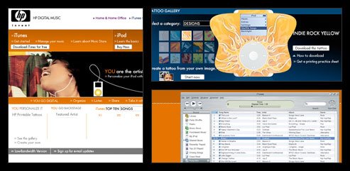
Hp music Again we can see that reflex of the words.I think this site is a great example of using flash and I think it's very well designed,effective and professional.

Wednesday, February 28, 2007

For more than 9 years the Developers at Smashing Ideas have been creating rich media experiences with websites, games, animations and business solutions. They have established themselves as one of the top 10 Flash developing teams worldwide.

Visit their site at:


http://www.smashingideas.com/services/

Their impressive client list includes working with Venerables & Bell to create original animations for the re-launch of Napster, unique games for the 2005 Music Video Awards, Sprite, and of course we all know Dora the Explorer! Just to name a few.

"Death to boredom. Long live fun!" is their motto.

As you explore their site, notice the small details. Notice the rollovers and interaction that holds you in their site for much longer than you intended to be there. It is FUN even if it is business.
Smashing Content is leading the industry with their innovative digital experiences with all manors of small screens; games, mobile handsets and other portable consumer electronic devices

New Media, or is there Flash in your future?

When I was doing some research for our mini project, I found some very helpful tutorials on the Adobe site. And in fitting in with “New Media-Flash for the Future” I elected to share this site with you.

http://www.adobe.com/devnet/flash/articles/total_training_scripting_basics.html

At the above posted link, Adobe has used Flash to create an instructional training tutorial for basic action script, as we are just now learning.

Open Flash, and work this tutorial for fun. It will help reinforce what Karl is lecturing about. And it just might help you with your mini project?

On the subject of how Flash will be used to improve the future, we should take a step into it’s history. Adobe has a page entitled,

www.adobe.com/products/flash/special/flashanniversary/ .

At this link you can take a flash-back to see just how far this powerful software has come.

10 Flash developers from around the world to tell us how Flash has made an impact on their personal and professional lives.

Answering 10 questions each, they relate how they learned what they know today about the technology, how they've used it in the past and how they use it today, which features they love most, how Flash has enhanced their creativity, what lessons Flash has taught them—and which tip they'd like to pass on to other developers—and, finally, what the future holds for Flash in the coming decade.

I found these interviews enlighteneing. And each developer had his/her own idea of the future of Flash.

As Flash runs on more and more devices and platforms, I believe it will become the standard for almost every application that requires interaction.

Tuesday, February 27, 2007

Cold Hard Flash

Cold Hard Flash is a website for independent flash animators who do contract work including short animated features and television shows. The site includes industry news and updates and outtakes from the creations of the site's featured animators for example frog in a blender. I really like Newgrounds because of the wide variety of flash games and animation, but the work here is (for the most part) much more sophisticated and the animators are professionals.


One animator I like is Han Hoogerbrugge. He did a flash video for the London based band The Young Punx . He also did a really funny interactive site called Nails. His website also shows a flash animation he did for Sony to advertise the Playstation2. I enjoy his work because he is a very good illustrator, his work is very creative (out there) and he has a really good sense of humor.

Sunday, February 25, 2007

Studio/Artist Exploration

I decided to cover a few artists and compare them. Coincidentally, they're all from Europe. Many of us are probably familiar with the work of Jacquie Lawson, (England, U.K.), who creates flash driven e-cards for all occasions. Her beautiful work can be seen for free here. Just click on any of the examples and enjoy! This is a smart way of doing business, she allows you to admire her art, but to personalize them, you're asked for a membership contribution of about $8 per year.

Besides holiday and birthday e-cards she also developed a series about her chocolate labrador(mix) "Chudleigh", which are kind of cute stories. It seems to me that she rotoscoped her dog. The clickable picture hyperlinks to "Digging for Gold" to celebrate St.Patrick's Day on March 17, with a pint on us! (Slainte, by the way, is Gaelic for "Cheers!").

My favorite e-cards are Dance of the Sugar Plum Fairy, from Nutcracker Suite by Tchaikovsky and a Happy Birthday card featuring musical teddy bears on music by Scott Joplin's "The Entertainer". After watching these flash clips, I also understand better now how powerful and important audio is to animation. I always underestimated that, really! Jacquie Lawson's style comes across as classic, the flash movies are very well done, but they do not carry great glitzy pizzazz. However, it feels it will take me a great deal of time to reach even that level of skill.

When searching the web for exiting sites, I came across the website www.goober.nu and flash site of Goober Productions by Olaf Bergner from Sweden. I was intrigued by the country code .nu (pronounced "new-way"), which is the abbreviation for the Island of Niue in the South Pacific, near New Zealand. More about ".nu" here. There are such other popular country codes as .cc for Cocos and Keeling Islands (west of Australia), .to for Kingdom of Tonga, .tv for Tuvalu, both are also in Polynesia.

I was struck by the Art of Bergner, who strangely enough seems to have stopped his activities near the end of 2005. The Gooberstory (Claudia, what is it about Peanuts and the InterNut, err I mean the InterNet ;) is a fantasy presentation about peanuts, fish, and trees. Beautiful music, dazzling scenery (created with Photoshop) and sweet animations. And again the music score is so important to add power to the presentation.

A funny flash clip is Sumo, the bambooman. Watch the spooky African mask while the movie loads. Nostalgic is the Story of Nim, a hobbit of sorts who lives near the North Pole. Beautiful scenery and music will also be found there. Bergner has some nice links to other animators and flash sites, such as Surya Cosmetics (Brazil/Portugal), The Little Ninja, for those whole like animated "Kill Bill" stuff.

A third flash site, stephaneguillot.com (France) was presented by Ronnie Nadal in IMT230 last semester. I found it very impressive and wanted to also share it with you.

This artist uses fancy sound effects and music tunes to accompany his creations. I especially like the score and the quick animations made for a French ISP called NOOS, but there's a lot more to discover.

Happy Surfing!

Tuesday, February 20, 2007

Speared Peanut Anyone?


What the heck is a Speared Peanut? Check out the Speared Peanut website to find out. Of course their answer is.... ok I am not going to tell you : ) You have to go to the site and check it out.

I found this site while trowling Karl's list of resources. I checked out quite a few of them and really liked the Speared Peanut site. I didn't find an about us section - so I don't really know how many people work there (only two are listed to email in the what's your phone number section). They are based in Texas.

Their work is quite diverse. It was interesting to see their own website is set up in frames and this is how most of their client sites are set up in as well. So not all Flash. But the Flash that was there was very fun and expressive. I like how their page is very condensed visually. Unusual in a world where most people want more, more, more stuffed in each page.

Their work is divided into 5 sections - visual arts, music related, educational, business and fun. I really enjoyed the music section. A couple of my favorite music sites were for Garland Jeffreys (the photo page is fun), Blink 182 (just weird), Prince of Egypt and Eels (what kind of navigation is that???).

Looks like a fun place to work - too bad they are so far away.


And just for comic relief - we need to check out the Homestarrunner website. This site was built by the two Chapman brothers. Mike (the older brother) and a friend had originally created the characters as a comic book spoof of the poor quality children's books they saw at their local mall. In 1999 Mike learned Flash and turned the static characters into "live" Flash cartoons. His brother Matt provided the voices. They decided to set up a website (in January of 2001) to amuse their friends and through word of mouth - knowledge of their website grew.

My youngest son started checking out Homestarrunner in spring of 2001. So over the years I have watched the site grow and mature. As the site became more popular, they started selling t-shirts and stickers. After 3 years their father told them those magic words - "they could quit their day jobs" and work on the site full time. And so they have. The site is updated every week - in the StrongBad email section. They both share in creating the Flash development but Matt still does most of the voices. It is great to see someone succeed at something they love to do - and if you notice - their site is totally self-supporting and does not have annoying advertising all over it. Way to go!!!

Jimimon Design / Dub Selector

I have been researching the Jimimon Design studio based in London. Jimimon’s lead designer is Jim Johnstone. They do illustration, web design, and the Dub Selector. Their web clients include Open House festival, Smith & Pye, Punk Rock Blues, Vacant Clothing, and Crusader Travel.

The main site is very clean and easy to navigate. The initial illustrations work really well at revealing what style of design they do best. It seems to be kind of cartoony, with an edgy sort of rock-and-roll feel. Due to the fact that they have hardly any text, a quality I love in websites, I am going to review Jim’s “pet flash project” called Infinite Wheel – Home of the Dub Selector.

Infinite wheel is a Flash-created doorway into all of the different Dub Selectors that Jim has designed. The Dub Selectors are interactive “games”, where you press things and move things to create a live dub song. (Dub is a style of music kind of like reggae but slower with no full vocals of any kind.) The entire Infinite Wheel website and each Dub Selector was created in Flash.

Now that we are learning about animation, I am starting to see what composes each Dub Selector. I would love to see how many placed movie clips they are using. Each individual moving thing is probably a movie clip that is motion-tweened across the screen. I can tell that the graphics and audio react specifically to what the mouse does. It seems like the samples and music are quantized (timed up), and that the echo’s of the sounds you play are quantized as well. I can’t wait to learn how to use music and sound in Flash. I am anxious to learn how the mouse interacts and controls graphics and sound.

I play with the Dub Selectors all the time. I am definitely not alone in this, as the Infinite Wheel pages have been viewed over 4 million times. This concept represents the direction I want to go with Flash, which is music + interaction! This site is an endless source of inspiration for me, not to mention totally fun!

Monday, February 19, 2007

Animators use Macromedia Flash


Since we have been doing animation exercises in Flash, I decided to research flash animators and their work. Nina Paley came up in the search engine on the first page. Her site was interesting, and easy to navigate. In her biography she says she started out as a comic book artist. After a few years drawing comics for semi-underground newspapers and magazines, she struck a deal for her own comic strip with Universal Press Syndicate titled Fluff. It bored her to draw the same comic strip day after day, so she gave it up for animation. She has tried all types of animation, with many successes. Her film, Pandorama, was made by drawing and scratching directly on the film. It became a huge success. After that she produced her first film in Macromedia Flash, called Fetch, which premiered in 2001. What I like about this film is how the effects look doable for anyone who can draw just a little, and who understands the basics of flash. It even has a bouncing ball! The dog and the person are very simple shapes with movie clips attached for the motion. The eyes roll, pop, the legs churn, the shapes get large, small, they fade in and out, and they stretch and compress. This film has taken basic flash rules and made a cartoon that is witty and fun to watch. The hardest part of the cartoon, according to her bio, was producing the sound. She had to raise the money to buy the music. The animation was adapted to film, and that was a large cost as well. Her cartooning took three months, but it took three years to complete the project.

I like Nina Paley’s web site – I can agree with a lot of what she says. Not all of her animation films are light and amusing. She has a lot to say about the population explosion. Those shorts are disturbing. I hope everyone visits her site and explore her works.

In her blog she has a link to another animator who has done some flash animation cartoons that makes her stuff look elementary. The cartoonist, Adam Phillips, is not as philosophical as Nina. He is not interested in social commentary. His flash animations are about fairy tales and his works are beautiful, funny and a little naughty. He is an Australian who started out as a Disney animator in Sydney. After a few years with Disney he decided to try working on his own. He has created a planet called Brakenwood with a cast of characters. Bitey is a young satyr, and he is the fastest creature on the planet. He can be bad, and if he is, he seems to always pay a price. There are fairies, a teeny witch, and prowlies, among others. Adam Phillips creations are totally animated, and his backgrounds are beautiful. It is hard to believe it is done in flash. It is – he has written an instructional flash book to explain how it is done. Try out YuYu, a cartoon by Adam Phillips that was linked to Nina Paley's site. If you like cartoons and comics, his site is one you will enjoy.


Sunday, February 11, 2007


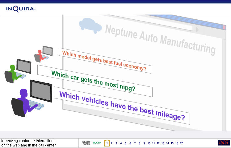
I thought it would be interesting to look at and discuss a movie created for the business-to-business market, especially in comparison with the Gangs of New York promo Karl showed us last week, which was created for the business-to-consumer market. InQuira in a Flash is a movie that introduces InQuira, a company that makes natural language software to improve the effectiveness of call centers (the people who answer your calls or emails when you inquire about a product or have a complaint).

You might think that this piece, which is extremely simple, using primary colors and flat clipart figures, has nothing in common with the Gangs of New York piece. But both movies aim to create desire--desire to see more. In the one case, the Flash team is trying to make us want to go see the film; in the other case, the team is trying to make us want to contact InQuira for more information.

But, what these two Flash movies must do to achieve similar aims is quite different:
  • Gangs of New York creates desire primarily by evoking emotion--the vivid images, the fire, the color, etc. Understanding is secondary. While there are lots of fun features for exploring the characters, history and topography of the story, we don't have to understand any of that to want to see the film. They are supportive secondary features, and therefore the Flash team has put them at lower levels of the site's architecture.

  • InQuira in a Flash creates desire primarily by helping viewers understand. It does this through sparse, carefully orchestrated visual/verbal explanations. It uses emotion too, but in a subtle way: the simple graphics on white background create a feeling of simplicity and ease, which suggests "the problems you're having with your call center are solved."

My comments on this movie revolve around this tension and balance (or lack of it) between understanding and emotion.

I think InQuira in a Flash does a great job of clearly conveying just the essential information necessary for understanding. Notice, for example, how we learn exactly what they do in the first 20 seconds. Watch how they begin with the familiar and specific, then gradually guide us to new content and abstract ideas. I'll talk a bit about this in class.

But I think the decision to play so little with our emotions was a mistake. They don't make us care enough. And the look and feel of this movie is too clean for subject matter that involves the messiness of people the way a call center does. The piece would have had much more impact, in my view, if they had used some images of real customers, people like us we could relate to, at least initially and perhaps occasionally throughout. They could have then transitioned to or layered on the icons representing customer in the diagrams. In fact, the ideal, in my opinion, would be to use images and sound to convey some of the human messiness and confusion of the real world (people calling in with problems, etc.), and use the graphics to suggest that the InQuira product takes it all in and handles it with a call center process that makes everything simple and clear (overall feeling kind of like a Jedi warrior passing his hand in front of our face, changing our perception).

I'll bring another business-to-business Flash movie to class, one that uses images to convey information in a similar way as the InQuira one. While this movie has plenty of its own problems, it has, I think, more emotional impact. I'll be interested to hear what you guys think.

See ya Tues.

P.S. If you think this business-to-business stuff is boring, consider that there is a very small number of films released every year, but an enormous number of businesses (including small startups and nonprofits) trying to convey their messages and sell their services and wares. There is a HUGE opportunity to help them, especially now that we are going through a market transition which is making Flash animation--formerly practical only for a handful of large, wealthy enterprises--feasible for nearly any business.

Wednesday, February 07, 2007

Testing

I am testing this thing to see if it works , or if I am still lost in cyberspace.

Tuesday, February 06, 2007

Big Spaceship: Studio Exploration

Big Spaceship is a design in New York with several movie studios as its primary clients. I was particulary...