Tuesday, November 18, 2008

Studio Exploration: AgencyNet Interactive


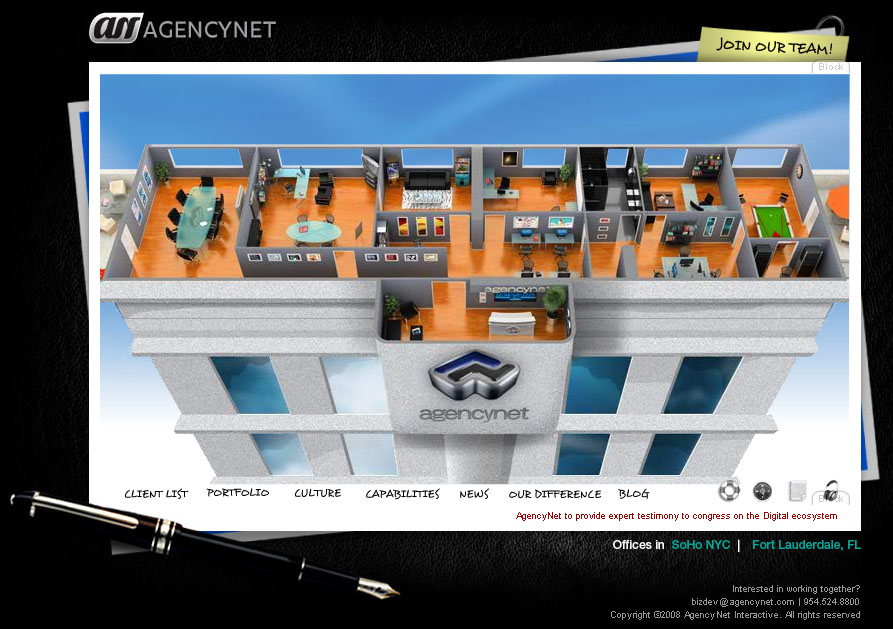
AgencyNet Interactive is an Online Media company that was founded in 1994. They have been using Flash since the company started. AgencyNet’s tools are the Adobe Software Suites. Their philosophy is to be passionate about what you do, so you must love Digital Multimedia. They have a relatively small number of employees ranging from 11-50 and have a yearly revenue of about 50 – 100 million dollars.

The reason that I choose this site is because they put as much effort into their own site as they do for their clients. There is one difference; they are trying to attract employees as well as customers. I think branding one’s own firm is just as important as successfully branding other companies. AgencyNet.com effectively displays the company’s overall look and feel. It shows the office of a very cool interactive web design company. Different offices can be clicked on like tabs and the site takes you inside the office and tells you more about that tab, for example the client list. The Client List is located in the Kitchen. The clients are magnets that can be rearranged on the fridge. You can also move the letters around, a nice addition for those people with short attention spans. There is a clock with the actual time and depending on the day, the food on the counter changes form Pizza to Chinese takeout. The immense detail draws you in and is very engaging making the site a truly interactive experience. Not only is the site entertaining but it is a great example of what the company is capable of.
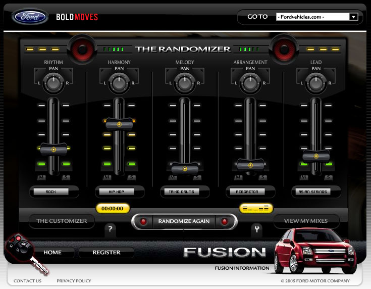


Ford Fusion Mixer is a site where you can choose up to 10 different genres of music as Mixers and create your own unique symphony. You can mix music like Rock, Hip-Hop and Asian Strings. And you can use the equalizer to make a truly unique sound.
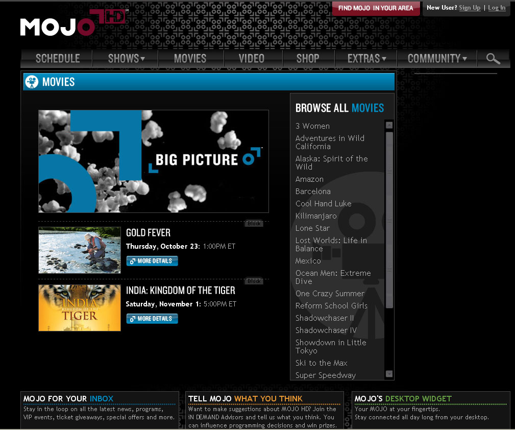


MojoHD.com shows in depth information about the television station. The site has the channels schedule, upcoming movies, as well as information on the shows. It has short video clips, as well as downloads of whole episodes. It has tons of extras, like recipes and travel info, both from the shows it airs.

Monday, November 17, 2008

Burton.com


I picked this Flash website Burton.com because it is the most frequently visited website by myself. As you enter the website you have a language menu from around the world. Once you have entered the things I really like about this website is it overwhelms you with activities. You can go to the the bottom and view some really hot snow boarding videos all featured by Burton of course. One of the cool features is you can search for gear by colors in one of the little pop-ups, or you can even enter to win free gear. It also gives you a quick overview of Burton upcoming news and events. One of the coolest things on the site is that on of the ads gives you the option to customize your board with your artwork or photos. If you come to this site looking to buy some gear, you can add it to your gear locker which is in the top right of your screen. They will store something in your locker for a week or so until removing it, so it gives you the chance to leave the website and come back later and start right where you left off. Once you click on gear you come to a menu for men's gear, women's gear etc. I really enjoyed the rollover menu's that pop up when you scroll through the screen. Something on this website that is very helpful is when you click on Tech, you can get a lot of information on useful information from ridding to setting up your boards bindings. Now if you goto teams you have a chance to kind of meat the team members and scroll through numerous photos of the team members and there daily lives. It does a great job of introducing the team members and gives some awesome information on them. The one thing i could critique on this website is that the first page, even though I know it suppose to be a little bland, it is simple just an enter page with languages on it but it really doesn't give the feel of Burton at all. If i had designed this website that would probably be one of the things I did differently. Other than that I love the site and visit it at least three times a week to check in on new things going on.

Sunday, November 16, 2008

2nd studio exploration -TARGET SCOPE-

Dallas Advertising Agency >>TargetScope<<


Target Scope is an advertising agency based in Dallas, Texas whose current website design appeared in June of 2005. Their use of a 1950's flyboy backdrop is completely innovative because of the depth they add to what could have easily been an overused theme.

I am not a big fun of American old school designs but their unified theme of 1950s flyboy backdrop is just excellent. All music, images, texture of paper and use of texts go together very well.


Some little interactive effects are making this site more interesting and outstanding. My favorite is rollover scope effect on menu bar. Once you hit the menu button, bullet holes appear over the menu with the sound of gun shot. It is pretty neat and fun.


A shadow of combat plane fly over the page in certin amount of time. You can also choose or turn off the music from the right top corner music section.


They work for a lot of famous companies such as Jack Daniel's, Verizon, Cold Stone.


Wednesday, November 12, 2008

Design Exploration : Nissan GT-R and AMG C63

For this exploration I chose two car manufacturers. These are two micro-sites for the New Nissan GT-R and the Mercedes AMG C63. Both sites are entirely designed in Flash and feature some amazing 360º video technology to promote two high performance cars.

My first pick is the Mercedes-AMG 360º This site features some amazing footage using a revolutionary 360º video technology and using flash to allow the user to "interact" with the footage. There are a lot of nice features used in this web site and subtle elements to make it appealing and interactively fun. I like the fluidity of the navigation. I also like the contrasting colors used, it is simple but powerful which is what the car is all about.

My second pick has also to do with cars...do you see a theme here! It is the micro-site for the new Nissan GT-R.The site is also entirely built in flash. I like the blend of video and interactive elements embedded in the video. As the AMG C63 website it features some 360º technology. I also like the spinning earth with its interactive cities. Again a great site which combines interactive elements as well as informative ones.

Monday, November 10, 2008

Blog #2: Design Exploration


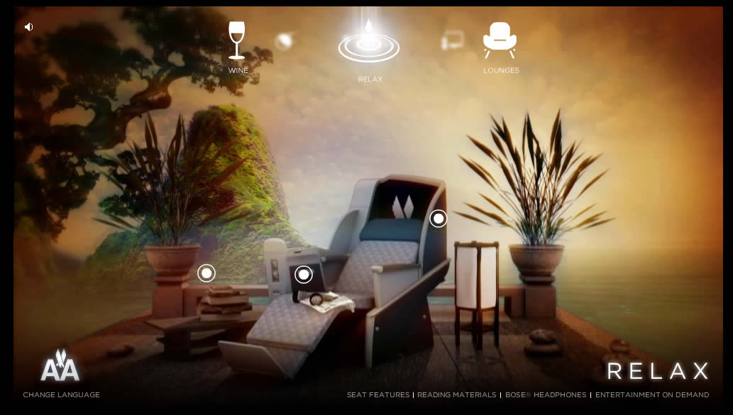
For this Exploration I picked www.theflagshipexperience.com. This is a website sponsored by American Airlines. The entire website is designed in flash and has a great navigation experience.

Design
This website has a variety of bright colors and suitable graphics. Small detail has been well placed throughout the site.

Navigation
The navigation for the website is easy and well design, it is simple and makes the most of promotion of competitions by having less pages. Flash animations within the page are great and so is the music on the background.

Content
The concept of on the website is to promote “the flagship experience” or in other words their business class seating. By selecting the different scenarios shows incredible sense of relaxation.

Summary
“The Flagship Experience” is an interesting and efficiently executed website with outstanding design and good use of media. It was especially good to see fast loading times and the well-thought out navigation and functionality. This is a well planned and executed website that deserves recognition in terms of design and concept.

Sunday, November 09, 2008

Design Exploration - Four Seasons Bora Bora and Idustrial Light Magic Pirates of the Carrabean

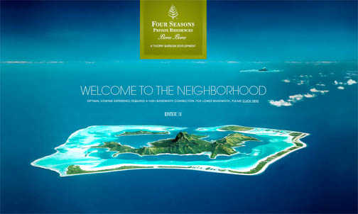
http://www.ownborabora.com/

This website was built to promote the sale of Four Seasons Private
Residences Bora Bora, 15 of the most rare and exquisite properties in the world. Fully deeded whole ownership interests. This website is visually stunning and very easy to navigate. The background of the site is video of the island and island life, while the navigation and information is laid over top the video. The flow of information on the site is fluid and seamless and the color pallette goes well with the island theme.


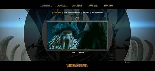
http://www.ilm.com/theshow/


This website provides visitors with a behind-the-scenes look at the artistry and technology used to bring the characters and environments to life in the Academy Award Winning move Pirates of the Caribbean. It was created to showcase that the best visual effects make the effort invisable and extend ILM to the web. The look of the site carries through the theme of the movie by having suddle underwater noises playing in the background. It is easy to navigate and encourages visitors to have non-linear interaction with video rather than a passive viewing experience. Flash is used to "peel apart" layered video revealing some of the special effects used to create the movie. It also engages the viewer by showing scenes from the movie and asking if it is "Real or ILM".

Software used to create ths site includes Flash 8 Professional,
Illustrator CS2, and Photoshop CS2.

Thursday, November 06, 2008

HOMESTAR RUNNER!

HomeStar Runner
http://www.Homestarrunner.com is an amazing flash website that is for pure entertainment. Launched in 2000, Mike Chapman just gathered together a few ideas for flash animation. Now the site has become so popular and successful that it has even drawn the attention of Nintendo, and they have released a homestar runner video game!
-Travis Wright

Wednesday, November 05, 2008

Blog #2: Design Exploration of Web-based journalism

Blog #2 (Design Exploration of Web-based journalism)
At a time when the newspaper industry is struggling due to economic factors and competition from the internet, the Christian Science Monitor, a century old, globally circulated newspaper, is planning a transition from it’s daily printed version to a more robust website, a daily emailed PDF version and a weekly print version. The Monitor will continue its current level of international and domestic coverage, with correspondents world wide. In this transition the Monitor hopes to achieve three goals: produce news that can be accessed and updated 24/7, focus resources on fast-growing web audience to increase reach and impact, and eliminate the major production and distribution costs of a daily newspaper. A look at the current on-line Monitor we find an exceptional example of multi-media journalism: use of webcasts, audio reports, photo journalism (Somialis in exile), daily pod-casts from reporters around the world, integration of blogs by multiple reporters on breaking news (e.g. Global Credit Crisis blog and Vote blog), regular blogs from experts, links to related stories, archives of past stories, and award winning story-telling narratives (Little Bill Clinton Hadam, the story of a 9 year old Tanzanian refugee), creation of virtual community with blogs from relevant and diverse community voices (Patchwork Nation Blog), photo galleries, and RSS feeds. Facebook provides the Monitor with an excellent opportunity to introduce its unique content to a younger audience, while Twitter, the Monitor’s experiment with social media, provides a service for friends, family, and co-workers to communicate and stay connected. Like the printed version, CSMonitor.com contains content that is straightforward, intelligent, unbiased, and non-“sensational”.

Tuesday, November 04, 2008

Interactive Sudoku Fun


I worked as a computer programmer for “decades” and ended up as a game developer, implementing educational games on Sony Playstation and Internet platforms. The company had a team of game designers, audio specialists, artists, and technical developers (of which I was one). The games were fun, engaging and taught elementary school level math and language concepts using multi-media tools. It was a very fun job and the product something I was proud of!
Since getting laid off, I have tried a number of professions, including teaching middle and high school math (an unsuccessful, but interesting experience!) and currently, tutor middle through college level math students, which helps understand specific troubles students are having in learning math concepts.
This brings me to the topic of my discussion, which is “using interactive multi-media to teach secondary math skills”.
A search of what is available on the internet came up with the following:
www.ed2go.com a text-book style instruction, with chapter quizzes and small projects. There is a teacher moderator and an on-line forum. www.learningplanet.com though most of the site requires a subscription, I did find some free examples (Math Mayhem, a Shockwave application) The problems had no instruction and limited problems with only “right/wrong” feedback. www.mathgoodies.com, offers instruction and practice problems categorized by topic. Again, the instruction was text-book style and a very limited number of practice problems. I narrowed my search to finding instruction and practice in “factoring 2nd degree polynomials” a subject algebra students encounter with varying degrees of difficulty. I found the following sites: www.factoring-polynomials.com which gave a book-like description on how to factor, but no practice problems. www.quia.com a seeminly endless supply, of multiple choice factoring problems, but with no instruction. www.glory.gc.maricopa.edu a site that explains the “bottoms up” factoring method and gives a couple of examples. The site is very basic and reads like a book without pictures, animation and no practice problems.
One point that was brought up in a sample lesson on ed2go was that learning can be fun, disputing the quote often heard by teachers "We are in school to learn, not to have fun." I think that interactive multi-media can facilitate both learning & fun. To this end I found a site that gave miscellaneous math problems embedded in a caching game www.mathbits.com The game was fun and engaging and revealed a “prize” at the end, which was a PDF certificate. But again, there was no intermediate feedback or step by step instructions on problem solving.
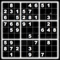
Finally, I found what I was looking for in the Sudoku game on the site www.learningplanet.com I love to play Sudoku, so this was a distraction and off-topic, but after investigating it further I realized it had incorporated the multi-media aspects I was looking for: interactive step-by-step instruction (see “How to Play” for I/A instructions) and pertinent player feedback during game play (time clock, sections light up when completed, interesting graphics, etc). The unlimited game play was also a bonus! This game has the elements I was looking for in teaching math skills: fun, interactivity and intermediate examples and feedback!

Monday, November 03, 2008

COCA-COLA AROUND WORLD


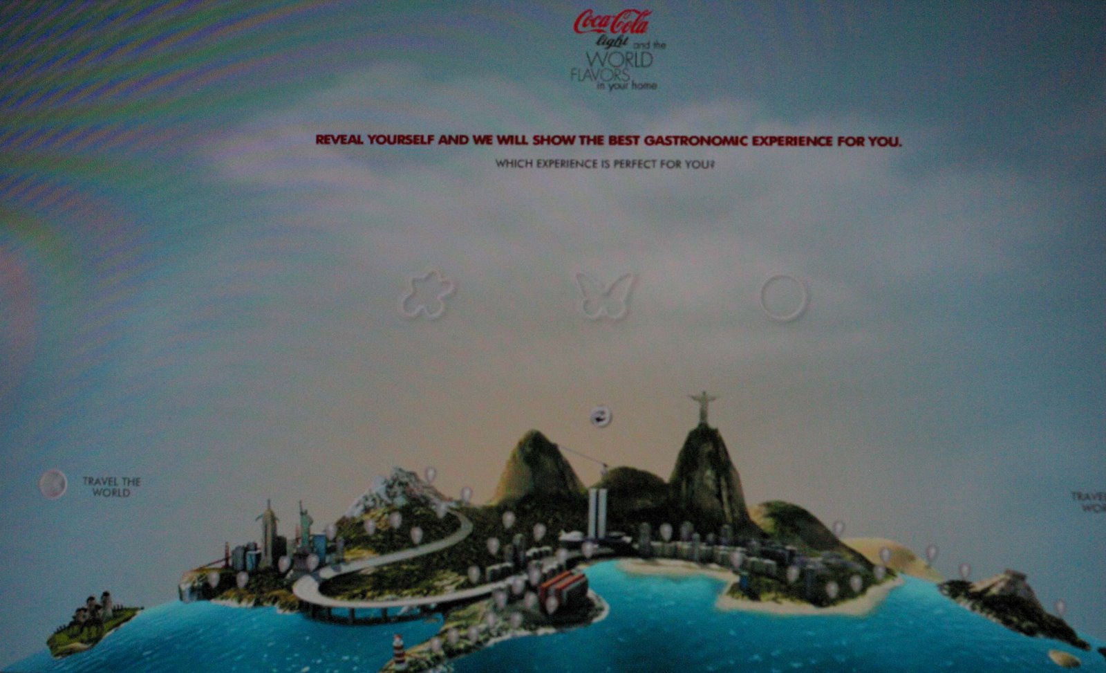
The thing that gets my attention is the fact that there are multiple things moving at one time, the sugar loaf gondola a parachute, cars are moving, and the lighthouse is blinking. The introduction is amazing starting from the clouds and then going down and focusing onto the world. They also give you multiple choices for where in the world you would like to find out about the greatest food and they do this in an innovative manner by not listing the names of the places, but by using landmarks. The ocean is also constantly moving, incredibly realistic, and almost give the illusion of liquid on your screen. The topography like appearance is very visually appealing,. The choice of word is also interesting as it doesn't say "next place" but "travel the world" making believe that you can actually travel the world. Even the parachutes appear to have a person inside, The attention to detail is absolutely outrageous,. This advertisement is very good: The key is a realistic look to a cartoon that almost looks like photography. In this advertisement they are using Flash animation and 3-D. Everything is interlinked making the world seem accessible. The balloons create an interactive almost game like feel to an advertisement. From this i will take the idea to use the "balloons" as an advertising idea. Not to mention that to cut the balloon and zoom into the place on earth you use scissors, which release the balloon. Some problems that the designers may have found were the fact that this advertisement required layers and layers with the clouds moving slowly while the cars zoom by on the freeway and the parachutes slowly fall to the earth. Also the illusion of depth may have been difficult to create. They used color and harsh edges to differentiate the background from the earth. Hopefully in the future we can travel like this and not have to spend money on gas and planes.

http://www.gringo.nu/projects/cokelight-worldflavours/#/world
By Patricia Brady

Design Exploration: Music, Movies, Games.

My exploration into the network took me to my favorite pastimes, Music, Movies and Games.


My first site is a singer named JULIAN VELARDE, who has a very interesting Home Site, as the animation is very appealing and navigation is fun.


http://www.grindhousemovie.net/

My second is the site of a couple of films of directors Quentin Tarantino and Robert Rodriguez. This site is great fun, full of interactivity and intense visual effects.

http://www.konami.jp/mgs4/uk/top.html

My third site is an online game in which they interact with a soldier in different scenarios.

Other intresting places:
http://saizenmedia.com/zoltar/
http://suzieg.co.uk/flashindex.html
http://www.saizenmedia.com/light/
http://www.whitegoldiswhitegold.com/

Carlos Osorno

Tuesday, October 28, 2008

Design Exploration of marketing and print companies

I started in graphic design over 20 years ago, when all graphic artists worked in print. I have experience with silkscreen, offset, litho, flexography, rotogravure, and web printing. Even though I now work digitally, almost 95% of my work ends up in print. Therefore it is no wonder I am drawn to companies that have a strong print background. For my design exploration I have chosen two companies that have strong print backgrounds, but have decided to have their web sites developed using Flash.

The Curiosity Group is a creative marketing agency based in Portland, Oregon, with strong roots in traditional print media, but has adapted their approach to include digital media. The interface of their site is simple, and whimsical using a flying elephant as a pre-loader, and other seemingly non-sequitor images that reside on the pages.

The core philosophy of Curiosity Group is to combine passion, creativity, and humanity to the projects they work on. This is evident by some of the non-client projects they produce that promote the green movement.

The Curiosity Group produces both traditional print media and digital media for clients as diverse as Apple, Microsoft, Disney, Dreamworks, HP, Nike, CBS, the LPGA, and Flash music videos for bands. They also maintain a blog called killedthecat.com (as in curiosity killed the cat) that details many of the ongoing projects at Curiosity Group.

The one drawback to their site is that is very heavy on graphic content, and the pre-loader takes forever before you are redirected to the page you want. Be prepared to be patient, even if you have a broadband connection.

Chromozone is a large format display printer, producing graphic displays for tradeshows, point-of-purchase displays, and retail signage located in the UK. They started out as a photographic printing specialist. Going digital in 1992 they expanded their business to become a color bureau service provider in 1993.

The Chromozone site is quite intriguing using color, shapes, and movement to draw you in to explore. The site has a traditional menu layout across the top, but that ‘s the only thing traditional about it. The site has more of a game-like feel about it. It even utilizes an overview in the lower-left corner that helps you know where your mouse is in relation to the ever-moving links on the page. Each time you visit a new page the transitions draw you in with an explosion of color, shapes, transparency, and depth. Just moving the mouse around gives you the sense that you are free-floating, or swimming.

Chromozone uses high-end large format printers to produce displays for their clients, and they have produced a high-end Flash site that is fun to play with, and their site is cutting edge just like their printers.

Jeff Ryan


Tin Man

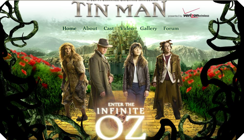
I chose to do my design exploration on a web site that promotes the movie Tin Man. This visually stimulating and effective web site features the artistic visions of nine acclaimed international artists in collaboration that brings to life the world of L. Frank Baum’s classic adventure, The Wonderful Wizard of Oz.

Unlike anything the author imagined a century ago, the artistic realm portrayed in Tin Man is much farther over the rainbow than ever before. Tin Man is boldly re-imagined for the new millennium with a darkly menacing world populated by wicked sisters, cowardly psychics, brain-drained inventors and a menagerie of other fantastical inhabitants.

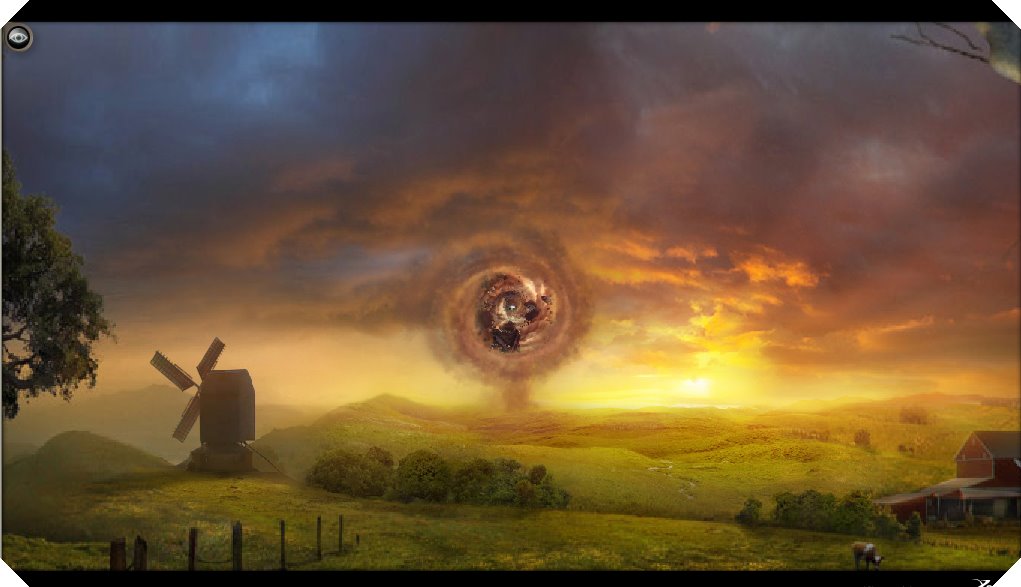
When first entering the web site you’re immediately sucked into this twister that continuously draws you into this beautifully, different universe. I think the web site conveys exactly what’s it’s meant to. It’s easy to navigate around in and give you control of everything you see. Its beaucoup of information on characters, plot, scenes, and even the acclaimed nine international artists is not only coupled with information, sound, and visuals but also small movie clips as well. I really think the web site was developed beautiful in sync with and for the movie.


I chose my second design exploration on a web site design for a brand new action RPG (role-playing game) for the Nintendo Wii and Nintendo DS called Monster Lab. Monster Labs web site & game, developed by Backbone Entertainment and published by Eidos, in my opinion, are targeted to more of a younger age group of children and teens.

In the web sites supernatural world, an evil scientist, Baron Mharti rules the region with a cruel hand. The player takes on the role of an apprentice scientist who must perform a vast array of intricate experiments to create their very own monster from over 150 monster parts offered. Taking control of their monster, the player can then explore the land; searching for ingredients to make more monster parts, hunting out other monsters to defeat in combat, uncovering quests to embark upon or simply competing in the numerous mini-games available.

I think the easy to comprehend instructions; the addictive games themselves, accompanied with the look & visual effects of the site really draw the youth in and entice them to go out and buy the game.

Design Exploration


I chose Freedom of the Seas website and Steven Wolf's website for my Design Exploration.

http://www.freedomoftheseas.com/ Freedom of the Seas has many features that are very interactive. Such as when you are looking at the boat with the magnifying glass, when you move over it, the magnifying glass reveals what is behind the glass. The loader appears to be a movie clip that loads what seems to be water in an anchor. There are many movie clips that are integrated within the webpage and the buttons you can click on. When you click on certain buttons it appears to be a tween that makes the image/background appear to fade in. Making interactive websites like this keeps customers and consumers involved in what is being presented and not becoming bored with what they are looking at.

http://stevenewolf.com/ Steven Wolf is friend of a friend. His website has many interactive options. When you open the website music starts to play. The buttons when you rollover them pop out and over to the right. There are a lot of movies and pictures that coincide with the buttons you can click which will keep users interested in what this person has to offer.

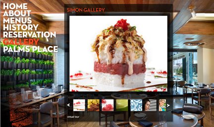
Design Exploration: Simon At Palm Place

The restaurant website at http://www.simonatpalmsplace.com/ is a full Flash website, using flash to call movies from the navigation menu, similar to our next mini-project. The website uses high quality photography to create a "super-hip, sophisticated" brand for the restaurant, with gorgeous artsy photographs of delicious food plates along with a puzzling but fascinating photo of the scantily-clad restaurateur looking a little like Angelina Jolie in a dominatrix role. The navigation features a gallery of highly artsy, appealing food photos along with more extreme attitude, scantily-clad woman. In the end, you can't help but wonder whether the owners are fabulously whimsical with a tongue-in-cheek portrayal of "simply irresistible" food and woman, or perhaps they are just entirely too full of themselves. In either event, I have no doubt that you would be drawn to this restaurant if you hope to mingle with the spectacularly chic and talented.

The navigation of the website is very simple and appealing. The imagery is "clean", attractive and creates a strong sense of place. The quality of the photography implies sophistication and high quality food and service. The incongruent photos of men and women in pink beehive hairdoes lounging poolside outside the restaurant create an allure that makes the viewer want to go there, if only just once, to see if it's really as hip as it implies. The website provides all the basic information needed for someone who would like to eat or drink at the restaurant, but the photography and attitude is the real story here.

Monday, October 27, 2008

Design Exploration: F1.com and Thnlizzyonline.com

F1.comThe Formula One website was the first example I looked at for my Design Exploration. The site is a combination of both HTML and Flash. The overall look of the site is sleek and strait forward with menus being easily identifiable and readable. The site is made to sell the brand that is Formula One, though F1 is a racing series it has the image of being the pinnacle of racing around the world. It is the most expensive, luxurious and competitive racing series around and so the site tries to sell this idea. The site design is geared toward people already slightly familiar with Formula One to some extent but there is a section for introducing newcomers to the sport. There are data bases for statistics about individual races, teams, drivers, seasons, and tracks. Another big part of the site is the pictures it hosts. Because Formula One is just as much about performance as it is looks there are hundreds of picture galleries and thousands of pictures as well as videos a visitor can go through. The only problem I have with the design of the site is the complete lack of color. though there are color highlights the site is 90% gray scale and so sometimes feels drab especially when looking at sections where there is little color highlighting.

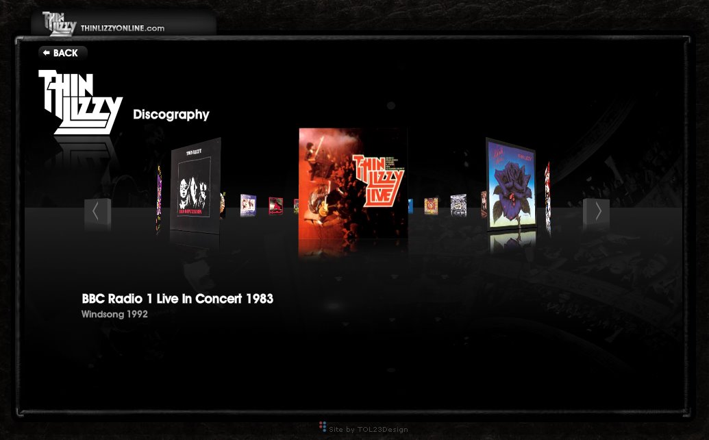
Thinlizzyonline.com
I was listening to Thin Lizzy on Youtube while writing the first part of this Exploration so as a joke I decided it would be fun to look at their website. I was presently surprised at what I found. I was expecting to find some botched FrontPage job. What I found was a well designed, sleek, easily navigable website that showed off all you wanted to know and did so through an extremely interactive Flash 10 design. The site uses the new 3D elements incorporated into Flash to have many turning menus and rotating scenes. The color choices are indicative of both the time Thin Lizzy came up in during the 70's and 80's and even of today. The site has a bit of the iTunes look with primary colors and the bubble feel that do make it feel a bit too cute for a band like Thin Lizzy though. Overall the design is very well thought out and there is really nothing that is glaringly wrong with the design.

Design Exploration


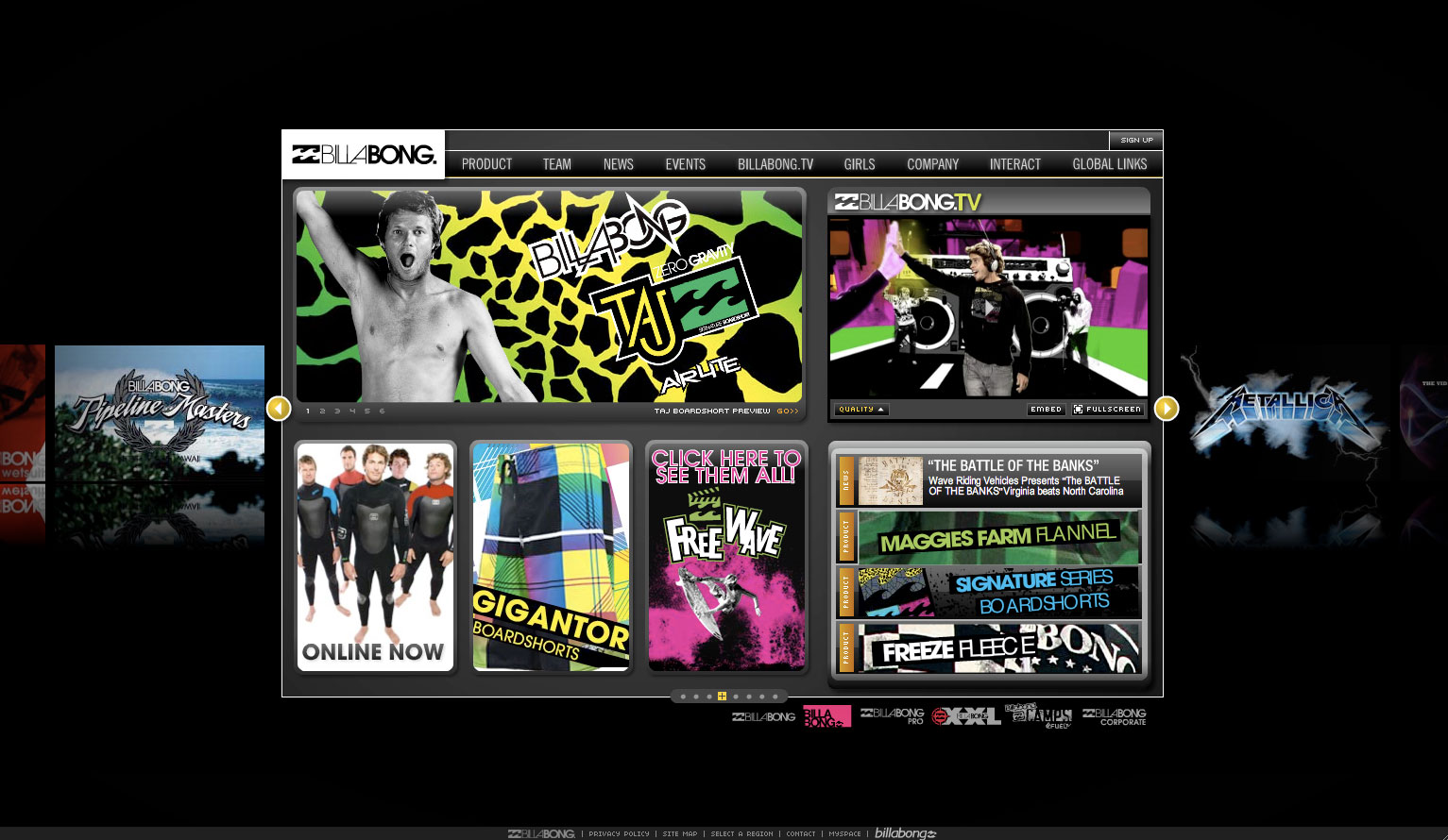
  I have decided to research Twix.com as well as Billabong.com for my design exploration. Starting with Twix.com, I choose this site because of it's large scale high def video game experience. 
 
 While visiting another site I saw a banner ad that intrigued me to check it out.  I had remembered the goofy ad of the dorky guy who runs into the good looking girl at the party and has to stuff a twix in his mouth while he came up with correct answer to give the good looking girl to get her back to his house.  I thought it was kind of funny so I clicked the ad and entered the Twix.com website.  When I arrived I noticed that there was an interesting preloader of one of the main characters chewing a twix.  I found that to be funny and somewhat entertaining, the downside is that you have to watch him while the game loads for about 2 minutes.  Once the game finally loaded the video begins and puts you into a situation of getting the girl back to your house.  At a certain point the conversation leads to a question of saying the right thing in order get the girl home.

  The Designer faced a few issues while creating this production.  Number one they had to display a large scale high definition video on the web, this causes long loading times, and in some situations freezing.  The overall design of the site was very simple, using various movie clip pre-loaders and stop actions to achieve the goal of this game.  I found it to be simple and effective but difficult to load for those with out a fast internet connection.

  Billabong.com uses flash to represent their entire line of products and media.  The design is very complex and uses various movieclips and background images to spice up their presence on the internet.  I would imagine that the designer had a lot of brainstorming and an entire team of designers to complete the production of this website.  The general design of the site remains the same throughout the site but new movie clips and pre-loaders are engaged when navigating through the various pages.  

  In conclusion if I were to choose between the two designs I would choose Billabong.com because it seems to have more effectiveness.  I felt like I wanted to purchase Billabong products after visiting their site which makes it a success.

Sunday, October 26, 2008

Design Exploration: Disney.com

The Disney channel website, Disney.com, is home to all of the Disney Channel shows. After watching my little sister (who is 10) check out this website almost every day, I thought it worth writing an exploration on.

On first loading the page, there’s plenty to look at and plenty of choices on where your next click will be. In addition to Disney.com’s own navigation, there is graphical navigation across the top of the page for some of Disney’s top shows and movies. I find it cool that when you hover on each one, they “pop” forward in an animation and their scheduled air-time/more information is displayed across the bottom of the graphic. Also, clicking on each will take you to the home page for its respective show or movie.

Despite so many small areas containing some kind of information or other, the website is very well organized and easy to navigate. After all, they had to make it easy to navigate considering that children would primarily be visiting the site.

The home page for each show contains it’s own specific content, information about the show’s characters, games, and videos, as well as photo and download pages. It’s all very eye-catching and very, pardon the pun, “flashy.”

I can see how the designer(s) were surely challenged in making the Disney.com website and make it so appealing for its target audience, namely kids. With a plethora of mini-games, videos, and a near-endless amount of odds-and-ends to click on, you never have the chance to get bored while visiting the Disney.com website.

Thursday, October 23, 2008

Flash exploration : The Darkness website


One of my favorite video games for the PS3 of last year is The Darkness. started as a comic book in the year 1990. the game is very graphic so you need to put your birth date to get in, must be 18 to enter bla bla..

the loading screen is the logo of the game. there little loaders in the corner so you now its working. the site give of a very dark and creepy feel to it. the best thing i like about the site is the darkness image in the back, when you click on a link the image grow. the cool effect the site has is the sound with the typography. the font moves with the sound give you the feeling of the speaker. the music mach's the feeling. the rollover ability is used on every item in the website. the mouse is also the Amer in the video game. graphical links for take how it pops up is also very cool.

Wednesday, October 22, 2008

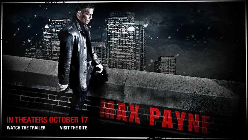
Design Exploration - Max Payne The Movie


Max Payne was originally a video game with a huge fan base. The video game is a 3rd person shooter with many cinematic scenes in the game. These scenes would play after completing certain objectives. Even while playing the game, you are like ”Wow, this would make a really good movie.”

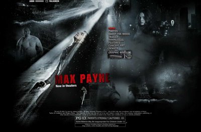
The purpose of the website is to reach new audiences and familiarize them with the story of Max Payne. I think the design of the site successfully sets the mood for a homicide detective roaming the streets of a major city. The site matches the in-game cinematic scenes, with dark and shadowy images, mostly black and white. I like that the site includes the Concept Art section, which shows how the movie chose it’s locations to match the concept art.

I liked the navigational buttons that were gray and slightly tilted and with broken lines running through them. I portrayed a sense of dismay and a broken spirit. I also like how the audio level has small lines to adjust the volume, when taking a screenshot I actually misread it and thought that is said Ammo lllllll. hehe

I also really liked how they used the transitioning from different pages within the site. It resembles the famous “bullet time” effect that director John Woo developed for “The Matrix”; and which Max Payne was the first video game to adapt this technology\idea. The “bullet time” was one of the reason Max Payne was so popular so it was nice that the design team incorporated it into their web site.

The graphic novel site was a great idea. It is a very entertaining way to get people familiar with the story of Max Payne. It shows the viewers what they can expect from the movie. And they won’t be surprised when they see the weird angel like creatures from the video game. The graphic novel also helps video game fans to get used to seeing Mark Wahlberg as Max Payne.

Check out the Graphic Novel Here

To see the official Max Payne Movie Site Click Here

Monday, October 20, 2008

Design Exploration- Barcinski & Jeanjean

Barcinski & Jeanjean is a two-men interactive studio based in Amsterdam. Their passion is creating innovative interactive experiences, as you can tell by their site. Their names are Mark Barcinski and Adrien Jeanjean. They met each other when they started as HTML freelancers at EuroRSCG Interactive Amsterdam in 1999. After a few years, Flash 5 appeared with interesting ActionScript capabilities for programmers such as the two of them. They soon specialized in building Websites, Banner Campaigns and Games in Flash. In 2004 they started a Freelance career. They grew into all-round Multimedia Engineers, expanding to other fields of interest such as Video, Audio, Interaction, Design and Concept Creation.

Here are some clients of theirs:
EuroRSCG 4D
Framfab
Lostboys
Proximity
Oer
Clockwork
IBM

You can view the site either normal, or in 3D (with the proper glasses, of course.) Their site is basically set up to be viewed in 3D. They even had some glasses made with their company name on them. The whole thing is centered on the two men, with examples of their work twirling around them. They even keep you entertained while you wait for the site to load, by letting you play pong while you wait (also in 3D.) The site is viewed in a 360 degree panorama style. Theyre standing in the middle of Amsterdam, right around the corner from their studio. The site is innovative and shows off their style, and right away lets you enjoy every little detail. Its creative but not crazy, and fun but still simple. Plus, if you get bored you can always go play some more pong.

Friday, October 17, 2008

NEUTRAL HABITAT RECORDS

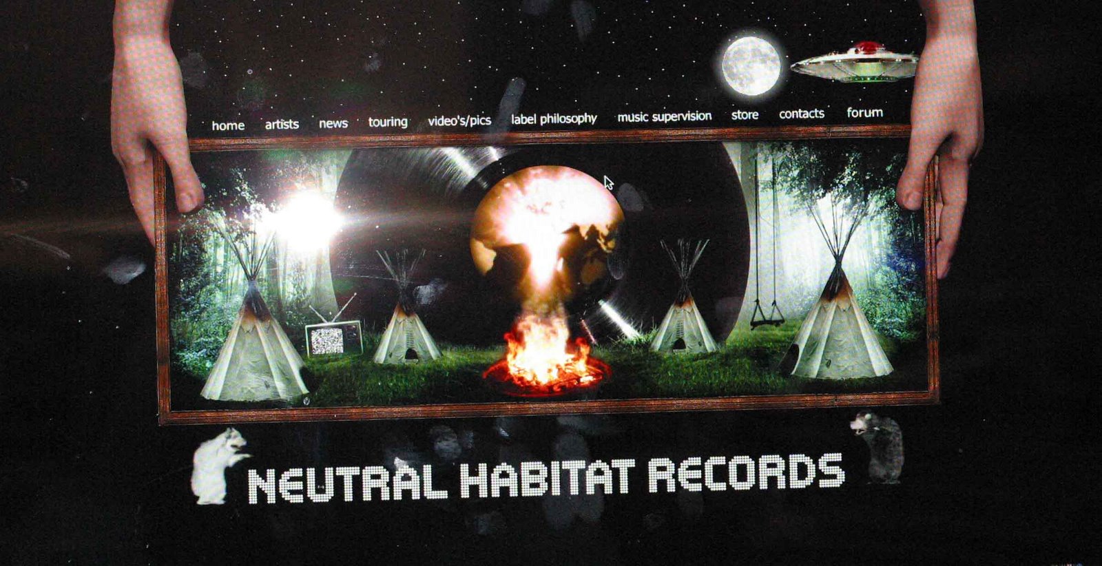
Neutral Habitat Records has a very edgy intro page using 3D flash animation.
Once the landing page has opened at http://www.neutralhabitat.com ,scroll the menu bar, select a category, and watch the space ship uptake your command,very cool.
Imedia Studios created Neutral Record'swebsite and is a very forward media studio owned by David Masters. Another project David has worked on is http://tomcruise.com.
Tom Cruise's website allows you to navigate through media that has been on the Big Screen,and
has flash animation as a background.This site is really amazing and a well organized website using many flash elements. Video streams and links function with ease and speed.
BY Patricia Brady

Exploration -Cross-Market Advertising

                                                            Effective Interactive Cross-Market
                  Advertising


SBE has taken Cross-Market advertising to a new level, Los Angeles based and driven by CEO Sam Nazarian, it has three major divisions which effectively bring the interrelated world of modern hospitality,restaurants,special events,nightlife,real estate development and film production all together for the connoisseur of LA.
SBE acquires,develops and manages hotels, restaurant, nightlife and real estate through specialized divisions,and together with Bolthouse Productions and elements Films,the three operate in "synergistic equilibrium". SBE has already moved beyond So.Cal and many target markets in line with the upscale consumer it targets.
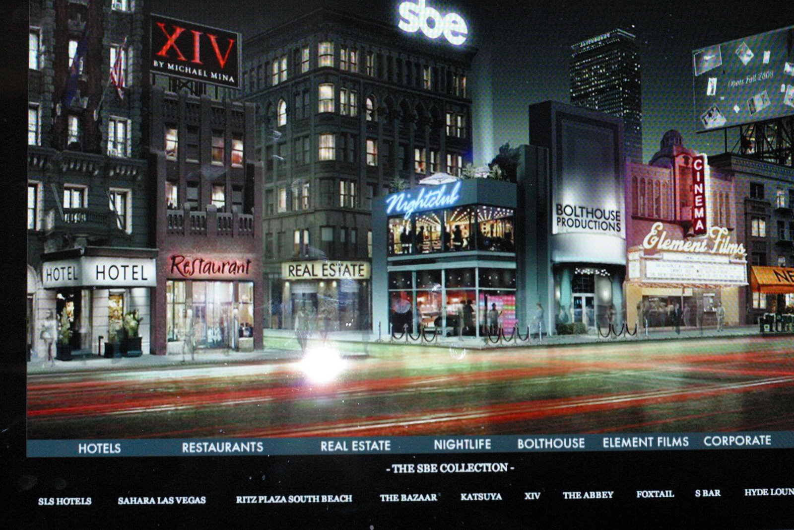
http://www.sbe.com/will welcome you to its home page with a pleasant skyline view of downtown Los Angeles created with flash and 3-D animation.There you may navigate through the street and enter any storefront that interest you. Once inside a division you will then be able to sort out where to go and can visit the location by link.Here you are able to plan dinner the night out,or find a film of interest. IT`s almost as if you have a private concierge at you fingertips.
By Patricia Brady

Wednesday, October 15, 2008

WDDG (World Domination Design Group) Exporation

Shirley Stevenson
Flash 1, MW class
WDDG.COM Exploration assignment
Oct 15th, 2008


wddg.com (World Domination Design Group) is based in New York, and is a premier flash design company that specializes in advertising, ana-games, and their project portfolio includes for large company’s include:
1.) Altoids
2.) Aguent: Studio Smackdown
3.) American Express: Seinfeld & Superman
4.) Ban: Deodorant
5.) Burger King: Chicken Fight & Need for Feed Game
6.) Cingular: Make me dance mini-site
7.) Ebay: The Power of all of us campaign
8.) Emerald Nuts:
9.) HP: You n& HP, and Forward campaigns, banners, and micro-sites
10.) Kelly Services: Find Frank a Job games, targeting college graduates and the
younger audience.
11.) LEGO: Advertising, Ecommerce, Animation Games
12.) Maverick Recording/Records
13.) MI:3 – Project Shadow with MTV for Mission Impossible 3
14.) Saturn: produced a mini-site called Saturn Sky
15.) Toyota: Put it in Play (High Octane) real life car games
16.) Virble: Dynamic WORD search game
17.) Volkswagen: force of good campaign for the new Beetle Bug
18.) Wrigley: Candystand.com gaming

When I first visited the WDDG.com site it started playing and old stat-icky video which I wasn’t very impressed at first, but after a few minutes the video site went from old grungy videos to dynamic video clips of the past projects portfolio.

The WDDG.com site is a 100% interactive video site that guides you through their company information, project video clips, and their portfolio of some of their award winning projects. WDDG projects have won many awards for best design sites and games. Their site ended up really catching my interest with all their videos and flash design, so I ended up staying almost 2 hours visiting this site and watching all the videos in their portfolio. I would recommend that if you have time to visit the wddg.com site and browse through their portfolio of projects. WDDG also heavily recruits in their site so if anyone wants to live and work in New York this company would be a good place to submit a resume.

Tuesday, October 14, 2008

New Media Exploration: Paper Critters


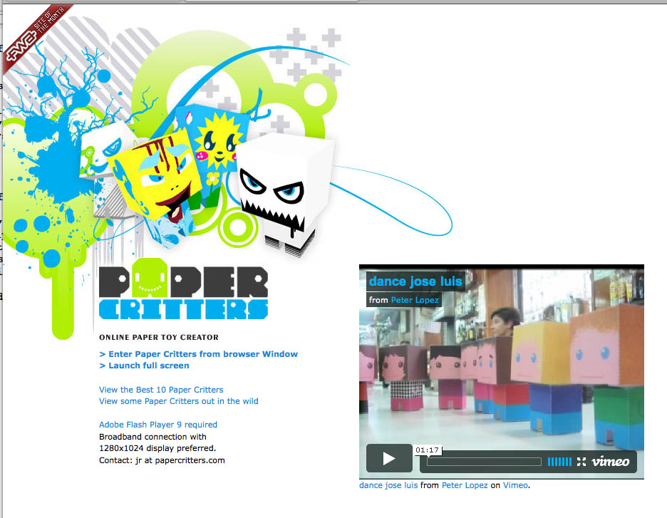
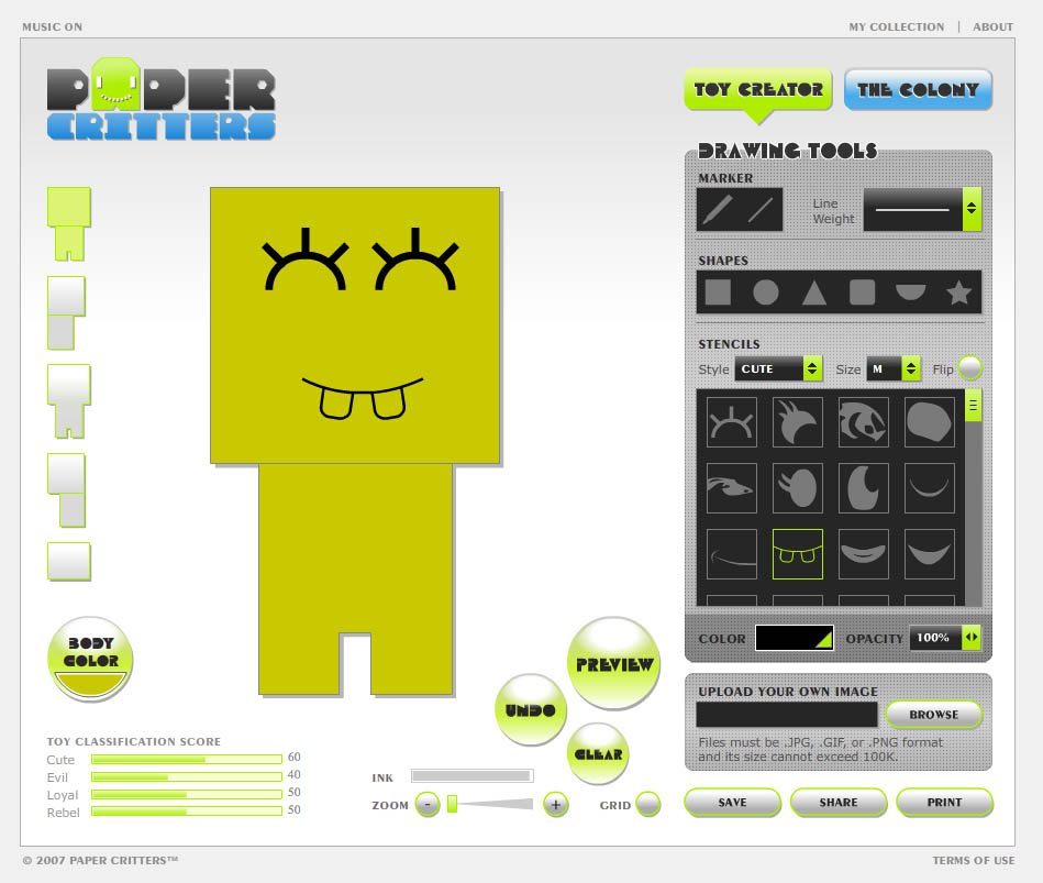
Paper Critters (www.papercritters.com) is an online application that allows users to design, customize, and create their own custom paper character toys through an online interface. It incorporates Flash CS3, ActionScript 3.0, 3DS Max, and uses the open source Papervision3D engine. Users can also share this experience by using the application to save and collect creations or by e-mailing Paper Critter movies (see the video “dance jose luis” upon launching the site). It functions equally well as arts and craft project for children and as a tool for artists to design some pretty awesome toys.

Choose the “Toy Creator” button if you want to start making a toy. A collection of tools, such as a freehand marker, a shape creator, a library of stencils classified by style, and the ability to upload an image, creates as much potential for customization as possible.

Or you can choose “The Colony” button to view an interactive gallery of all the toys. The site contains more than 15,000 publicly viewable submissions.

It was designed and developed by JR Fabito as his final project at the Academy of Art University MFA Computer Arts New Media program. He currently is one of the speakers at the 2008 Flashbelt Conference and is stoked that he gets to make cool stuff and play with Flash all day at RED Interactive Agency and get paid for it.

One of the most challenging aspects of the project for him was designing the set paper toy for the application because it had to translate well in both digital and analog forms. Digitally, it had to work well with the 2D nature of the site’s “Toy Creator” and also within the technical limitations of Flash. Additionally, the final paper model had to accurately replicate the digital version without being too complex to fold and put together in the analog world. The final solution became a box-like figure where users can design on each of the five different sides in a flat view and preview the final product in 3D. The simplicity of the model allows effortless folding and a 3D gallery where users can see and interact with up to twenty user-created toys at a time.