Design Exploration
Nurture Digital created a website with eye-catching animations and satisfying transitions. It is a company that creates videos, sites, and mobile apps for marketing and branding purposes, and this is clearly reflected in their website. Their opening front page starts with a looped animation that displays the process of what drives their business. It’s highly responsive; as soon as you roll over text within the animation, a section of it becomes more vibrant and it immediately underlines itself. When you roll away, the vibrant section of the animation returns to its desaturated state and the underline smoothly returns to oblivion. When you click click on one of the text buttons, a page pops up with a brief description about the topic with an obvious “X” to click out of the description.
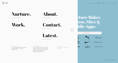
If you click their drop down menu, it is not conventional, because the drop down selection takes up half the web page, but it adds a pleasant amount of empty space with easy to read text such as “About”, “Contact”, etc.
When you click the “about” page, the loading icon appears, and it is their logo with a loading circle orbiting it. It is a pleasant way to add extra branding to a space that might otherwise just say loading. The number “22” appears in large text that is masked so that a video can play within the number and there is a large dot that is also masked and follows your cursor so that you can reveal certain parts of the video too.
Once again, the description in the “about” page was short and to the point just like in their front page. If this website did not have animation and interactivity included, it would still be a very well-designed site, however that interactivity within it adds and extra punch that makes it stand out more than other sites. One way I noticed that they keep their website stimulating is by putting making moving content/video on one half or two-thirds of the screen while the other side is text. The section with text often allows you to scroll while to the moving content stays in place, but once again it's always brief. The downside to this is that the client might not get all the information they are looking for, but nonetheless it is an impressive website that shows rather than tells. They don't try too hard to pitch cheesy copywriting at you, Nurture Digital's website makes their skill level clear through video, animation, and interactivity.
-Mia Snyder


No comments:
Post a Comment