

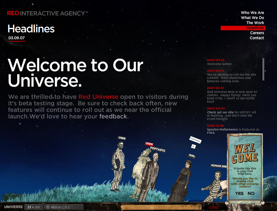
Red Interactive Agency- This website contains a unique and entertaining way of communicating with people all across the globe. It took a bit of getting used to at first, but basically this site is a profile page for a design company, which also hosts an interactive chat program. It allows you to choose a character, name it, and to use the character to explore the landscape. You can also chat with other visitors using the dialog entry screen at the bottom of the frame. The rest of the website is mostly describing the company’s goals and clients, using menu buttons in the upper right portion of the screen. I think that the interaction element on this website is excellent, almost to the point of distraction. It’s hard to read about the company’s accomplishments when you’re busy chatting with people and making your character jerk around like a puppet on strings. I found it hard to get off this site simply because it’s so amusing! I think that, if RIA made this site with the intent to involve visitors as well as entertain them, then they definitely succeeded.

Sketchbook by Martin Hughes- Another interactive site, but this one is more personal. The navigation takes the form of a pack of pills, and you get to another page by “swallowing” them. This site is also a bit confusing, unless you read the “suggested user tips” on the main page. The transition effects between pages are a bit crazy and disorienting, with text and titles zooming and rotating at random angles, but that just adds to the fun. The Sketchbook serves as an animated journal of Hughes’ experiences in life, though it’s hard to make sense of them, even if you do take the pills in the right order. I admire his style, because the page content is random and bizarre, but at the same time fun. The animation is definitely amusing (like on pill nine- the walking red skull chasing a dollar bill), and it seems to push the boundaries of what is acceptable to today’s Flash-familiar audience.
I’m not sure which site I prefer more, but I think both are brilliant. Have fun with these two!


 In this site, there are several examples of superb websites using flash. There is one about IKEA, which I found quite interesting. Check it out.
 The second site that I really likes was
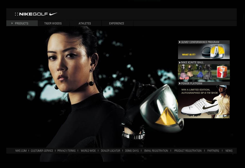


 Founded in 1999 by Steven Lerner primarily for the sake of promoting his band of the same name. After taking web desinging classes Steven Lerner decided to redesign the entire website, and ever since it has gained popularity throughout the years. The most obvious aspects that ABS shows is its wide variety of amature flash animations, some of which are collaberations between numerous animators. A good number of resources that are used for these animations usually come from an open source such as


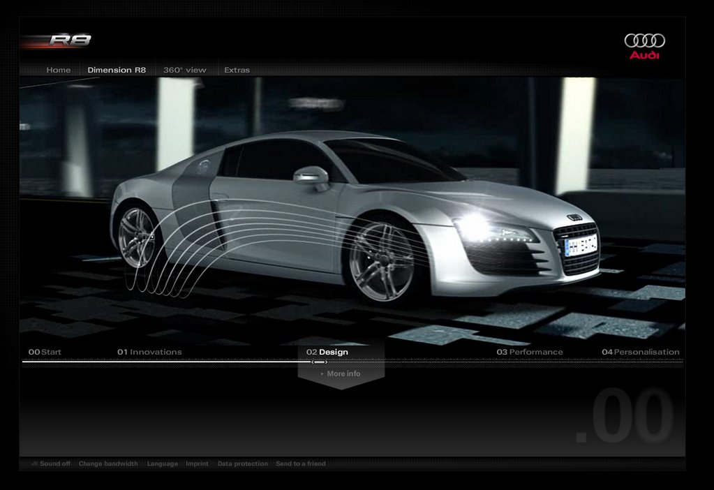
 This one is my most favorite one.The colors,the options ,specially the intro is great.The way that each page open and start is amazing.I really like this one.