

Saturday, February 28, 2015
Design exploration
This is a design exploration on Creaktif's site. In their site they offer a look at their different projects that they have worked on. I played around and navigated through several sites. One that I actually got stock on was the Creakatif site. It's an animation in which you control your character that you choose in the beginning. You can change their outfit and you can choose the character too. You navigate through the site by the arrow keys. And along the way there are these white floaty things that when you run into them they give free downloads to different things like a Photoshop brush upgrade and a Mario Brother short upgrade where your character gets large for five seconds or so. Through this little site you roam round to different areas where you run into a several areas like a "work" section where you can explore their work they have done for their clients. another area is a photo section with a photographers photos that you can check out. The whole site is a cool idea. There is a problem with the part with the videos that re suppose to load up. They don't work. It'll start to load and then it stops and brings you back to the scene. A little glitch in the program. And of course this isn't the only site you can navigate through. I just though this one which is number five by the way, was the most interactive one. There studio has won 9 FWA's. There work on different platforms like HTML, css3, and JS. I also like how when you scroll down the site the images move up and you go down and fold in on one another, I thought that was a nice touch. Cool site site overall.
http://www.creaktif.com/
Design Exploration
Coca Cola has a fun website geared towards the youth to get them hooked on Coke. There are little flash games that are interactive. Some are pretty fun and others are anti climatic. Overall the experience isn't bad. Click on the "EXPLORE the world of ahhh" and your on your way. Bu scrolling over the different images they flip over drawing your eye to the two options for which you have to choose from. You can save it to your play list or play it. Play it! The site has different categories you can choose from in the menu bar. You can sort through popular, new, animals, from fans, and games.
After you choose to play a game the loading icon is a coke bottle spinning around. It's simple a nice. Each of the flash games or interactive mini site has a little drop down display which shows their creator. After you play a game or whatever, it gives you the option to share your results on Face book or Twitter. Each of the mini sites are well done flash projects. They are colorful and well thought out I thought. Overall it's a simple site to navigate through. And it definitely caters to the younger generation.

http://us.coca-cola.com/home/
After you choose to play a game the loading icon is a coke bottle spinning around. It's simple a nice. Each of the flash games or interactive mini site has a little drop down display which shows their creator. After you play a game or whatever, it gives you the option to share your results on Face book or Twitter. Each of the mini sites are well done flash projects. They are colorful and well thought out I thought. Overall it's a simple site to navigate through. And it definitely caters to the younger generation.
http://us.coca-cola.com/home/
Thursday, February 26, 2015
Design Exploration: WeChooseTheMoon.Org
I found a really neat website that takes you through the
Apollo 11 mission to the moon. This is an interactive Flash website that will
take you to the NASA experience! It’s
put together in flash, and it’s pretty impressive. You can go through the various
phases of the mission as the module drifts closer to the moons orbit. As you move between stages, they have some
really neat 3D modeled animations of the rocket taking off, and separating in
orbit. When the website has completely loaded, you can hear an astronaut’s
voice talking to you. He’s basically orienting you about the status of the
launching of the space craft to the moon. You can view real-life photo
galleries – the same photos taken during the moon mission.


When you’re done looking at the photos, it is time for you to hit the launch button and watch the rocket fly to the sky and into the moon. This is truly a unique way to relive the Apollo 11 mission.

Five Minutes
FIVE MINUTES is a live action experiences written and directed by Maximilian Niemann and produced by Felix Faißt. It is an interacted film about a Man and his daughter surviving against a zombie attack.


At random times during the film, it will ask you to do certain motions with your mouse, and if you fail, the character fails. You get three tries, and after the third one the character dies. If you get the motions correct, the story will continue.
Sometimes it will give you a bunch of different motions you have to do before the time runs out, and the more you mess up the more motions you have to do. In the beginning of the game, you pick a difficulty. The first difficulty is called Tourists, the second is called Moderate, and the third is called Hell. I think this website uses great techniques to keep the viewer involved, and i like how it lets you play games while watching the movie, almost like your actually in it.
The Vanishing Game Design Exploration
This interactive reading experience is quite unique and has many aspects that make it interesting to explore. There are visuals, music, background sounds, not to mention that the story is all read out loud. It is quite visually pleasing with many different picture aspects that go along with the story the is being told. With everything together it really is quite a great leap in technology, and even how books are read. It is like watching what is going on in the background and listening to the sounds that you would expect to hear while reading the book.

This is the first page that is split up in eight different parts of the story all connected but each can be accessed separately. Even the first page is very appeasing to the senses and draws the reader in to the story.

This show the page with one of the books and some of the text. In the side bar you can pause the story, mute the music, and there are also links to many different social media sites for the book. The visuals in the website match very well with the story that is being told.
There is a link on the book website that is marked #wellstoried that links to this interactive website that show stories and pictures from all across the globe. There are many different words that can show different stories based on different topics.

This shows the map and you can see all the different countries with further exploration. It also show all the different places you can click on to see stories or pictures.

This shows a picture from California, that shows the area that the link was marked. This whole website was very interactive and is a great way to see things from all around the world with just a few clicks of a button. It is quite a unique website that is fun to explore for hours on end.
Wednesday, February 25, 2015
Design Exploration: The Bare Bones
http://www.captainforever.com/captainforever.php

Captain Forever is an amazing example of what flash and code knowledge is capable of. This small indie game manages to create a deep and fun experience with minimal animation and programming.
The games simple mechanics make it one of the most intuitive games I've played to date. You move with WASD, shoot with space-bar, and collect parts and customize your ship by clicking and dragging.
There's not much to say about this game, only that its fun and simple.
http://htwins.net/scale2/

I present to you a slider that lets you observe the string the dictate the laws of the universe to the farthest reaches of space. The integration of flash and science is perfect. Flash lets you learn and understand the makeup the universe with a very simple interface. You move the slider from left to right or use your scroll wheel to zoom in and out of the the different levels of life. The design of the overall experience is simple and clean. No fancy art or fancy effects, just good old fashioned text and vector art. Even the music is simple, but it communicates a message that the universe is almost magical. This small but huge project is a beautiful representation of life through digital art.
Captain Forever is an amazing example of what flash and code knowledge is capable of. This small indie game manages to create a deep and fun experience with minimal animation and programming.
The games simple mechanics make it one of the most intuitive games I've played to date. You move with WASD, shoot with space-bar, and collect parts and customize your ship by clicking and dragging.
There's not much to say about this game, only that its fun and simple.
http://htwins.net/scale2/
I present to you a slider that lets you observe the string the dictate the laws of the universe to the farthest reaches of space. The integration of flash and science is perfect. Flash lets you learn and understand the makeup the universe with a very simple interface. You move the slider from left to right or use your scroll wheel to zoom in and out of the the different levels of life. The design of the overall experience is simple and clean. No fancy art or fancy effects, just good old fashioned text and vector art. Even the music is simple, but it communicates a message that the universe is almost magical. This small but huge project is a beautiful representation of life through digital art.
Design Exploration
Design Exploration
by Tyler Soule

It took me a while to find an interactive website that I could get lost in and enjoy as much as I did with BlaBla. I love the bold images and interesting art work. I've played with the site about five times now and still find new interactions each time. The music and soundscape integrates itself perfectly with the visual aspect, creating a fascinating experience for the user.

The site was created by Vincent Morisset. Vincent set out to develop an interactive tale that represents human interaction. The user becomes an integral part of the characters purpose, without the user the characters would simply be stationary and would have no story to tell. He wanted to create moods and generate emotions while simultaneously designing clean and uncluttered scenes.

Being a drummer, I was drawn to the initial interface. Beatbox Academy is an interactive website with the purpose of selling products that could potentially help aspiring beatboxers learn new skills. When you enter the site, you are introduced to three drums and a cymbal. They give you simple directions on how to play the drums using your key pad. They also give you a few different "kits" to choose from. I like the simplicity and the parallax scrolling which gives it depth. I wish it had more sounds to chose from because I started to get bored after a few minutes.

Beatbox Academy offers DVD's, books and posters to try to entice the user to become a customer. They give you a little history about beatboxing and foreshadow what beatboxers might someday achieve. I really like the layout that chose and the images they used, however I feel like they could have incorporated more interaction within the sight. I wish you could click on the different instruments to hear what sounds they make. Or maybe click on the guy beatboxing for a sample of what you could learn. Its a fun concept but lacks some creativity.
Sunday, February 22, 2015
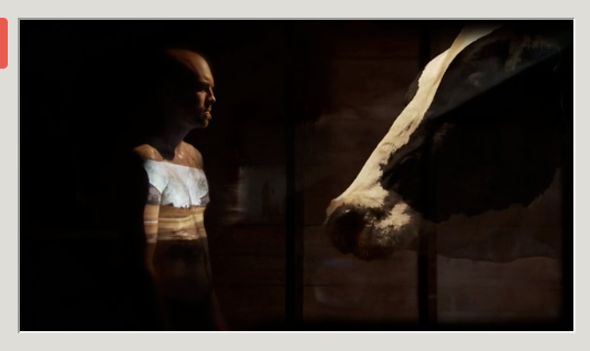
Design Exploration: Waterlife & Titanic Interactive
I have discovered two examples of effective multimedia design, both developed with Flash. I chose these two examples because they demonstrate a contrast in how a design can be both dramatic or simple, yet still be effective by covering basic design principals.
Design #1: Waterlife

Waterlife is a multimedia interface created by the National Film Board of Canada (https://www.nfb.ca/). The site raises awareness about the degrading ecology and pollution of the Great Lakes of North America. This site is extremely effective at engaging the user emotionally. The design is stunning. It's clean, balanced and thematically coherent and rich in content. It uses a dynamic combination of audio, video, graphics, animation and links to engage the user and really suck them in to an interactive experience, not just a presentation. The navigation takes a little getting used to, but after some experimentation the user can navigate easily a few ways. It has linear navigation using the timeline at the bottom and there is drop-down tab menu on the top left. Finally, the user can jump around using the main interface screen which consists of photos compiled in a mosaic-type structure on which the user can click to go to a certain part of the site.
Here is an example:

Overall, Waterlife effectively follows the basic design principals of an effective design. It is profoundly dramatic and engages the user's emotions and provides an immersive, interactive and informative user experience.
Design #2: Titanic Interactive

Titanic Interactive is a multimedia Flash presentation created by the History Channel (http://www.history.com/) that allows the user to explore the Titantic from the time of it's construction until after its disastrous sinking. This is an example of a Flash design that is simple, effective and educational. It is easy to navigate because the design uses balance, repetition and consistency. the user can scroll over the three main navigation areas, "1909," "1912," and "1913." These areas are animated provide short description of what information they contain. Once inside of of these areas there are photo galleries, scrolling written content, animations, interactive maps, etc... contained inside a linear navigation menu. There are also sound effects when an area is clicked. This helps the user feel more interactive with the design. My favorite part of the design is the "Ship Cutaway" and "Tour" inside the "1909" menu. Although this design is smaller in screen area it is very educational and informative due to it's clear organization, easy navigability, consistency and quality content.
Wednesday, February 18, 2015
Examples of Mesmerizing Interactive Design

When your site visitors get completely lost in the experience and forget how much time they've spent there, I think that's a sign you're doing Flash right. Every time I thought I had discovered everything about this site, I found something else that added a whole new layer of complexity.
First off, it's a map of the Solar System which you can explore by clicking and dragging, or using the scroll wheel to zoom. You can access the different planets and moons, and even see the anticipated trajectories of comets and zoom back in forth in time to see, for example, how Jupiter's moons orbit around it. There's also an option to check out fascinating facts.

In addition, you can access a map of the constellations visible from your area, which yeah, there's all kinds of sites that do that, but this one includes the Moon, which makes it a helluva lot easier to orient yourself when you're trying to figure out which stars are which constellation.


I think the navigation is fairly effective and intuitive. You can use the scroll wheel to zoom in and out and click the arrows on the ground to move, or you can use the navigation buttons at the bottom for zooming and moving. There's a limit to the zoom, which might drive you insane if you're the type of person who likes to read EVERY title card and description, but if you mostly just want to browse and admire some awesome dinosaur bones, then this site is perfect.
There's also this cool map (accessible from the top right) that you can use to quickly escape to other areas if you get bored.

Design exploration
Zdzisław Beksiński's Official Website: http://www.beksinski.pl/
Zdzisław Beksiński (1929-2005) was a Polish fine artist specializing in the field of fantastic realism. Influenced by his early memories from WW2, Z.B. created hunting art works that are both eerie and awe inspiring.
It is rare to find a website that with its design and functionality describes the style and mood of an artist’s work. Most of the portfolios I come across have a simple generic interface,which is great for showcasing images, but sometimes it provides nothing but a boring experience. This website on the other hand, preserves the criteria of a functional website with an intuitive navigation, but it also contains fun interactive elements. My favorite one is the navigation menu that a user can pull around and a mini decorative animations embedded in every page. Even the soundtrack contributes to the overall ethereal mood.
Presented by: Belvedere Gallery
Created by: http://www.kubicki.info/index_beks.html
Music by: Zbigniew Preisner


Jim Carrey's official website: http://www.jimcarrey.com/index_jc.html
JC has had a long successful acting career that encompasses a wide range of roles form silly slapstick comedies to serious drama movies. His official website represents this eclectic career with quirky interactive collaged images that provide an exciting user experience.
Browsing through the website really makes you feel like you are riding the roller-coaster, while simultaneously looking through the kaleidoscope (especially during the animated transitions between the pages).
Created by: 65Media

Monday, February 16, 2015
Design Exploration by KW
the future - what will be -
the future - what will be -
Technology is all around us. How are those technologies
making the world a better place. Who
wants to find out….
The International CES is a global consumer electronics and
consumer technology tradeshow that takes place every January in Las Vegas,
Nevada.
This last January conference
showed many technology advancements.
Here are some of my favorites:
Cars that drive themselves
READ: Forget
Buttons: Volkswagen’s Upcoming Golf Lets You Control Everything via Gestures
and Touchscreen
“And let’s not forget the slew of
self-driving vehicles from BMW, Mercedes, and Audi. Not only can those
automakers’ cars drive on their own — Audi drove one of its cars from San
Francisco to Las Vegas without a driver — they can also be summoned via a
smartwatch app. Based on what we’ve seen, the future of transportation is
arriving right about now.” - Daniel Howley
Now a car ride can be a relaxing
thing. I have been dreaming of this
since I was 10. How productive would
this be – maybe safer than planes. No
getting padded down by disgruntled employees and the ability to keep your clean
socks clean – because they are still in your shoes. This is the life for me. Next flying cars.. That would be great.
TVs and selfies
Smart Beds and Wired Babies
The future is here now. Awesome new technology unveiled at the
consumer electronics show.
The Consumer Electronics Association
can keep you up-to-date in between conferences.
Like them on Facebook: https://www.facebook.com/ConsumerElectronicsAssociation
These subjects are trending now:
------------------------------------------------------------
Women innovators
Infographics
http://www.ce.org/Blog/Articles/2015/January/INFOGRAPHICS-The-World-Mentioned-CES-Over-1-Millio.aspx
Robots
Music
We are at the brink of something big. Ideas - technology all rushing us toward the
next revolution – or evolution in society.
Keep those ideas coming.
Interactive Movies: Zombies or Robbing?

Zombies. They are all the rage. But why just watch a horror movie, or zombie movie, when you can take part in how it actually plays out? Chose your sides, you are PART OF THE MOVIE. What you do will affect the outcome. Will your survive or will you die? THE OUTBREAK is a interactive media website. Your choices determine the outcome.
Get ready - the end is here and the outbreak is among us - it's time to take charge and make a choice.
Are zombies not your thing? Don't worry. How about a bank robbery? The thrill of the chase and danger more your thing?

WELCOME TO BANK RUN!
A bit more vigorous and violent than THE OUTBREAK. Bank run is more than just making choices, it is a game and a movie in one. Using your keypad you have ques to run, advance, fight, move and more. What type of trouble did you get in and can you get out? BANK RUN....someone has to play. It start on your computer but travels to your phone. Can you survive part one? How about part two? Take back what is yours! Run for your life, fight to survive, and get the hell out of there!
Wednesday, May 14, 2014
Relax! It's calm.com
Calm.com is very simple and boring, which is exactly what it is supposed to be. The site is intended to give people a break from their stressful, internet-laden lives and provide a 2 to 20 minute meditation session. Users can choose between many different themes, from flying through the clouds to watching waves break at sunset. Each scene is accompanied by it's own relaxing music, and the guided session has a voice which talks you through meditation.

Despite it's simplicity, the site is effective. The background videos very pretty, however what I found most relaxing are the calming music and narrated meditation. I recommend making the site full screen on a big monitor, if you can :) Happy relaxing!

Despite it's simplicity, the site is effective. The background videos very pretty, however what I found most relaxing are the calming music and narrated meditation. I recommend making the site full screen on a big monitor, if you can :) Happy relaxing!
Thursday, May 08, 2014
Design Exploration - Thompson

The lost thing is a flash website built for the film and book titled “The Lost Thing”. Initially, I never have heard of this book or film before, but after seeing this gorgeously designed page I quickly acquainted myself with the content. The site is composed of a interesting navigation element, not quite where user’s would expect it but easy enough to locate none-the-less. Each element of the navigation lends animates as it is clicked and really is fun to watch. To load page content a trolley drives by in a way the that it is unloading it’s passengers, or in our case, it is the content.
Other than its fantastic functionality, it’s rustic style, and amazing artwork truly do make this a unique site to look at. It goes to show how much a good design can really take something to another level and engage the viewer. I’ve clicked through every aspect of the site and where it lacks a little bit is simply that I wish it did more. Knowing the power and flexbility of flash I really feel that some great easter eggs could be in the site, but alas, I cannot find a single one. Either way, it is always so inspiring seeing something that is truly original.

Custom case mate allows you through an online app that allows you the design your very own mobile phone case. It is a simple three step process where you: 1) pick a case 2) choose your design, text, and photos 3) Preview and order your case. I really like how this make someones experience truly unique upon purchasing the product. The design on their interface is straightforward, and adds a nice functional touch by allowing users to upload their photos from instagram or facebook. My only gripe is that the amount of fonts and layouts to choose from is pretty limited. I’m pretty sure they could find a way to integrate google fonts into this app. Overall though it is top notch work, and I hope to only see more of something like it for other industries as time progresses.
Wednesday, April 23, 2014
Design Exploration - Bickford
What can I say about this site.......Animad. Animad is a Animation and Illustration company consisting of two people Ersi Spathopoulou and Dimitris Karatzaferis. The site Animad is an interactive portfolio which showcases their work in a way which makes the visitor to the site get involved and wanting to discover more. The artwork and design is extremely creative and the thought and time that went into this project had to have been extensive.
Go ahead and discover it.

Go ahead and discover it.
Animad

Saturday, April 19, 2014
I found a “Golden Nugget” while doing research for the class
blog.
I’ve always been intrigued by the creative process. I’m curious about how other creative beings,
come up with innovative ideas for their expressions. Weather it is for a
painting, a book, a film, or new product, humans have an innate desire to
create something. It is part of our
inherent nature, the creative process. I’m thinking as a fellow classmate, you have a
desire to express an idea, and were looking for a vehicle to express that idea,
when you signed up for this class.
There are many resources and workshops out there regarding
the creative process.
I am captivated by Steven Pressfield, and his insights, deep
understanding of the creative process, and whit regarding the creative spirit.
I know many of us struggle, trying to figure out what drives us to create, and
often what paralyses us with fear, all at the same time. He talks about the
“Resistance” we feel when we are on the right track, or on verge of a
breakthrough. Sometimes we stop cold in our tracks, but there is a gift, if you
face the dragon, head on.
Check his book out: "The War of Art": Break Through the Blocks
& Win Your Inner Creative Battles ― Steven Pressfield.
My favorite quote of Steven’s is “Put your ass where your heart
wants to be”… “If you want to paint, put yourself in front of an easel. If you
want to write, sit in front of a keyboard…. Plunge in!” (This resonates with me).
While exploring creativity I stumbled across this…
“Allergy to Originality” Sundance 2014 Short
Drew Christie describes his animated short “Allergy to
Originality”, and explores Un-Originality, Plagiarism, through this
satire, illustrated film short. He
discusses the tools he used (in creative cloud). The bottom line is, the story is important. The “story” is a continuing theme in all of
my research. Tools are just the vehicles
used to tell the story.
http://tv.adobe.com/watch/adobe-at-sundance-/drew-christie/
“This
May Be the Last”, Sundance 2014 Short
Filmmaker Sterlin
Harjo, describes his 2014 Sundance entry, documenting a story through song and film. It is so much easier to tell a story through
technology. Using his grandfather's 1962 car accident as
a starting point, the film explores a Muskogee Indian singing tradition that
incorporates Scottish missionary songs, Christian hymns, and slave spirituals.
Story telling
intrigues me. I love the power of the
written word, particularly when combined with imagery. I love it when I hear a
story, or poem that gives me chills, or moves my spirit from apathy to activism,
or makes me laugh, or brings tears of compassion to my eyes.
The Golden Nugget
I found this cool
website http://www.motionpoems.com/
An Art
Museum in Minneapolis features poetry set to film. Motionpoems presents world premiere of Season
5 New poetry films to screen May 22 at Walker Art Center.
Their Mission
- Motionpoems broadens the audience for poetry by turning great contemporary
poems into short films. This is done through cinematography and animation. I think the flash class will really enjoy
some of the productions.
Their Background
- In 2008, animator/producer Angella Kassube animated one of Todd Boss’s poems.
The results were so compelling that Boss and Kassube began introducing other
poets to other video artists. A year later, a public screening at Open Book in
Minneapolis drew a standing-room-only crowd of 150+ to see 12 pieces they
dubbed Motionpoems… and a new hybrid form was born. Since then, motionpoems have
appeared in mainstream media, blogs, YouTube, international film festivals, art
galleries, and here on our website.
It’s
funny but some of the poems reflect Drew Christie’s perspective, described in
“Allergy to Originality”. Many of the
shorts are famous poems, brought to you with a new spin.
I thought the class would enjoy the flash animation used
in the following shorts.

STRAND | WENNER | “The Mysterious Arrival of an Unusual
Letter”
Filmmaker Scott Wenner didn’t take many interpretive
liberties with this poem, though it bears his particular stamp. Check out the
illustrations, the use of light and shadow.
Many of the animation concepts we learned in the class are rendered
beautifully.

HICOK | MOLLER | “Circles in the Sky”
Seeing beauty in vultures, poet Bob Hicok and filmmaker
Keri Moller circle back to the living in this quiet, tenderly wrought
motionpoem.

KUMIN | TOW | “Either Or”
Socrates had some either/or thoughts about death. Poet
Maxine Kumin has some thoughts about those thoughts. Filmmaker Adam Tow adds
his thoughts to hers.

WILBUR | ESKOLA | “Ecclesiastes 11:1″
The filmmaker Faith Eskola’s five-year-old daughter gives
voice to this poem by 90-year-old Pulitzer Prize winning poet Richard Wilbur. This poem exemplifies Drew Christie’s
perspective. An old poem, reinterpreted,
and read by a five year old. Take note
of the simple interface.
HICOK | KOHLER | “Having intended to merely pick on an oil
company, the poem goes awry.” Bob
Hicok’s invective against British Petroleum becomes an indictment of his own
consumptive habits, but documentary filmmaker Joanna Kohler sets him straight
in the end.
I am so glad I stumbled upon this site. They have a newsletter you can sign up for to
receive updates.
Enjoy!
Mella
“See for yourself, but be warned: [a motionpoem] is so
striking and cinematic … you can’t just watch it once. Most people replay [it]
several times because each viewing pulls them deeper into the poem.”
TESTIMONIALS
“Astonishing, powerful, and hilarious. Motionpoems is
leading a poetry renaissance.”
—Forbes
“I feel confident in my prediction that more and more
arranged marriages will be made between poetry and video—confident enough to
call this a trend. The idea of basing a video on a poem may one day seem as
natural and inevitable as the setting of poems to music used to be.”
—David Lehman in his introduction to Best American Poetry
2012
Subscribe to:
Posts (Atom)