Wednesday, March 24, 2010

Studio and Artist Exploration


For my second blog entry I am doing Studio and Artist Exploration. I chose to examine the design firm The Visionaire Group (thevisionairegroup.com). The Visionaire Group is interesting because it provides a wide range of media experiences. It designs promotional websites, flash advertisements, smart phone widgets and interactive flash-based games for both computers and phones.
TVG consists of two departments: design and advertising. TVG’s strength comes from the fact that these two departments fully support each other. The design team does not lose site of the advertising goals, and the advertising team is able to use artistically compelling design. In this way the design does not overshadow the practical (and financial) concerns of marketing. By utilizing well-designed banner ads and rich media, TVG creates compelling product and brand awareness.
As a marketing company, TVG aims to use innovative digital technology in order to promote products in the most entertaining way possible. Some parts of their promotional websites seem to lean towards viral marketing, as they seem to represent and promote an alternate reality. For example, part of the website for the new vampire movie Daybreakers (daybreakersmovie.com) immerses you in a world where humans are farmed for their blood. TVG uses social networking to endorse this idea. The website for the movie Repo Men (theunioncares.com) similarly presents and markets an alternate reality.
Although they design for several mediums, TVG’s design portfolio consists largely of film and television promotional websites. Some of their most prominent clients include Paramount Pictures, Walt Disney Pictures, CBS and NBC. The websites TVG creates link to multiple media outlets. By utilizing social networking and widgets, TVG creates word-of-mouth for their clients. Solid Flash design directly supports TVG's marketing techniques.

Tuesday, March 23, 2010

SlickMill Studio


This is my second post. I found this really cool site using effective flash animation. The studio is called SlickMill. When i entered the site i was expecting a lot seeing as they claim it to be a high impact flash website. The side menu was easy to use nothing really to difficult to figure out. Every time you click on something new from the menu tab, a quick animation kicks in and it makes it a little fun and it takes you to that page right after. I went in to go check out other sites they made and notice they have some really cool intro, it kinda gets me in tune with the site and wanna stick around to see what the rest of the site will do.


I went through a lot of sites and i chose this site because i think the animations and the whole site is very clean. Other sites i went too some of the work that i think was suppose to have animation did not work properly or it was very complicated to use. I think that is what sets this site from others.

I think what makes there work effective is that each site is pretty much organize. Most of there sites carry the same theme with the same menu tab on the left, and same features as there main site. SlickMill


Here is one of Slickmill sites. Buzz check
..Once again you kinda get the same feeling from the main site. The menu is easy to read and find. Easy to use, all though there isn't that many animation, i think the site has got all its need.

Another site from Slickmill is Eli Halpern.
The site is fun and interactive. Like the slickmill page it has quick animation and takes you to the page you want. The site is very small, but with the animation you can kinda see a resemblance with Slickmill studio site.

Tuesday, March 16, 2010

Studio and Artist Exploration


First time, it was kind of dificult for me to try to find a studio that created flash animation, graphic design, and other types of web designing. i did my best to try to find out about someone who creates designs for companys that we know. it was kind of interesting what i found out threw my search.
During my exploration i found out about this particular company that makes incredible designs for many companys like Ford, O'neil, Fox Sports and many other companys. The web site is
http://www.2advanced.com/index.php?lang=en#home

There is many things i liked about this site, the design its alittle complicated at first but as soon as you get to know how to navigate, its almost like playing a game. when you scroll threw the links the have most of the information pops up. the graphic design they used its really cool, it looks like a movie, because it has many interesting details. They have two major companys one is in California and the other one is in Japan.

The company has a lot of information about the work they do for other companys. In their portfolio you can search about the companys designs, and what they offer to their customers.

Wednesday, March 03, 2010

Billboard Website


Billboard website is a awesome website for all things music and the website is just as snazzy. You can see here just how fluid and clean it is with great ways to organize everything.

I really like how easy it is to find what you need and while it might not be out in the open to find right away, navigation to the page is not difficult at all. There is so much information that this website houses but organized in such a fashion that it is easy to get to. I like that it has tabs to link you to other places and the buttons are effective and not intrusive over the top. Its a great way to run a publication online. It manages to be visually pretty and intriguing without being over the top in your face about it.

Monday, March 01, 2010

Mission Accomplished, design that works

In order to have an effective design, whether it be for a home, automobile, gown, and/or product you have to first understand the need and desire of the consumer. As a charter member of the ASA (Addicted Surfers Association) I have chosen a site that is near and dear to me, www.magicseaweed.com When I get up in the morning I always review this site to determine the conditions of the swell, weather, tide, etc.. This site has the ability to give information for most every location around the world. I especially appreciate the link through the pull down menu to the Scripps bouys which give me a pretty accurate summary of what the conditions were , in most cases, an hour before I went on the site. Most other sites do not have this link all you get is what they think conditions will be, in most cases like the weatherman it is wrong. When you visit the site you will see 2 pull down menus, under these menus you will see a white rectangle, click on the button and choose the region you are interested in (California, South) 0n the rectangle to the right click the button and select the city (Carlsbad) you will then see the Latest Conditions and the Tide for the day. I review this information then I go back up to the second row of pull down menus and choose Charts, when the graph comes up I choose old style, when it comes up I go to the right of the page and choose Southern California near shore I will then get a chart that shows swell direction, size, shadows from the islands and other important information so that I can properly prepared for my morning in the water. As you can see from the process I employ in utilizing this site the creators know and address my needs and those other addicts that form there customer base. You will also see that they have links to great photos, surf news, a store, travel, education. This is also a great site if you don't surf but want to take the kids to the beach, you can plan the day around tide conditions etc. to make sure you have an enjoyable experience.

Saturday, February 27, 2010

DESIGN EXPLORATION | Trollback + Company

I'm recommending this site:

http://www.trollback.com/#/work/

I find it to be an excellent source for inspiration. A lot of their projects utilize fairly simple flash animation techniques such as we've learned in class, but what makes them great are the brilliant concepts.

Check out the clever use of typography in the Met Life spot, the energetic graphics for Target, and the beautiful metaphor for Nike butterfly. Even a sobering political message becomes engaging in the Caucus4 Priorities.

In my experience as an ad agency art and creative director, I've learned that no matter how strong the execution, whether it be photography, illustration or film, if there's no concept the work is simply eye candy.

DESIGN EXPLORATION | ecomagination

Okay, before we talk about the site, we have to talk history first. Just as we evolved from silent black and white films into the talkies and later color films, the first Window’s pages adopted a newspaper type format. Then, Flash came along to blaze a trail of motion and movement. But we are now at the crossroads…and there is no turning back. The rules have changed and we as designers have the responsibility to merge function with current artistic design concepts. I believe we are moving toward the next generation of Flash sites that will include more 3D modeling. By next year televisions will be available with visors designed with computer chips with the ability to change the 3D images for the right and left eye independently. As our lives become more complex we are hungry for more than 2 dimensional images and static HTML pages. I chose the GE ecomaginaton site because it is an innovative design representing the cyber world of 3D modeling.

-jv


I love the graphics of Ecomagination. The animation comes in vertically from the top as moving 3D graphs modeled in vibrant earth tone colors and textures. As you roll over the images the text is engaging and appears to be 3D by the use of a drop shadow effect on a skewed text. I like the way the site is very clean with open spaces, and includes a great pre-loader. There are no extraneous, unnecessary movements or distractions and it is very easy to navigate. The navigation bar is hidden and becomes active with a rollover of the mouse. When you roll over the icons on the menu there are subtle movements of a simple movie clip. If you navigate to ‘Alternative Energy’. A very nice addition to the graph is a click and drag option to plug in an animated turbine engine powered by wind. When you add the turbine energy by dropping and dragging to the electrical outlet, the images grows larger. Once you traverse to ‘CO2 Emissions’, a 3D model of a map of the United States rolls in, and a cloud of CO2 collects as the data increases. To the right is a an exciting feature animating how much smoke disappears as you move the mouse over a scale which represents how much emissions are reduced if the power grid is made more efficient, as it simultaneously crunches the numbers of the data in an interesting and informative manner. Another feature is a do it yourself hologram as the ‘Smart Grid Augmented Reality’ comes to life when using your web cam and a special image that you print from the site. This site is fascinating because it presents a lot of information and data in a small amount of efficient design space. By using a Flash design the creator was able to use compelling visual elements in an informative, educational manner creating interest for a general audience on a typically dry subject matter.


Technology is changing at an alarming rate. The introduction of the ‘Apps’ have kicked it up a notch and changed how we approach digital graphics over night. Flash capabilities are being introduced to the iPhone as we speak. The electric car in every driveway is in our immediate future. As technology changes so do design concepts. So it’s time for us to put our thinking caps on and start thinking out of the ‘cube’. Speaking of which, before I go, there is one other site of interest that you have to experience. I found this to be an incredible use of Flash. It’s in Spanish but basically it says that you can paint along to the music with your mouse to this beautiful love song that has truths and lies called “Soy Tu Aire”, by ‘Labuat’ This is a definite Flash Design ‘must see’. FYI, A rough translation of soy tu aire, soy tu agua means I am your air, I am your water.

Enjoy.
http://soytuaire.labuat.com/


This post was originally published on 02/26/10 but I didn't like the end results of the layout, so I made a few changes in the images. Sorry, but I'm a newbie at this.

-jv

Friday, February 26, 2010

DESIGN EXPLORATION | ecomagination

I didn't like the way the images looked so I cleaned it up and published it again. The main body of text remains the same.
Sorry but I'm new at this....
-jv

Design Exploration


The Ikea website “Come In To The Closet” (http://demo.fb.se/e/ikea/comeintothecloset2/site/default.html) features interaction with on-screen bizarre dancers as a way to promote Ikea products. These dancers are shown in a room furnished by Ikea. Visitors to the site use music and sound to affect the movements and tempo of the dancers. Upon opening the website, the visitor is alerted to some practical considerations, as the site states “Sound makes all the difference.” Ikea provides the music and sound through a selection of songs. The website also lets the user have increased control of the dancers by using their keyboard as a drumset, or uploading their own music to the site. The greatest amount of control is available if the visitor uses their microphone to control the dancers through sounds he or she creates.
The Ikea products for sale are highlighted when the visitor clicks on one of several items shown at the bottom of the screen. After clicking on an item a dancer will enter a closet- providing Ikea with the opportunity to showcase different organizational and storage products. Visitors can switch rooms to view different dancers, surroundings and items.
This website seems to be intended to entertain the viewer for a few minutes while showing absurd but certainly memorable imagery. The website does not use Flash to provide detailed product information, but instead uses Flash to create a long-lasting impression on the visitor about the Ikea brand itself. Ikea is presented as both practical and fun. The ability to quickly and simply change rooms and dancers is appropriate for the Ikea website because it reflects the modular and interchangeable nature of Ikea products.
The strength of Come In To The Closet’s use of Flash is that the means of interaction are kept simple. There are a limited number of design elements on the screen, as a complicated or cluttered space would overwhelm straightforward interaction with the dancers. There are several options to interact through sound, from simply listing to the first song provided to using computer hardware to create original sounds. However, the visitor can easily opt out of the more complicated choices and still fully experience the site.

“Lescaux- A Visit to the Cave”

The website “Lescaux- A Visit to the Cave” (http://www.lascaux.culture.fr/#/en/00.xml)
uses Flash to explore the 16,000 year-old cave system in Southern France. The main section of this site recreates a walking tour by guiding the viewer through the length of the caves in a nearly 3D presentation. As different cave drawings are shown, the user can click on them to go to a different page to view more information and more detailed pictures. As the tour processes, an overhead map is updated to show what area of the cave is being viewed.
Flash is used effectively to control the pacing of the cave tour. The slow and deliberate pace of the presentation creates an impression of exploration and discovery. The images of the cave are the most important part of the site, so the option to hide the text is easy to find. Flash is also useful to give the impression of interaction with different cave drawings.
The navigation of the site is straightforward, as there are almost always options at the bottom the screen to go back to the main introductory screen or to skip to the next or previous chapter of the presentation. A popup menu is always available. This menu can take the user to any section of the website. The sound option button is clearly visible.
Although Flash is useful for the exploration section of this website, the site is not perfect. Several times I was directed to French language pages and I could not easily select English again. The scrolling button on the text information screens does not stand out enough to be immediately apparent to the visitor. Additionally, the popup menu to select any part of the presentation was also difficult to find at first. Once I found these options navigation was a lot easier.

Design Exploration

Well the web page that I chose is WWW.Rolex.com. Rolex is a brand of very expensive watches. When you first enter there web page, they give options on what language you want to see the page. Once you choose the language I'll take you to there page and a watch appears while the page is loading. You can click on the arrows to navigate to different information. The page has three main menus and they have different options. The top menu is just general information about the company, the middle menu gives you a preview of the different watches and the bottom menu is for the web site it self it gives you options like to turning off the sound. This page has also videos of their individual watches.

Well I really liked this web site because it's easy to navigate through and the information is clear. I think they did a good job using flash.


Thursday, February 25, 2010

WaterLife


Heres a cool site i found, it talks about the different use in water and how it effects our lives. The animation through out the site is very effective and very neat. The animation gets me more into the site and makes me wanna to browse it more, also giving out good informations about the use of water. The background music fits perfectly with the site. The music gets me more interested in the site, espeacially when you hear the voice overs over the music. Gets me tuned in. The site has a very unique selecting tab at the bottom of the screen which you could easly scan over and choose a subject you want to learn about and its pretty cool because it moves like waves. It also has videos playing in the background, i feel that this is a very complete site.


I chose to share this site because i think it uses good examples of using flash. Plus the site really caught my eye and really enjoyed it, Please come check it here

Wednesday, February 24, 2010

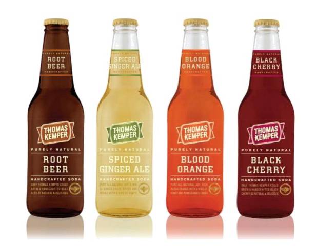
DESIGN EXPLORATION: Thomas Kemper


The first Thomas Kemper Root Beer was brewed by Andy Thomas and Will Kemper (local Northwest beermeisters) back in 1990. They wanted to serve a cool alternative to beer at their Oktoberfest celebration. It quickly became so popular they had to invent Novemberfest. Now you’ll find Thomas Kemper all over the West (and everywhere else if you look hard enough) – thanks to a lot of great stores and restaurants that share the best of taste.
It all began with a little party. Or so say Brewmeisters Andy Thomas and Will Kemper of Thomas Kemper Soda, whose fizzy drinks and website are good, clever fun. The flash layout for this marketing site offers up a well crafted, whimsical vehicle for their product; which happens to be a well crafted whimsical take on pop. The personality of the site seems to reflect the sunny crew featured there. The design is thoughtful and full of cute hidden mouse click and roll-over features.


I was unfamiliar with the brand, and h
appened upon it when researching for a mock soda ad I was creating. It was a pleasure to use and I found myself spending more time here than other sites I'd visited for the project. I think it is a good example of good functionality/utility and dynamic use of information architecture. You can visit the Thomas Kemper or TKsoda site here: tksoda.com

Tuesday, February 23, 2010

DESIGN EXPLORATION: Alannah Hill

I was entranced from the moment I entered Alannah Hill's fashion design website. The hot air balloon quickly led me to an old gnarled oak tree surrounded by flora and fauna with a shiny golden key to click on, which then gives access through a door in the tree to a website that is esthetically appealing to many senses at first glance. You will see as you explore this quirky and unique website that Alannah has a sense of humor and a flair for the unusual. The main page is a secret garden that is so chockful of visually appealing images that it takes several minutes just to absorb everything that is occurring in the scene. The garden gnomes blowing bubbles, the colorful cats and squirrels, and the elephant and ice cream cone all give the viewer a reason to smile.

The sounds of nature in the background lend a charm that is engaging and create a very peaceful atmosphere to continue exploring what this fashion designer wants her prospective clients to see and experience. When you click on the Map held by the garden gnome and then on 'Features' you will be led to an outdoor movie theatre which shows you how to receive an invitation to her launch party for her newest boutique or to join her exclusive mailing list.


This design element gives us a hint of Alannah's rise to fame in the ways of old Hollywood, where "tenacity, natural talent and a glamorous dream", can give a fashion designer international success. The outdoor movie theatre also draws the viewer in and makes them feel a part of the audience as they view the screen along with the bunnies in their cars. The sepia tones and flickering movie screen also create a mood of days gone by as dusk begins to shade the clouds and sky. The movie screen is a great way to draw attention to one of the most important aspects of building up a clientele. By inviting viewers to join her exclusive mailing list and/or receiving an invitation to her newest launch party, Alannah is making people feel like they are special to her. This is an invitation to join her world and her website designers have done this in a clever way.

The next design element under 'Collection' of a starry sky, a fluttering sheet with Alannah's designs and hovering humming birds was a romantic, sensual and amusing way to showcase her fashion creations. This element again leads the viewer to enjoy viewing her clothing line while being entertained by the quirkiness of the humming birds and sounds of nature.


The small row of squares that darken as you click on them to select another of Alannah's creations are easy to navigate and allow a nice progression of images that also lend an aura of old Hollywood in the way they are presented and photographed. By having the humming birds flitting around the images and appearing interested in what they are seeing... the designer is also keeping the viewer interested in the clothing line as well as what the next image will show.

I really enjoyed the 'Editorial' section of this website as again the design elements chosen just made me laugh and created a fun environment to view Alannah's clothes and accessories. What could be more engaging and funny than ferrets poised on top of an old television set and watching avidly as the screen changes and different images are shown? As well as a violet horse sculpture with a lampshade floating over its head... this is creativity at its finest. When web designers can create interest for viewers who are not even vested in the product, this shows that they have great insight into what makes a successful website.

The Map is an excellent way to lead the viewer to explore the website in its entirety. As the viewer begins to see the creativity and appeal of each section of the Map, they feel the need to continue until they have viewed all of its sections. It is a logical element to use for exploring a secret garden. The use of such diverse animals, themes and motifs is a benchmark of intelligent creativity. The viewer almost has a sense of having stumbled upon an "Alice in Wonderland" type of world and it's enchanting to travel through the visually vibrant scenes and just sit in silent wonder and watch.

I am not even a fan of this type of clothing line but was in awe of everything I observed and experienced here. I will be visiting this website in the future just in the interest of seeing what changes have occurred in Alannah's secret garden of fashion design. The website designers, Enrico Bettesworth and David Johnson, used whimsy, a subtle sense of humor and a unique approach to create a website for Alannah Hill that is a delight to explore and experience.

This website won a "Best In Class" award from the Interactive Media Council and was designed by Paper Stone Scissors. It was also built by Flint Interactive.

Design exploration- Starbucks

It is absolutely mind boggling how much time a person can spend looking at different websites. The endless video’s, animations and varieties of design are overwhelming. I spent about 4 hours just surfing the web and only looked through a handful of websites. One thing is for sure, those websites had the purpose of keeping me there and it worked!
I played games at the “Got Milk” website. (Click on the picture to play the game)

Got Milk?

Watched documentaries about the Burger King Whopper and interacted with the moods of Getty Images

Get in the mood with Getty Images


After all that I felt it was time to kick back and relax with a cuppa Starbucks coffee and check out their interactive website at the same time.
It was actually refreshing to find that Starbucks website is simple, down to earth and relaxing, just like their coffee.
The background with its simple chalk board, indicating education and learning, the accompanying sounds of writing with chalk and the distant sounds of nature in the background helped make my experience a pleasant one.

Relax at Starbucks

The menu is simple and clear. There are only three items that can be explored, the different types of coffee, a place to find your “perfect cup of coffee” and a place to enjoy art created by baristas.

The menu items are large and fill with color when moused over, inviting the user to click and explore further. If the user is confused they can navigate by clicking on the more traditional links located at the bottom of the page. When mousing over, what looks like tabs at the bottom of the chalk board a variety of different coffees fan into view.

A nice touch is that when the “invisible eraser” erases the previous window from the chalk board, a colorful soft residue from the chalk is left behind like a lingering memory, just like the taste of great coffee.
Down to earth with a touch of culture, art and relaxation and a pleasant lingering taste to enjoy the day with.

Sunday, February 21, 2010

Design Exploration

Usually when I go to the web sites, I just looked at the ones that look interesting to me but I don't pay attention to the work that go into the project. Now that I am doing this exploration will help me understand, what design suppost to show to the viewers.

The first web site that I chose is one of my favorite sites

Disney The Official Home Page . When I went threw the web site, I looked at the animation that sorrounded the web page I really liked that design.


One good example is that the design of the web site was created and design to accomodate the older and young viewers, because of its concept it was design to be view by all ages so they decided to use different visuals to make the web site exiting.

The web site is effective because of its content. It has many Icons that show and represent what they offer, for example when you press any Icon they become active and then they show a visual illustration of what they can do.

The thing that was compelling for me was that in the center of the web site it has a small screen that shows footage of the new things that disney is coming out with. it also has a link to follow your favorite caracters.

Second site of exploration is
Infinity Offical Web Site. I was interested in this web site because I am interested in some of their cars. I wanted to find out what they try to show to the public and the way they design thier product.


One of the good things in this web site is you can choose many options if you wanted to build your own car. It has many Icons that you can click to change the design of the car you want, you can choose different types of models that you are looking for, this design was made to be easy to use.

This web site is very effective on its design it has alot of options that will guide you do build your car this is really good for customers to give them options when they buy a vehicle. this design is effective for mature viewers.

This web site was compelling for me in a way that makes me think on how to use different design
techniques to attract customers or sell a product. i really like the design they use because they make it easy on choosing a car you want. The design they use to choose your car, to choose the color, to choose the different option you can add to a vehicle was amazing.

Saturday, February 20, 2010

Design Exploration

This project has forced me to spend time (that I don't have) looking through scores of web sites developed through flash, and I'm glad because it was entertaining and exciting to think that I might be able to develop something like them some day.

I find that I'm positively influenced by sites that are clean and easy to navigate with good background music. I decided to discuss a locker room site for the Los Angeles Lakers because it is straight forward and easy to navigate.

http://www.nba.com/lakers/lockerroom/index.html

The site was developed to promote both the Lakers and Verison Wireless and that is clear on the site's opening page with attention to both. You can also tell their intended hierarchy by giving the Lakers more attention then Verison. The eye is naturally drawn to the right corner where the office door leads back toward the locker room. Clarity is created by the clean desk and the obvious three objects (buttons) and and doorway.

This hierarchy and clarity are repeated as you enter different rooms which adds consistency. The cleanness of the front office and hallway and the large open carpet space contrasts with cluttered lockers in the locker room and the cluttered desk in the owners office. This contrast draws our attention to these areas for further inspection where we can find the Lakers schedule and can even buy tickets or watch a clip of game highlights.

I appreciate that you can turn on and off the background music and the sound effects. There is also a "share this" button where you can send it to 47 different places like face book, blogger, email, twitter, buzz up! (what's that?) etc.

A second site I would like to talk about is something completely different. I really encourage you to take a look at this and see if you are moved as much as I was.

"The Last Day of Betty Nkomo"

http://www.poemsthatgo.com/gallery/winter2004/YHCHI/index.htm

The artist, Young Hae Chang, strips away interactivity, graphics, photos, illustrations, and colors and leaves you with just language and sound. Sounds boring doesn't it? But the speed of the text and the rhythm and tone of the music requires your full attention and you are forced to let all other thought leave your mind or you will miss some of the words and meaning. The music seems upbeat and happy, but you soon find how sad and real to life it is. This is a dramatic use of white space, balance and contrast. The text size, placement and length of time on the stage all have implicit connotations as to the meaning of the poem.

No more newspapers

The only regret to me is the occasional opportunity for shared community with everyone with things like the local high school football scores or where the next garden club meeting is. You can find this stuff on the web, but its not in the serendipitous way that it used to be in newspapers.

Things were already different in 1963. Although the Orange County newspaper had an “extra” and probably about 100 pages of news and ads, that big-shared experience was on television and radio. Radio had shared things during World War II, but in 1963 even the newsrooms had television sets. That newspaper was probably set on a linotype machine.

These are now found in museums. And it was run off from hot type on cylinders after being composited on chases in a print shop. You can see one of these linotypes in action on You Tube.

By the time 1969 came along much of the process had changed to a photo reproduction and offset process. No more lynotype machines.

Now you can read Romanesko to chronicle the death of the newspaper.

Even the venerable Editor and Publisher the Bible for journalists, is now online with the latest on the grief.

Today you can get instant news feeds, articles and quotes for your project newspaper from Daylife. com

Or if you aspire to be a reporter study entrepreneurial journalism wherein you write and sell ads on your own website. Jeff Jarviswho wrote "What Would Google Do," always has interesting insights.

So we will continue to get news: On CNN, from the local Channel 7 news desk (only if you have local channels(), but less and less about or community’s shared interest. And less and less for that clipping about the Oceanside Pirate’s big football win.

Thursday, February 18, 2010

First Blog Ever!

I'm writing today about compelling interactive multimedia design developed in Flash. Now that I'm expanding my educational knowledge of Media Arts & Technologies at Mira Costa, I realize the importance and recognize the greatness it has on our culture today.

Since starting this Flash class
I have noticed a lot of what we are currently learning is all around us, not only on the computer but on television as well. I've been taking a look at
interactive websites primarily in the movie industry. I've decided to share the Disney page devoted to Tim Burton's film - Alice in Wonderland. My family & I are very eager to see this remake; we love Tim Burton's work, my stepmother is an extra on the film and mostly because the sexiest actor ever...Johnny Depp is in it!

http://disney.go.com/disneypictures/aliceinwonderland/

The first thing you see on this page is the timepiece open and ticking while the page is loading and after that a spinning teacup, clever. I really like the menu and the wooden buttons, the sound that follows the rollovers in my opinion make a strong statement and a nice design feature. This site allows you to turn off and on the sound, which is nice. The gallery contains a rollover that gives off the sound of a beating drum another way the designer has created an effective and engaging experience. There is a promotions button that allows you to navigate away to other websites, one of which also intrigued me.
http://www.opi.com/. I really liked the "try it on" pop out, you can sample the colors of polish on the hand, change the length of the nails and the skin tone to get your perfect color. That's another blog all together.

Although I have learned designing
for Flash can be very time intensive, it's a good idea to have a clear vision of what you want the end result to do before you start building from scratch. As a graphic designer I'm eager to have my ideas come to life interactively through Flash. The possibilities are endless!

Friday, February 12, 2010

Flash Student resource site


Hey-hi. Here's the thing, this is my very first blog ever.
Yes, I k
now, how can this be but alas it's true. Honestly, I always had a "so what-who cares" kind of attitude when it comes to blogging. I think that feeling comes from the word itself "blog" what nine year old made that one up? Anywho.. back to the subject at hand. Flash 150 and a web site that pertains to our course material.

I am a member of this great s
ocial network site: Krust U Must http://krustumust.ning.com/
A few MiraCosta students thought it would be a good idea to have a website that related to all MiraCosta Media Arts and Technology courses and a current student just ran with it. Luis created the site and is still a student at MiraCosta. He graduates this year in Web Design.
FYI, the site is offered by Ning and setting it up was free. In the past I have posted questions and solutions were suggested and followed with success.Postings include helpful links on multimedia subjects(Flash stuff galore) and a place to share art and digital designs.

A big atta boy to Luis, he is most helpful and knowledgeable and if he doesn't know the answer he drops you bread crumbs so you can seek out the answers yourself.
I highly recommend this site. I joined last year and although I took a semester off, I jumped back in there and here I am today. Thank you Karl for getting me to post my first blog. Wow, this kind of homework I can get used to.
Blog-on my fellow artists
Until next time,
Rebecca

Saturday, February 06, 2010

Flash Resources Exploration

Since we all are just learning the basics of Flash, this post will focus primarily on the many sources of free help, support and development tools provided by Adobe.

First and foremost, use the on-line "Flash Help". The basic questions that I have had to date on how to do something in Flash have been adequately answered by the on-line Flash help pages. Additionally, several topics that I have used contain links to Adobe TV video tutorials for that particular subject if you would prefer to watch a video rather than going through the written instructions.

You can also link to Adobe TV directly by using this link: http://tv.adobe.com/

Find the link to the Flash section under the Products tab or go directly there using this link: http://tv.adobe.com/product/flash/ This Flash-specific Adobe TV page contains many links to Flash tutorials and development tips. Be sure and click on the "Learn Flash CS4 Professional" link which will direct you to a page containing more than 35 video tutorials on a variety of subjects. So far, each of the tutorials I viewed have been Lynda.com tutorials. All have been free.

The Flash Help and Support page can be found at http://www.adobe.com/support/flash/ This page contains links to the Flash on-line help, more Flash articles and tips, and links to Flash development tools, such as the Adobe Developer Connection Pages.

Also check out the Adobe Developer Connection web pages, http://www.adobe.com/devnet/flash/?view=home , which also have many links to Flash specific articles and tutorials.

Other non-Adobe resources that I have found to date include:

Flash Design Marketing - http://www.flash-design-marketing.com/

CreativePro.com - http://www.creativepro.com/

and

CreativeCOW.net - http://www.creativecow.net/

Creative COW appears to be focused toward tutorials and training. There are fifty-three free Flash tutorials on the site. The tutorials run the gamut from basic use of the drawing tools to advanced Action Script 3 topics. Creative COW also has a Flash forum.

Flash Design Marketing offers Flash templates, some for free - and some for a price. Some of the free templates appear to be worth a second look once I learn more about Flash.

Creative Pro appears to be focused on web design in general and does not appear to have a lot of Flash-specific content. However, the web site does contain a lot of design articles and "how-tos" for the web designer.

Check out FlashSources.net - http://flashsources.net/- for more Flash templates and design inspiration. There are some free templates here.

Lastly Digital Thread - http://digitalthread.com/ - describes itself as follows:

"Dedicated to the graphic designer, Digitalthread is the oldest existing web design community web site. Built to showcase only a handful of successful web designs back in September 1996, Digitalthread is the currently the designer's home for the finding the best web design companies, and the best designed web sites of all time. "

I have not yet had much time to go through the pages of Digital Thread. However, it appears to be a good resource for design inspiration. Look at the Flash section in the Web Design section for links to Flash web sites.

In summary, there are a LOT more Flash resources, both free or for a price, than I realized. For now I will content myself with the free training and tutorials that Adobe has to offer.

(Author's Update - 2/10/2010: Although I stated above that one should use the Flash on-line help first, I have since found Karl's video tutorials [ http://karlcleveland.com/150/tutorials.htm ] to be extremely helpful in answering the question... "How did he do that in class?" It seems that while it made sense in class, I seem to forget the steps before I get home. Thus, my first source for "how-to" questions is now Karl's tutorials.)

Wednesday, February 03, 2010

Studio Exporation: Firstborn Multimedia

Firstborn is a digital agency based out of New York that specializes in cutting-edge Flash websites.

A couple sites from their portfolio that really struck were:

http://www.sobe.com - The interactive video is really effective and load quickly to give person-on-the-street accounts of the product.

Wednesday, December 16, 2009

Reece Elder second blog

my second blog is on this site pixelcase.com.au/vr/2009/newyork/ It pretty amazing. The idea of the site is an virtual ariel tour of NYC. im guessing that they used some kind of insane process peice thousands of pictures together or something like that. the site puts you in control of the tour letting you decide where to direct your vision you can zoom in on all the land scape. you can see every angle of every building pretty much or atlest that was my experience. of coarse they designer doesnt leave you completely alone to navigate the city by yourself. they have poupular locations listed along the bottom of the screen as thumbnails. however their background music really blows. i couldnt find a way of turning it off. in addition to all the other features it has it allows you to easily take screen shots and share with friends. no messy print screen/croping stuff annoying. other than the music its pretty damn cool

Wilkinson- Resources Blog

So it is the end of the semester, and for my last blog I though I would share with the rest of the class some helpful sites I found among all the late-night, last minute, google scrambling to figure out how to fix that last bit of scripting or animating.
The first is a collection of tutorials on how to use the Wacom tablets the school provides for us: the collection is through a magazine and provides some very intriguing lessons.

http://designm.ag/tutorials/wacom-tutorials/
The tutorials for the most part have nothing to do with flash, but knowing how to animate with one of these tablets can lead to interesting creations in illustrator which in turn can provide you with great symbols to animate in flash. If you are interested in creating animated films or games with flash this is a site you should definitely check out.
The second site is a user-generated tutorial site that only deals with flash called: www.tutorialized.com.

If there are any questions you have pertaining to scripting or animating, chances are that within the over 3,500 tutorials you will find you answer. And best of all, you will find it explained to you in normal lingo. A great website that provides not only insight but also has a lot of great ideas to build upon.
The Third site is a website called www.Kibashare.com

KibaShare is a great website, although incredibly hard to understand. People post their work on there so you may take it, change the content and keep the awesome animation and scripting. It is incredibly difficult to understand everything once you have the files open, but if you find something worth having, it might be worth all the effort to decipher the scripting.
My fourth site is one I have been going to all semester for all my classes and that is the tutorial section of www.SmashingMagazine.com

A magazine that mainly deals with design issues, they offer a gigantic section of tutorials for Photoshop, Illustrator, and Flash. Once again, a very nice way to figure out how to make items to use in your Flash project. If Flash is point C than this provides guides on how to make Point A and B kick ass. It also provides very well written tutorials on Flash from experts and students alike.
My final site is an added bonus, one I enjoy checking out before entering a project and getting ideas from. www.thebestdesigns.com

The Best Designs is a website that merely offers their choices in the current best designed sites, not like the FWA where flash is the main concentration, this website showcases the incredible uses of fonts, layouts and pictures, not animation. If you need a base to start a website design on, start here, then figure out how you can add some animation to the site to make it more interactive, and therefore better.
I hope you enjoy these sites and I really hope that they can help you in your further classes.

Tuesday, December 15, 2009

Becca Patterson: Resource Exploration

http://forums.creativecow.net/adobeflash

Creative Cow is a "Creative Community" which allows people to post ideas, questions, and answers.  This forum allows for a person to discover everything from new tricks, to fixing problems.  I really like the interactivity of the site, and it is very easy to navigate.  Not only does this site have a message board portion, but there are also links to different tutorials and podcasts for more information.

http://www.webdesign.org/flash-swish/flash-tutorials/page-1.html

Web Design Library is really helpful in the tutorial aspect.  The instructions are so clearly laid out.  There are many different topics discussed so it covers just about everything you might want to know.

http://www.designyourway.net/blog/inspiration/website-showcase/weekly-30-inspirational-websites-43/

Design Your Way gives multiple sites of inspiration for web designers.  There is such a myriad of artwork on here, whatever your taste/style may be, you can find something that catches your eye.  This site also has a bunch of tutorials, information and downloads.

http://www.csscake.com/

CSS Cake is a blog that compiles extraordinary websites.  They are sent in by viewers and are sorted into 7 different categories: Company, E-commerce, Lifestyle, Other, Portfolio, Resource, and Showcase.  I think this is my favorite website that I've stumbled across because the design is so crisp and inviting.

Friday, December 04, 2009

Third Blog: Silenzio

www.silenzio.fr

I did my third blog exploration on a website called Silenzio. This site was created for the Silenzio Communications company which works with graphic designers to create movie posters.I liked the simplicity of the site and it's easy navigation. Basically it allows the user to look through a portfolio of different posters this company has produced throughout the years. Once the site has loading it displays all of the posters and allows the user to scroll through and choose which they would like to see. When one is selected you can view a larger picture of it. This site also allows you to organize these posters to view them in order of A-Z and date.