Thursday, September 27, 2007

Studio/Artist Exploration - Red Interactive Agency

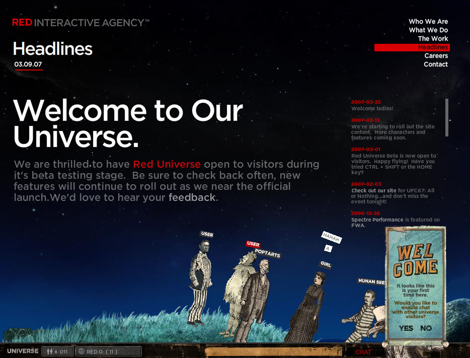
The design studio I researched is Red Interactive Agency. You guys may remember Karl previewing it in class- it’s the one with the characters you can walk and fly around.


Red Interactive Agency is an independent interactive agency. Founded in 1999, RIA creates online marketing and advertising, and also does website development. RIA believes that as the interactive universe grows, the future will consist of fully immersive experiences. That philosophy shows in their designs. Some of RIA’s clients include Comedy Central, FX, HBO, NFL Network, UFC, Warner Brothers Pictures, MTV 2 and Lions Gate.


I really like RIA’s work for many reasons. They are very original and interesting. The amount of detail that is shown in some of their projects is amazing. A good example of this is their website for Sony TV, which can be found here
http://www.sonypictures.com/tv/sales/. When you get into the site and scroll around you’ll notice how many things change and become added to the scene. I find that to be really cool. Also, everything they do is clean and organized. In their ad campaign for Spiderman 3, they have organized different ads in an interesting way -http://www.ff0000.com/portfolio/sony_sm3/. In addition, they designed a few UFC sites, and being a huge fan I find that pretty cool.


Here are two reviews of RIA’s work:


1.
http://75.ufc.com/#lhw – This is a promotional site for a company called the UFC, UFC standing for Ultimate Fighting Championship. The UFC is a U.S. based mixed martial arts organization. The site was, and still is used as a promotional tool for the company. There are a few different links that take you to different parts of the site. The link I have posted above will take you to what I think is the best part of the site. It is an interactive page that showcases the UFC’s light heavyweight division fighters. I really like it because of it’s layout. The two other main parts of the site talk about UFC 75, and the last UFC event, UFC 76. They can be found here http://75.ufc.com/#previews


2. http://www.ethanhaaswasright.com/ewr.php - At first I had no idea what this website was about. On RIA’s site, all they have to say about the site is “Who is Ethan Haas? We have yet to find out in this mysterious viral gamesite.” So that led me to believe it was either a site advertising a video game, or simply an online game. Well after the loading screen finishes, we’re taken to a new page where an egg shaped object pops up in the foreground, with a city skyline in the background, and opens up revealing what looks to be a circular puzzle of some sort containing something inside. After clicking all over it and not really getting anywhere, I noticed at the top of the page there are two stars. The one on the right will change the words in the center from “Ethan Haas Was Right” to some made up language. The left star however was a little more interesting. When you click on it, your default e-mail client will launch and already have an e-mail address and subject filled in. I went ahead and sent the e-mail, and did receive a message. I’ll leave the review at that and let you guys find out what happens on your own if you wish.


photography website made in flash

This is flash photo website made by a friend of mine. Her name is Elizabeth and she has an online gallery of her and her husbands work. She lives in New York is a photo retoucher as a profession. She loves to travel and take phots of interesting things she see in the US. THe collection of pictures is called American Ritual. Her current work is lots of street scenes in New York of people walking down the street. Some of her pictures I really like and others are just ok. So you will have to look around at lots of the pictures to find some that might inspire you. The website is really simple but thats why I like it. With photography you have to be careful not to add too many distractions to the art itself. I feel that if her sight was more busy with animations it would take away from the pictures.


Low Morale.

Low Morale - a series of animations by Monkeehub design studio about a pessimistic office worker, who feels upset about his day-to-day routine and annoying colleagues. There are 13 short stories and a longer one. Each of them has similar suicidal ending. Watch stories #5, #7 and #9 to get an idea of this series.
Warning: the stories may seem offensive or inappropriate for some people.

In my opinion it is a good example of a website, that was created with an interesting concept to do three things:
  • Entertain visitors.
  • Bring new clients for the studio.
  • Bring income from sales (mugs, t-shirts)
But what I really wanted to emphasize in this post is the last work in this series because it is a remarkable piece of Flash animation. It is not a short one - 5 minutes, accompanied by a great music track by Radiohead. Creep.

I think this animation as a good example to show two important concepts in Flash animation - that is animation on multiple layers and animation of separate pieces (movie clips). Notice, how it starts with only one character on an empty scene and step-by-step many layers add in front and in the back with different moving and static objects. All these small pieces sum up and bring the scene to life. Don't hesitate, this video is definitely worth watching.

Anything But Square

Design Exploration in the ATTIK, Stephanie Lopez

ATTIK is an interactive design firm that began in a small attic bedroom in England. The company now has offices in San Francisco, New York, and Los Angeles as well. What initially attracted me to the the firm was their design-driven mentality and their incredible versatility. This is a fully "interactive" company, in all senses of the word. They do branding, broadcast, print, environment, events, guerrilla, advertising, and packaging. Essentially, ATTIK can be considered an advertising agency but instead of employing tried and tired ad models they entice consumers with curious and well-thought-out design. Considering the variety of their work and for the purpose of this exercise, I focus on their most Flash-related endeavor, the Scion campaign.


Guerrilla advertising: this sequence of images were posted in a
nd around San Francisco with the slogan "want2bsquare"


Believe it or not but the posters above are part of a multi-dimensional ad campaign for Scion cars. In addition to graffiti-style posters, ATTIK employed television commercials, events, print ads, and interactive online worlds, to promote the product. The strategy was elusive and mysterious, focusing on the box-head characters and online environment. The following images illustrate the entrance to the 6 interactive worlds. In these worlds, you can play games, navigate, and occasionally read product info. The focus is on the experience and not the bombardment of advertising.


They have created a non-box-head-related world that has a direct link on the Scion home page, called Little Deviant. This has a fairytale tone where the evil characters become the protagonist. The story teller gives the Little Deviant (you) instructions on how to torment and eliminate the Sheeple, a clever play on words describing mindless trend followers. This is a clear advertising strategy to make the consumer feel like he/she is different, unique, and therefore cool. All-the-while, the site integrates story with product info, as on the want2Bsquare site. Below is the opening image from Little Deviant.

Beyond the online experience, ATTIK has coordinated launch parties and concerts, all in effort to promote Scion. The dynamic efforts that go into their advertising strategies are far from traditional and are what set them apart. But only time will tell if these innovative tactics will make a difference in a world ruled by the consumer.


http://www.attik.com/
http://www.want2bsquare.com/pub-share/w2s/index.html
http://www.littledeviant.com/
http://www.aiga.org/content.cfm/case-study-scion-xb-campaign-by-attik

Sunday, September 09, 2007

New Media Exploration - Process

Process, while not a fascinating topic, is a necessary one. It applies to any business and any product – be it a car, a toy, a cell phone, or a multimedia web site.

First, Terminology 101. Businesses must manage the way they produce a product – from conception to delivery and beyond, until product ‘end of life’ (when you quit fixing it and dump it to build a newer and much cooler widget) something you often hear referred to as ‘cradle to grave’. This is referred to as lifecycle management. Processes (also called methodology) are the tools of management. They specify what phases, stages or steps (equivalently) that a business goes through to produce a “good” product (“good” is included in quotes because what comprises “good” is industry and customer dependent). Procedures (or methods) specify how those steps are to be accomplished.

Process is often described in a very structured way (that has a tendency to put even the most determined to sleep). However, on the most fundamental level, it simply ensures you properly define what it is you are going to make, that you make what you intended to make, and that when you’re all done… it works. That’s it, end of story. Not hard, is it?

To understand the importance of process, we’ll briefly examine the growth of a start-up company… to make it more personal, we’ll name the company ‘Really Cool Multimedia’ or RCM for short.

RCM starts up in Bob’s office. Bob is a really, really smart and creative guy who can hack out multimedia designs faster than you can say ‘jack’. People really love his stuff. They look at his online portfolio and pretty soon Bob is getting more Email requests for information than he can handle. SO, Bob… being the web type guy he is… quickly networks to other smart and creative people he knows and starts building a business. At this point, Bob is living on coffee and chocolate bars, working 14 hours a day and doesn’t have time to baby sit employees… so he connects with and brings in other experienced, smart and creative people like himself that he knows and can trust to do what he needs done with minimal interaction.

Time goes on. RCM is making money and bringing in more business. This is a good thing, right? Sure… (do hear the hesitation in Bob’s voice) Bob is forced to come to the realization he needs to expand his business. He has tapped out his personal network and so must look outside for more employees. He is also at a point where there is a great deal of work that can be taken on by less experienced employees. He’d like his more experienced employees to focus on new business and to delegate a lot of the actual development work.

Fortunately, Bob is able to use Monster.com and rapidly bring in more talented people at a variety of levels. NOW RCM should be able to take on the projects that have been waiting in the wings. Except, Bob starts to notice work is actually slowing down. Holy Snail Pace Batman!? What’s going on!?

Well, RCM has been functioning to date with a small tight knit group of very experienced, smart and creative people. These people know what needs to be done, how it needs to be done, and they get it done. They have a history with each other and heck, they hardly have to talk to each other to get things done. The new employees are talented but they have no experience with the company, the company’s projects or the other employees at the company. Some are just out of college, maybe they have done some internships but they do not have experience that spans a large team project from start to finish. The new employees feel a bit intimidated but they conscientiously dig in by reviewing the details of previous projects, looking at the actual application files, mark-up language and scripts… and basically, hoping someone (please God) actually documented something. They try to build a mental picture of how all the pieces fit together… and they start asking questions... a lot of questions.

The only people around that have answers are, of course, the experienced employees. So, they spend their time answering questions (often one-on-one, often the same question for different people) on previous or current projects instead of working on new projects. So who’s working?

Hmmm… Bob starts to see the problem and the word ‘process’ pops into his mind. (Ow, hate it when that happens.) If only they had written things down. If only they had outlined coding standards for the new employees… if only they had tracked the changes (and the reasons for them) that came in along the way. OH, and how about the project goals… that would have been useful. If only…

There are endless scenarios that lend a hand in explaining the importance of process – the story of the customer reviewing the final site and their comment “That’s really neat but I wanted…”, the web site that cost three times what it was estimated to, the site that went live… and didn’t work, the site that should have been extensible… but you had to rebuild the WHOLE darned thing to change one ostensibly simple function.

I could go on, but I think you’ve got the idea. Process is a way of curing the ‘if onlys’.

The most basic stages in life cycle management are the same for any product. They are not always described precisely the same, but they are always a simple set and one description can always be mapped to another with more or less accuracy. In most cases, these stages are described as a sequential set. While that helps in grasping the concept, it is not strictly representative of what actually happens. Yes, in a broad sense a project should progress from one stage to another in the manner described… yet, any supporting processes must handle the natural sputters and restarts that occur in any development process (the ‘technical term’ for those points in the development is an… pardon the expression… “oh, shit” moment).

I describe those stages as follows:

  1. CONCEPT AND PLANNING– Develop the concept for the product, start the project planning. In other words, define the product to be solved and the boundaries / constraints on the problem. This includes not only design, user, and functional requirements but also programmatic requirements like cost and time to market. Remember, different assumptions, requirements, or proposed solutions may lead to dramatically different results.
    1. Define your customer / identify your target market (users).

Note that these may or may not be the same. Who is paying you and who is going to use the product?

    1. Identify the requirements that this customer and/or market places on the product. Identify the requirements that the product’s environment places on the product.

The term ‘environment’ refers to a number of things – physical environment for products like a cell phone or software / hardware environment for products like web sites. How are you constrained by the connection speed, monitor size, operating system, browser type/version, etc.? Often, you have to deal with legacy issues. You could build a cooler widget if you were not constrained to operate it in situations that involve older technology.

  1. ANALYSIS AND DESIGN – Analyze the product requirements and, with your customer, finalize a design solution.
    1. Brainstorm potential product design solutions.
    2. Analyze the trade-offs involved.
    3. Document and present your analysis and proposed solution to your customer.
    4. Negotiate and document a final design.
  2. DEVELOPMENT – Build to the design specification.
  3. (INTEGRATION AND) TEST –Test focuses on a system level test ensuring that you built what you intended to build.

In many lifecycle management descriptions you will see integration listed with test. This applies to products that are comprised of more than one major component that have been developed and component-tested separately. Integration at this stage takes the individually developed components, puts them together and ensures that the components all work together as a system. I include it in parentheses because with multimedia web site projects, any integration is largely a lower level activity that is really part of the development effort. The work does not proceed in the same way as say a cell phone where one manufacturer makes the chips, another makes the case and purchases the accessories from a third… and then SOMEONE has to put all the pieces together and make sure they all play nice.

  1. (PRODUCTION) – Manufacturing.

I include this stage in parentheses since it is only applicable if the product is something that is manufactured, i.e., you’re making more than one of an identical widget. That does not apply to a business that makes one up customer-specific multimedia web sites.

  1. DELIVERY – Deliver the product,. Take the site live.
  2. MAINTENANCE AND SUPPORT – Maintenance is the process of keeping a system running despite changes in its surrounding environment. Support is the process of assisting customers and users after delivery.

I chose a set of firms and used the information on their websites to build a cross reference table to the generic lifecycle management stages I described above. This allowed me to review and compare their processes. I included four I found on Karl’s list of multimedia design studios/firms plus four companies that identify themselves as web site developers (but do some interactive design) because they are interesting examples.

Process Cross Reference Table

Generalizing what I saw in the sample of web sites I reviewed – multimedia design studios / firms seemed to present their process (if at all) in a less formal, more conversational or entertaining manner. Firms that characterized themselves as offering broader web services had a bit more of a tendency to describe process in more detail (infrequently in too much detail). In retrospect, those generalities seem appropriate to their industry. If you are in the business of dealing with the government or military, detailed and formal process descriptions are necessary. In other industries, the level of formality presented... particularly on a web site where you are seeking to attract new clients is more open. In a design industry, clients are looking first to see what you can do and what you have done, then they'll proceed to substantiating for themselves that you are a reputable and reliable business. Business philosophy with a light sprinkling of process may be just the right mix for this industry... and that was where a fair number of the multimedia design firms went on their web sites.

Thursday, August 23, 2007

Studio/Artist Exploration: Second Story Studios


Second Story Studios is a Portland, Oregon based interactive media design firm, specializing in creating interactive experiences for museums and cultural institutions.

A great example of their work: This site

Tuesday, May 15, 2007

Convergence Culture


I started out thinking of doing this exploration on internet TV. It has been an interesting journey which has lead into the convergence culture. MIT has a Convergence Culture Consortium (C3) that explores the ways the business landscape is changing in response to the growing integration of content and brands across media platforms and the increasingly prominent roles that consumers are playing in shaping the flow of media.
You can access their weblog
where it discusses current topics such as: Encouraged by the success of Heroes 360, an expansive transmedia campaign to enable viewer interaction with Heroes (via an "interactive" graphic novel, an ARGesque campaign, and so on), NBC is expanding their 360-approach to television to another of their biggest hits... The Office.
In addition to making extra content available on digital platforms, "The Office 360" will allow online users of NBC's Web site to create their own branches of the comedy's fictional Dunder-Mifflin paper company with different challenges to complete. The branches could be integrated into a network episode of the show.
And
The show Bones was launching a particularly interesting storyline and running a series of ads that this week's mystery would provide viewers the chance to begin solving the case before the show ever aired. The primary characters involved in this particular case would have their own MySpace pages that would contain some relative information and which would allow viewers the chance to start investigating the case prior to the show's beginning.
Society is becoming very internet savvy and we are sophisticated. We are now bored with just static websites. If you have a clever video you can have your five minutes of fame. Youtube.com is a good example of that.
Another new video-sharing site, LiveLeak, based in London, has positioned itself as a source for reality-based fare like footage of Iraq battle scenes and grisly accidents. Last week, popular clips on the site included one of an agitated man in Muslim dress on a fast-moving treadmill and video of an American A-20 aircraft bombing Taliban forces in Afghanistan.
The possibilities for success are greater today with the media platforms available today. Reality TV shows have helped to foster appreciation for the common man not just big screen movie stars.
I know a race car driver who started a little podcast on his website. http://www.ronnava.com/ It became so popular he now has major sponsors and has become heavily involved with the ASA.

Tuesday, May 08, 2007

Artificial Intelligence and Flash (New Media)

I found some interesting websites related to AI and Flash. AI is used in many Flash games, but now it is being used to make "avatars" or "intelligent" animated characters for cell phones, ebay listings, chat rooms, inclusion on web pages and many other uses.
Site Pal uses the avatars as translators and for advertising applications. At The John Lennon Project they are recreating John Lennon's personality using AI and his visage using Flash.
At Personalityforge.com you can join a free community where you can create and program your own chat bot which will interact with other community members. Make sure to look to the right column of the main page and enter the Hall of Fame to chat with some interesting characters.

Personality Forge also contains a fun article on an
AI robot
who looks like Einstein. I think there is a good possibility that Artificial Intelligence and Flash avatars could become integrated into household appliances, monitoring systems (such as security systems) and other robotic devices. The avatars could assist users operate the systems, but could also personalize and humanize users' experiences with the devices.

communicatorworld.com

communicatorworld.com is an Agency that is only 5 years old.
They work for some top brand company's. They try to release websites
that have energy for their clients. I think they do a great job with their use of flash in their website.
Everything flows and give you energy.

A Handful of Start-up Ideas

The web is so interesting. I put in New Media Multimedia into the Google box and of course came up with a whole enormous list of pages to look... I wanted to go someplace new and interesting - the first few pages I looked at were pretty dull.... But then I hit upon this site...

EyeJot: Video Email
And I thought - wow - video email could be pretty cool. Especially since it said you could use it just like regular email. It s not like video conferencing. You make your video and send it. The receiver opens it whenever they want to....
Eyejot is a company that hopes to merge email with video chat. They provide a free application that lets you send video to anyone as long as you have a webcam. The files can be added to MySpace or viewed on an Apple video ipod. It works with any web browser, including mobile phones. Unlike video conferencing which must take place all at one time, video email can be sent and viewed at anytime. The only special software required is Adobe Flash.
Eyejot is just a start-up company so hopefully they can expand their product without being swallowed or put out of business by the big guys (ie Google).
Anyway they had some links to news articles on their page and I ended up checking a few out... which led me to ...

Vringo.com: Video Greetings
This may be the next gimmick on the new wave of technology. Similar to phone ringtones you might soon be able to buy the movie clip of your choice to use as your video phone greeting. Video greetings could be a much more personable expression of who you are.
Video greetings - could be fun. Instead of just expressing yourself with your musical taste - what better to express yourself with than a clip from your favorite movie? A whole new money making scheme could unfold. The ringtone market has slowed down considerably... the video clip market would swoop in and stir things up again. Ok to tell you the truth when I was reading about Vringo I thought I was reading about eyejot... oops - they just had a photo on the page... OK... so I returned to the original eyejot site and checked out some blogs... They had a real nice one all about themselves - which unfortunately several people had commented on - saying that eyejot was too difficult that you should try Freegabmail instead. So what the heck - we are cruisin the web here - let go check them out.

Freegabmail: Video Email Gabfests
Ewww - totally twitchy site... but you can jump right in (if you have a webcam) and make a video to send to all your friends (or whomever you like). All they need to have is Flash installed on their computers and they can view your video work of art/live conversation. No signing up - just shoot and go for it. This product is compatible with most email clients or webmail services. Anyway they had a link to a Q&A page which - thank goodness - was not twitchy like the opening page. Gab Mail Q&A It had a lot of useful information on it. Basically right now there are two types of service. GabMail and GabJam. GabMail can be sent to however many people you want - just like regular email. The messages and video can be forwarded and they are threaded together.
GabJam takes it to another level. Once it is started, anyone who receives the email will be able to see every video that is on it right now and every video that is added later. It can go between thousands of people. Become an enormous thread of video mail/information. Sounds pretty crazy and unwieldy to me. Maybe it will be the wave that crashes over me.
Anyway - I will say that it is sort of unfortunate for the eyejot folks that they had that blog that will lead people to other/possibly better software... beware the internet...

Design Exploration

I found a couple of sites that I thought were really good examples of design, even though they are quite different. The first is http://www.michelinman.com/forward, a fun site by Michelin. They took their old mascot and created a fun site in which the design elements further the design goals. The whole site uses the rounded white circles of the Michelin Man himself as a consistent motif. The site also is primarily white and green, with nature sounds in the background (birds, water), aligning Michelin with conservation and environmentally-friendly products.

It's a very relaxed, mellow site. Even the cars racing in the background sound like waves against the shore. The structures are futuristic, placing the company firmly in the future, but warm instead of cool. They also found a few different places to mention the amount of fuel the country would save if everyone drove on Michelin tires (2.6 billion gallons a year). You can link to pages to buy tires or learn about them, but you can also just play around with great graphics and sounds. I could care less about tire brands but maybe I will look for Michelins next time I need tires. :)

The second site I reviewed is http://aisforapple.net. This is an multimedia interactive net art project. It uses music, photos, graphics, and spoken words to create an ambience and a commentary on randomness, good and evil, god, psychoanalysis etc. The artists use a lot of black and white on a large white background to isolate and highlight their work. There are some things that move when you roll over them but the primary interactivity is the path you choose. Each selection you make changes your future selections, kind of like life. You generally can't go back using the Back button either. I thought this was a great philosophical/art site in which all the elements contributed to the overall effect and message.

SFMOMA - art and the internet.


My final blog submittal is about a web site for San Francisco's Museum of Modern Art, or SFMOMA for short. This is a site sponsored by the museum that has been designed by Intel. It explores multimedia art and the internet.

The site is visually very attractive, with lots of wonderful flash effects. There are many links, and you could spend a lot of time exploring all of the possibilities. My computer is a little "sick" and I need to take it to the computer doctor, so not all of it worked for me. But the basic site worked just fine, and the flash effects were well done, so I thought it deserved a place in our class blog.

The site gives many hints on navigation. Among some of the many flash effects, the main button has random, small, flashing red squares moving around it. After a couple of minutes a few of them begin to "pop" and become black. It is an invitation to roll over them. They each open a window to a quote from a famous personality - just a little diversion if you care to try it. This main button can be dragged around the site. (It tells you how to do it.) There are no scroll bars - you just position your mouse either near the top or near the bottom of columns. Rows of patterns will slide and enlarge as you mouse over them - then text will appear from the rows and expand into links. There are nine links that pop out as you roll over the main mouse button. All of this text looks extruded. The type in the columns is nice and large. Karl might have a bone to pick with how they present the column type as there are no margins, but I liked the way it looked. Polly

Monday, May 07, 2007

Three-dimensional printers +

Three-dimensional printers have been seen in industrial design shops for about a decade. They are used to test part designs for cars, airplanes and other products before they are sent to manufacturing. Once well over $100,000 each, such machines can now be had for $15,000. In the next two years, prices are expected to fall further, putting the printers in reach of small offices and even corner copy stores.
The next frontier will be the home. One company that wants to be the first to deliver a 3-D printer for consumers is Desktop Factory, started by IdeaLab, a technology incubator here. The company will start selling its first printer for $4,995 this year.
Three-dimensional printers, often called rapid prototypers, assemble objects out of an array of specks of material, just as traditional printers create images out of dots of ink or toner. They build models in a stack of very thin layers, each created by a liquid or powdered plastic that can be hardened in small spots by precisely applied heat, light or chemicals.
Colleges and high schools are buying them for design classes. Dental labs are using them to shape crowns and bridges. Doctors print models from CT scans to help plan complex surgery. Architects are printing three-dimensional models of their designs. And the Army Corps of Engineers used the technology to build a topographical map of New Orleans to help plan reconstruction.


Recently Craighead Research Group at Corenll University reported their next “nano” breakthrough. They created a so-called “Nano-Lamp” - a microscopic collection of light-emitting fibers with dimensions of only a few hundred nanometers.
According to the research article published in “Nano Letters”, the scientists were able to create one of the smallest manmade source of light that world has ever seen. The light-emitting spots on the fibers measure less than 250 nm in diameter which makes this light source smaller than the wavelength of light that they emit - 600nm. The fibers are made from a polymer with ruthenium-based molecules using a complex technique called - electrospinning - when a small droplet of polymer solution is placed on a metal needle tip followed by application of a high voltage between the tip and gold electrodes in a silicon base placed a few millimeters away.
A light-emitting nanofiber spans gold electrodes that are 500 nm apart and ruthenium-based molecules embedded in the fiber light up when exposed to an electric field of 3-4 V. An interesting fact is that when researches applied a high voltage of 100 volts, the orange light was bright enough to be seen by a human eye in the dark.


The design process for vSPLASH:

DesignXperts (DX) sell websites direct as well as through their resellers.

DX handles the sales, payments, contracts etc.
After the sales process is over, DX Sales rep passes on the account to the Design Support group rep.
The Design Support group rep takes all details from the customer like the logo, homepage structure, links, reference sites, preferred colors etc.
The Design Support group rep then enters this information into the project tool provided by vSplash

DX assigns a project manager at its end for all interactions with vSplash

vSplash then takes over the design process and builds a custom layout for the website and presents the information back into the tool.

The entire communication process between vSplash and DX is managed through the tool. Of course, other channels of communication are also open between both the partners and the project managers on both the sides regularly interact to enhance the relationship and the business.

Once the custom layout is approved by the customer, the DX rep messages it into the tool.

The vSplash designers then start building the complete site.

The due date for the site is presented back in the tool so that the DX rep knows the status of the project at all times.

Once the design work is complete, it is presented back into the tool.

DX then presents it to the customer and hosts it on approval.

The project is closed in the tool.

The project managers at both ends can see the project status of all projects from the dashboard. This gives a complete production pipeline snapshot.

ryandesignstudio process
One of the questions we often get is "How do you come up with the designs for my site?" or "How do I know you will design something that I will like?". Well, I'll try to clarify that here by going through the design process.
The first thing we do when contracted to come up with a new site design is to send the client a questionnaire with a number of detailed questions. These questions range from "Do you have an existing site/logo/marketing material?" to "What is your target market?". Essentially we are looking for not only an idea of what the client pictures in their mind for the new site, but also what their store is selling and to whom. The more information the client provides up front, the closer our initial concepts are to what they envision.One of the advantages of hiring a professional designer, whether it be for a web site or a new home, is that we are trained to take someone's vision and turn it into something tangible. Once we receive the information from the client, we look at their existing graphics, their target market, their competition, their products and their thoughts on what they want the site to look like. We then take that information and translate it in to some initial design concepts in image format, usually just the 'home' page of the site. This gives the client the overall feel for what the site could look like. The initial two concepts we provide are usually pretty different, with one concept being exactly what the client asks for, but also one that is 'outside the box' so that they won't get tunnel vision and see only one possible solution.We always ask that the client be brutally honest with their feedback, as it is much easier to revise a concept if we know exactly what they love/hate about it. About 90% of the time we are pretty close to what the client wants with the first concepts, but sometimes it take a few rounds to get to the point where they are 100% happy. We simply adjust the concepts based on the client's feedback, or if we are completely off base, we start from scratch. We don't actually start the implementation of the design until the client fully approves the design concept, as it is much easier (and less expensive) to change the concept in image format as opposed to changing code on a working site.
Once the design is approved, we start implementing the design into X-Cart. This is where we will also work with the client on the 'interior' pages of the site - category, product detail, cart, checkout and static pages all use the same basic framework of the design, but are arranged differently depending on the client's preferences. We use a highly modified version of X-Cart, so the checkout and category pages in particular are completely different than the default X-Cart templates.
When hiring a designer (even if it isn't us!) there is never such a thing as too much information. Here is a simple checklist of things that are helpful for a designer when creating a new image for your site:
- Existing site/logo/marketing material- Color palates you prefer- Other web sites you like/dislike and why- Navigation structure you would like to use, both for products and non-product pages- Who your closes competitors are- Who your target market is- An idea of what kinds of products you are selling- The 'feeling' you are trying to convey to your customers- Your company philosophy/story/personality- What features you want to use on the site (bestsellers, newsletters, featured products, etc)- Any other details that make your company unique

Saturday, May 05, 2007

New Media Exploration - Technology

A Mind Reading Interface now available.

Immersion still the future of Multimedia.
This blog entry is indirectly related to my final project:

Visitors from the 9th Dimension.

Once in a dream, I saw humanity as a pure energy life form of only conscious thought. We had evolved into an interconnected collective comprised of free individual thought and we existed forever in Oneness. You'll say, well,... that's the (promise of an) Afterlife, or a sequence from the Matrix. Maybe that's true, I don't know. (Check out previous link, it has a cool Flash movie of the Matrix and its characters).
This is where Faith and Science touch asymptotically.

String Theory, predicts existence of Parallel Universes, or real dimensions beyond the four (L, W, D, & T) of Space-Time, and may be proven valid after the Large Hadron Collider (LHC) at CERN in Switzerland becomes operational, in 2007. Think about it, we create thoughts from feelings and emotions in the four dimensional world. But where do thoughts go? They influence and become part of our mind. Our mind surrounds us and stretches out beyond the four dimensions of the material universe we know. As human evolution continues, our infinite minds would tear free from the shell that it once inhabited. It is my hope that we reach this point even though it may take millions of years, or maybe never...

I saw in my dream that the beings of light energy had total transformation power over matter. A simple thought could physically change a locomotive into a flower. The ultimate Philosopher's Stone realized. Even though you'd think what would be the purpose of a locomotive at that stage of evolution.J We could travel freely between galaxies just by a mere thought. No need for warp drives or opening worm holes to cover distances of millions of light-years.
We could be anywhere at once.

Maybe the Internet (a Virtual Reality form of interconnectedness) and new technologies that allow brainwaves to control your computer, and thus also multimedia applications, is the onset of this gradual change. A new mind reading interface developed by Neurosky.com may be the beginning of a new breed of man, when we cause material change to happen with just pure thought alone. We may develop a higher level of consciousness and exercise our innate psychic powers such as telekinesis, remote viewing, material creation by thought, that will become part of our evolution as we progress to use these types of technologies.

It's like riding a bike. At first you're uncertain and need stabilizers, then after a while your parents remove the stabilizers. You may wobble and even fall. But with practice you develop a better equilibrium and it becomes a part of you. The experience is engrained in your mind and you know how to ride a bike for the rest of your life.

The same could work for a mind reading interface. As our minds learn to control machines by thought, new neural pathways are created in the brain, which is really a neuro-transceiver (organic Wi-Fi?), a mind-to-body interface that transmits brain waves into the aether to interact with the mind. The mind (not the brain) is now programmed to perform this way. After a while we can take off our mind reader visors and manifest without them. This ability becomes genetically encoded in our DNA and passed on to the next generations.

A new dawn is breaking for mankind...

Tuesday, May 01, 2007

flash and 3d


Triworks.net was founded in 2001 and since then they have been developing internet solutions for websites, print and other interactive media, such as, multimedia CDs, intranets and CMS. They use a lot of 3D animation in their site and make 3D models. I really like navigating this site and looking at the sites Triworks made. This site has given me a lot of ideas for my final's web page like their music player. Well I hope you go to this site.


Samorost is a great mix of movie, story, and game that is fantastically fun and entertaining. You get introduced to the storyline, then you get to navigate through levels as the story continues. The graphics and textures really help to make the game successful, everything has different textures and each scene is visually unique and interesting.


The only product being sold is the game itself, which has been cleverly marketed by allowing the first half of the levels to be free and online. This is smart because Samorost is a relatively small game, even a mediocre gamer can finish it in under an hour. You don't have to go purchase the game or read the back of a box to see if you'll like the game.


Nothing about the game is really "new" as far as media goes, but I think that a lot of unique things were done with Samorost which has boosted its success immensely. The graphics, puzzles, interesting story, creative solutions, and easy access has helped to create a product that appeals to a wide range of customers. The entire product can be created using Flash, creativity, and a lot of coffee and pizza. As the entire game is online and uses no language whatsoever, anyone anywhere can play. It's very beneficial to have a product that needs no resources and has no production costs. Certainly this isn't a game like Sim City, World of Warcraft, or Grand Theft Auto, but an individual could make this game. I think that as the entertainment industry grows individuals are having an even greater impact upon it; one designer or artist can create something.

Wednesday, April 18, 2007

RIA and Sketchbook


Red Interactive Agency- This website contains a unique and entertaining way of communicating with people all across the globe. It took a bit of getting used to at first, but basically this site is a profile page for a design company, which also hosts an interactive chat program. It allows you to choose a character, name it, and to use the character to explore the landscape. You can also chat with other visitors using the dialog entry screen at the bottom of the frame. The rest of the website is mostly describing the company’s goals and clients, using menu buttons in the upper right portion of the screen. I think that the interaction element on this website is excellent, almost to the point of distraction. It’s hard to read about the company’s accomplishments when you’re busy chatting with people and making your character jerk around like a puppet on strings. I found it hard to get off this site simply because it’s so amusing! I think that, if RIA made this site with the intent to involve visitors as well as entertain them, then they definitely succeeded.


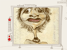
Sketchbook by Martin Hughes- Another interactive site, but this one is more personal. The navigation takes the form of a pack of pills, and you get to another page by “swallowing” them. This site is also a bit confusing, unless you read the “suggested user tips” on the main page. The transition effects between pages are a bit crazy and disorienting, with text and titles zooming and rotating at random angles, but that just adds to the fun. The Sketchbook serves as an animated journal of Hughes’ experiences in life, though it’s hard to make sense of them, even if you do take the pills in the right order. I admire his style, because the page content is random and bizarre, but at the same time fun. The animation is definitely amusing (like on pill nine- the walking red skull chasing a dollar bill), and it seems to push the boundaries of what is acceptable to today’s Flash-familiar audience.

I’m not sure which site I prefer more, but I think both are brilliant. Have fun with these two!

Design Exploration


If you want a compelling site to visit check out http://www.okaydave.com/
I think I spent about 45 minutes there checking everything out.

This is an award winning artist’s portfolio site. The design has very good consistency, in several arenas, throughout the site. He used contrast well on the home page. It has a collage of photos in black and white and when you roll over it elements pop out to click on in color. He uses a lot of black and white but it feels warm because of the dark background and brown tones. He also has a nice menu that is on every page at the bottom with a red pencil circle that highlights each choice as you rollover. Having this menu stay there makes you feel grounded and knowledgeable as to where you can go and are. When you first get to the homepage he has a pleasing video type effect with music that he replicates in the little videos that he has on his other pages.

Most pages are broken up nicely into 3 parts. The left side has video on top and sub-navigation for the information on the right side of the screen. The screen is split so that the right side has more room than the left which is visually appealing.

There is a nice combination of artsy, scratched words and hand-drawn loading images, yet there are nice, polished, professional projects and they end up being very cohesive. For instance on his logo page he has some simple stark and bold logos and you can move the mouse to see his design notes scrawled out.
The music is appropriate and not overwhelming. His videos explain each project in a visually stimulating way and are not too long. I would like it if he had a written synopsis but I guess that is where his process notes come in so it works. And I’m sure that is what he thought when he did it. It left me inspired.

Another site that was nicely done, visually stimulating and fun exploring is http://www.longneck.ro/


Tuesday, April 17, 2007

New Media Exploration


As we continue to advance in technology at the rate we are at, it is only up to the imagination where we will take new forms of medium. For now we have the internet, television, movies, video games, and analog mediums such as the classic pen on paper or paints. But as we continue to progress, it seems that the boundaries between the two will no longer exist.

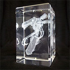
For example CrystalRender will take any 3D model that you have created and place it within a crystal so that you may display as your very own personal accessory. What they do is convert the polygons of the model into a collection of points that match up with the geometry surface, and then they shoot tiny lasers into the crystal which causes the structure to heat up and crack. These small cracks when collected together will form a dusty looking cloud that represents what your original polygon model looks like in perfect detail.

Another sort of medium is within the futuristic realm. A Brain-Computer Interface, at some point we will be able to directly link our brains with computers using a sort of data-jack or other port system, our brains and the machine will be able to speak a common language and with that we may be able to not only create within a new perspective but be able to experience new or familiar forms of media in a whole new way.

Fashion vs Fun

Nautica Jean's
site was a very fun fashion web site. The look of the site captured the feel of the jeans experience. Grungy, but playful. They offered a unique way of viewing the model wearing the clothes. He was positioned on a coin that slowly turned so you could view him front and back. There was a variety of levels of navigation offered. Up close you could choose very casual, kinda casual and dressy casual. They offered a sample of each and then navigation further back in the page offered you a choice of denim, shirts, tees, tops and outerwear for each style. The top level navigation offered product, jeans, style advisor, heritage and store locators. I like how the design was clean, playful, captured the product feel well. It was very easy to see the navigation, although it was not huge and in your face. Quietly understated and yet easy to access. The site loaded very quickly throughout which is always a big plus. There was music on the site but they were also considerate enough to add a sound on/off button choice in case the music was not to your liking.
The fast loading helped me stay on the site. The easy to use navigation encouraged me to investigate the site. It was an altogether pleasant experience. Well designed, well laid out, thoughtful to the end user, not just there to cram as much Flash in our face as they can.

Sze's site offers the visitor an opportunity to experience a wide variety of Flash styles. From an interactive flash book, to a silly catch the chicken game. It offers a mix of commercial projects and pet projects. I enjoyed the pet projects best. Always a good way to keep your creative juices flowing. She won the first annual Flash Goddess award for her pet projects. The site loaded quickly, was very entertainingly presented. Maybe a little cute for guys... but thats ok - there are lots of us females out there exploring the web : )

Design Exploration

www.agencynet.com : all I can say is that this website is an advance piece of design. I'm sure there's got to be more than flash elements in this design. First, the interactivity. It's very clever how they made a Three-Dimensional representation of their office as their main navigation. Things are easy to find. However, once you click one, you'll be blown away as what you are about to see. I believed they incorporated a lot of motion graphics, as well as video. You can see how the people in the interface is real but looping. Other inclusion of clever design is the client list, where client logos are things you can stick on the fridge and you can move them anyway you want. On the portfolio page, they used this technique where you pick one category and it isolates the items relevant to that category. On the demo reel page, you feel like you are actually watching tv with a remote control in your hand. On the news page, an advanced iframe technique was used. For those who don't know what an iframe is, it is used in html, you have a small window, you click a link and all of its contents will appear in that window. On Our Difference page is a video of one of the representatives of the company. To me, this is very professional on a personal level. That's how you gain the trust of your clients. They also have a blog section. Every aspect of this website is rich in content. It's funny how help pages are some plain text. Here, you'll be greeted by a video, like the one's you watch on airplanes before they take off. Even their contacts page alone is has rich mouse-over interactivity. In a nutshell, I can only dream of building a website like this. I'm pretty sure too, this website has provided all its information it needs to, very clean, very professional, very competitive... very cool.


www.dreamstudiodesign.com : Here's another flash technology that is beyond this class :) I may sound ambitious, but hey.. that's how websites like these are concieved. I've done research about this technology. Today, there are support softwares out there that help bridge the gap between flash 2D design and 3D design. Check out www.erain.com they offer this software called "Swift 3d". As for the design, interactivity and purpose of this website.. it's very simple, elegant, yet humorous. Each navigation represents an animation on the screen, or you can do it also by mouse over. Each area of the navigation, which also contains information has a little "short animation" to accompany it with. Overall, it's visually interactive. For those poeple who wants their animation to go to the next level, this is the way to go.

Flashy Flash


Here is flash being put to work in the online retail market. I really enjoyed navigating through this site and it has sparked many ideas for myself and now hopefully you to use in future productions. They have really nice visuals with awesome transitions. They have a lot of action going on with-in the site, yet still maintain a uniform flow. I like the way they incorporate video and pictures into the site. I hope we can learn to do some of the transitions they use to navigate through out the site. So over all i think its a great site. I do feel they could improve. I would like to hear alittle more audio through out the site, i think it would really bring it to life. The main problem is this site is very hard to find. I was unable to find the site through google searches. I had to find it through links. Here is the site! www.windwakewater.com

Monday, April 16, 2007

Design Exploration (Disney.com <> Agencynet.com)

I discovered that Disney.com has become quite an elaborate flash site

and I would like to compare it to agencynet.com (click anchor link and read just below 2nd picture), which also has an impressive video animated flash interface.

At first glance Disney seems a complicated website, overwhelming with lots of information. Discovering the site is meant to be an adventure, a reflection of the lay-out of Disney's themeparks. But instead, the main pages focus on the company's core businesses.

Looking at the source code, I learned that the website developers built a CSS site with Flash movies and flv's (Flash Video's) embedded in a Flash driven interface. They also used javascript to call the flash elements within the interface. The homepage source code is unexpectedly short, I assume because of the javascript code, that processes the webpage needs/call outs on Disney's webserver. Still so much to learn and understand and so little time: "...Mork calling Orson, come in Orson,... I need more life..." *Sigh ;)

Each web/Flashpage opens with a wonderfully beautiful background (hallmark of Disney's State of the Art animation capabilites), then the subwindows load. At the top of each page is a recurring horizontal control bar with navigation text buttons with a matching clickable icon above them that branch off to a new webpage. Some pages carry an Ad banner (Movies, TVshows, etc). The NavBar lists Disney's main lines of business: movies, TV, games, music, live events, travel, shopping, mobile, characters, and Disney XD (Xtreme Digital). On rollover, the buttons glow up and a trace of pixie dust shoots across, and the corresponding icons light up. Central on each theme page is a flash video... Disney's website tries to avoid being perceived as a commercial website. This is a place where dreams come true, a magical and happy place, pixie dust (cute) is all over the webpages and in the flash intros...

The visual center of any of Disney's webpages (except for the shopping pages, which tend to have a more commercial look and lay-out) is just slightly above and to the right of the actual (mathematical) center, and that's where the designers placed the Flash flv's. This tends to be the natural placement of visual focus, and is also sometimes referred to as museum height. The design recipy of the pages also respects the rule of thirds. Top 1/3 includes Adbanner, Horizontal NavBar, and windows with main flv panel. Middle 1/3 branch off to individual Disney characters. Bottom 1/3 contains legal footer. All 3 parts are embedded in a main Flash window. So what I'm trying to state is that the website consists of embedded, cascading style Flash based webpages.
Cool!

The balance of the webpages are approximate horizontal symmetrical. Symmetrical balance occurs when the weight of a composition is evenly distributed around a central vertical or horizontal axis. The size of the whole website is really big, matching the clout of a Fortune 500 company. The cluttery look with windows left and right reflects the feel of the store fronts of Main Street in Disneyland. There is quite a lot to discover. Have fun!

For example: explore the fairy minigames at:
fairies minigame: sundown. Aren't those fairies enchanting!

Another attractive Disney cartoon character I like is
Kim Possible. Have you noticed "Erin Esurance" the auto insurance company's secret agent looks like Kim. Well yes, they have the same been created by artists from different companies: Alan Lau (who used to work for Disney) from ghostbot.com and Phil Robinson from W!ldbrain.com. The last two links: "Lau" and "Robinson", lead to QuickTime video versions of original Flash animations.

On to the next one:
AgencyNet.com

Check out the website by clicking the picture here below:


The webdesign technology is similar to Disney's, but this company chose to display a professional & clear commercial corporate identity.
Website build is the same symmetrical center balance. A group of flv's are strung together and are in fact clickable button areas (they flash on rollover) with embedded Flash movies (swf's) that link to a deeper level in the site. The background murmur gives this an active office feel. I wonder how they shot the videos as base for the clickable buttons. Anyone have an idea?

Anyway, this website gives Agencynet.com an interesting and modern, corporate cool image!

Victor Sturm
4/16/07

Is there a new Flash 9 CS3?

http://www.bestflashanimationsite.com

In this site, there are several examples of superb websites using flash. There is one about IKEA, which I found quite interesting. Check it out.

Do you know about the new Flash 9 CS3?
www.flashmagazine.com/

They mention about script action 3.
Are we going to learn this in the advanced flash class?

Tuesday, April 10, 2007

Design Exploration


One of the good effective interactive multimedia design that I found was Dior.com .If i say good it doesn't mean that there is no problem in the sits'e design I mean I liked it and attrected to it.I could see that this site has alot of flash in it.I think the design of this site is very well done and attractive.In the intro we can see the drop menu.In this site we can choose many languages for its presentation. Each time I've opend the site, I've faced a new picture in intro.I think this make the site more interesting for its customers.The menu leads the customers to different part of the site.One problem that I faced in this site was the nevigation because I couldn't find a good navigation for going back to the main page or some other navigation.The colors are vary bright in this site which is a need for this kind of sites.Most of the pages have white background which is good and make the main picturs more effective.We can see the company name for loading each page and it repeats over and over.
The second site that I really likes was wynn hotel in las vegas.This site has a great navigation to different parts.There are many different categThe menu which leads us to different sections of this site and presents the hotel.This site is about a great hotel and I think it's really showing the great things about this hotel by using the colorfyl pictures and color.The way the menu works is so interesting .This site is a great example of using flash.