Wednesday, February 27, 2008

Artist Exploration

I've chosen a site called "The World Is My Canvas"


Check it out at

http://www.theworldismycanvas.com/


I found this site to be very interesting and entertaining. To be completely honest I wasn't sure what it was at first. After exploring for quite sometime I found that it is a clever plug by Nokia to market their products GPS devices.

The site introduces an interesting and comical host 'Stavros' as he explains the concept of "position art through GPS." The site itself includes a nice navigational system bar that's clean and easy manipulate. It interaction is simple and maneuverable. It includes fun little movie clips and intros to explain GPS tracking tools and how to make funny art. It even includes a contest for people to actually use the concept. In a separate section it allows screen saver and desktop downloads of the miniature comedian. I think it has an awesome promotional aspect because it's hilarious.

A few other interesting flash based sites that I found by Nokia are as follows

http://www.nokia.com/

This is a direct link to Nokia's main website. Here you can access area support, find and purchase various products and explore features of their company.

http://ovi.nokia.com/ovi/app/ovi/flash/
This site links to info, pictures and music options within Nokia.

These sites are equally well designed, clean and easy to navigate. Their page layout is interesting because it presents a picture slideshow that is shown over multiple turning screens (each that is seperately cued with the user mouse.) It's a nice touch to the site's interactivity..

Tuesday, February 26, 2008

Artist Exploration


http://nikefootball.nike.com/nikefootball/siteshell/index.jsp#,en,0;choose

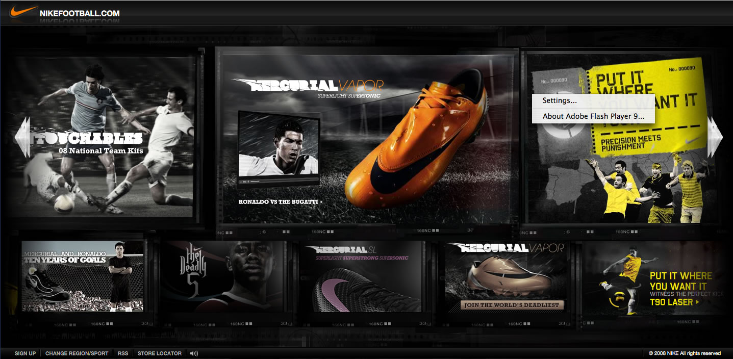
This website has always caught my attention by all the different interaction it offers and it’s to my interest. It wasn’t until I started taking this class that I realized this website was a flash based website. I’m not exactly sure who are the creators of this flash based website are I just know it’s created by Nike and they reserved all rights.

I could honestly say that this website was obviously created to target soccer fanatics and to sale products of course!! In this case being Nike soccer products. One of the ways they do this is by making this website very easy to navigate and allowing you to see video clips relating to the subject matter.

This web site allows you to see what is going to on in the world of football or as we like to call it soccer. They do this by combining the products Nike has to offer with along with all the players it sponsors. It’s another form of marketing and another way to gain interest.

Throughout the whole first Interface in this website, with the use of flash it use a lot of rollovers to address the subject or the merchandise Nike is offering. Or whatever is they are trying to get thru to you. This make is very effective because you know right away that subject has some form of interaction another thing that comes into affect it’s the use of bright colors it uses.

One of the things that I really enjoyed was the NikeID that Nike has to offer in this website. If you click on this it allows you into the Nike Store and with some form of flash it allows you to choose from any kind of soccer shoe and make it any color with any designs that you want.

http://nikeid.nike.com/nikeid/index.jhtml?ref=http://nikefootball.com&sitesrc=eufootball#category,soccer

Another thing that I found very interesting and fun in this website was that it allows uploading your own soccer video and adding it the chain of videos it has from other users all over the world, then it plays it as one clip.


http://nikefootball.nike.com/nikefootball/siteshell/index.jsp#,en,0;shootinggallery,

Monday, February 25, 2008

Artist Exploration


Whitneybiennial.com was conceived by Miltos Manetas and Peter Lunenfeld in a clever effort to challenge the opening of the Whitney Biennial show. This website is a collaborative piece that uses the talents of over one hundred individuals to display their animated pieces integrated into a clean interactive web design.

The website allows you to stroll through an art museum like space, perusing computer generated works. By moving the mouse along a map situated at the bottom of the page, you simultaneously walk through the exhibition spaces, creating a virtual art viewing experience.

Soft background melodies enhance the airy, contemporary atmosphere. The website successfully mimics contemporary art curation and installation practices while adding an inclusive interactive element allowing the greater public to be the artist and the viewer.

The website uses Flash to create a user friendly and visually appealing experience while delivering a clever commentary on the pretentiousness of said art fair by allowing viewers to manipulate the pieces, many of which are similar to that of famous contemporary artists. The theme and layout used in this website ties the design and concept together successfully.

One of the drawbacks about this website is that it seems like a few of the artworks do not upload correctly. This may be due to the type of software that was used to create it. Also, at times, the map or guide doesn’t navigate as smoothly as it could.

Overall I think the website is a unique and creative way to mirror an environment while at the same time critiquing it.

Saturday, February 23, 2008

Artist Exploration


The studio that caught my attention was the Juxt Interactive Studio. It's an interactive marketing and design company based out of Newport Beach. I love their website because it's not too busy and not cluttered. The navigation is very clear and the "jeans-style" background gives the hole page kind of an urban feel to it. http://www.juxtinteractive.com/

The studio uses combined flash animation with game imagery for some of their projects (see http://www.lucasarts.com/games/thrillvilleofftherails/). The home page lead your into an interactive themepark with different interactive buttons with minigames, Souvenir-stand etc. and to build your own theme park.

Some of their impressive work was made for Target, Cherry Coke and their newest project Fizzix Gogurt that is an interactive web page catering to a very specific target group (boys 8-13). This project leads you into an interactive "Laboratory" world with funny feautures like flavor tasting and the "burp-interactive sound machine" etc. http://www.gogurtfizzix.com/

The BMW learn to drive integrates Video with Flash with great humor. The beginning leads you to a page where you can choose how your parents treated you when you were learning to drive and it goes from there. Very funny. http://www.relearntodrive.com/

The use of color in their project is very thought through and is used all throughout the whole page. The overall simplicity or better contemporary style of the studio is what makes it work for me. The studio has won several wards for their web pages including best of show, bronce in the 2008 Service Industry Advertising Awards etc.


Wednesday, February 20, 2008

New Media Exploration? - by Chie

As Karl and Veesh introduced web based programs in the last class, such as word processor or game which utilize Flash to provide rich and light content, I’d like to introduce an online photo editing program Picnik.com.

Picnik allows users to edit their photos online. They just need a web browser, but never need Photoshop with Picnik.com (if they are not demanding)! Some web sites or web photo albums have had online editing function but Picnik is definitely advanced and high-speed processing. Once they upload their photos from own PC or Mac, even from ANY web site, they are able to edit the photos in the web browser and then save them in their computers. Not only basic editing, such as rotate, crop, resize, color, sharpen, red-eyes, but also it has filters, text, and shapes so on.

Of c
ause it doesn’t have high editing ability as much as Photoshop does, and if you want to use advanced filters, shapes and fonts, you have to subscribe "Premium" for $24.95 for a year. Advanced users must be better to buy Photoshop, but I think free functions are enough for just regular users and even price of Premium is not too expensive.

New Technologies have cleared our limits one by one. For example, Photographers used to edit photos in a dark room. They needed different filters, chemicals, exposed time, amount of light, time and skills to create high quality arts. Since digital cameras have invented, they do not need the dark room anymore. But still, a high performance computer and enough money to buy Photoshop or so are required. Now, Flash allows all users who are online to work on creative photos whenever they are.

Actually, I was amazed its speed to upload, edit, save photos and the variety what I can do. It says "Picnik itself is a lightweight and 'download-less' experience. But it does require Flash 9 to be installed in order to have the rich, full-featured experience of photo-editing within a browser."

I guess I'm going to learn the mechanism how Flash works for those web based programs from now. It is so exciting to think what we can do with this amazing tool which could get over some obstacles we have had. We probably will have more variety of online tools like Picnik.com. Someday in the future, I might be able to work on a corporate project with my friend, a web designer in Japan, simultaneously on the Internet.

Tuesday, February 19, 2008

Design Exploration - by Chie

I show you two examples of successful design with Flash contents. Both website could be very ordinary one which just introduce information, but Flash contents make the web sites so attractive.

Michelin's web site is a great example of integrating interactive media function into ordinary web structure. The structure of the web site is very basic and simple: 4 global menu and 3 to 6 local menu on each global menu. Those local menu link to contents such as texts, graphics and movies. Instead of usual navigation by buttons and links, it navigates the audiences with interactive animation to each level of hierarchy very successfully. I analyzed what are the keys of the success. If you could, it'll be easier to understand what I say after you cruise the web site little.

  1. Hierarchy

If you notice, it has some links outside of center screen which the animation is on, such as Dealer Locator, Tire Selector, Web Shopping. Those are very important links to relate their sales directory, but they focus on a main purpose of this web site: promote the company. Links that outside of the main space is in same color scheme with background and simple and small text; They keep sales function but make them low-key. It helps the audience to focus on the main idea.

  1. Consistent

In the animation, they use same pattern from the main to reach the end level. It has many hidden button in the animation but it’s very easy to find because they use same symbol as hidden buttons in any pages. A “Back” button is always in same position in the frames and “Quick Guide” bar on the bottom tells the audience where you are now. Also each section has each theme color but main color “white” create a sense of unity through whole web site.

  1. Balance

The web site has good balance of positive and negative space. The animation has enough depth of field and proper space between each items, such as graphics or hidden buttons. It makes the web site looking simple and avoid the audience being overwhelmed.

  1. 3D Animation

It attracted me so much!! Experienced the 3D special migration, I also was wondering how they create the animation. It’s really COOL!!


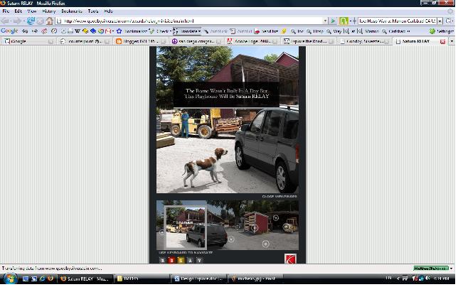
I found another example of great design in Saturn. In same reasons as Michelin, I think this website is successful. Its’ clear and consistent navigation leads audiences’ eye movement and make easy to understand the hierarchy. Large, whitish negative space counterpoints the rectangular main space. Flash animation makes the website a lot more active and attractive. It’s been so exciting to learn Flash!!
For my first blog, I have two websites that use Flash in different ways.

The first website does not use Flash as its main format. Instead, it has found an interesting usage for Flash that I found to be of importance. The Website is the offical site of author Chuck Palahniuk, whom most people know through the film adaptation of his novel, Fight Club.

http://www.chuckpalahniuk.net/workshop/chucks-essays-2008-25

I would assume that most people in this class are familiar with Napster, and the RIAA's lawsuit against people downloading music for free. The Internet and the ease at which media of entertainment are available create hassles and conundrums for copyrights. The webmaster of ChuckPalahniuk.net, however, found an innovative way to ensure the copyright nature certain essays written by Palahniuk featured on the site.

By having the essay displayed in a Flash format, it secures the document. Highlighting and copying do not work. Saving the entire web page does not work. Trying to print the document will only print the small bit shown on screen. You are left to simply scroll through the Flash document, read the article, and not to maintain a copy for yourself.

The second Website I explored has its entire interface in Flash.

http://www.pandora.com

Pandora is an Internet Radio created by the Music Genome Project, which was founded by Tim Westergren. The Project seeks to catalogue all of the music in the world by its various attributes: rhythm, instrumentation, orchestration, arrangement, lyrics, singing style, syncopation, et al.

Pandora works by the User inputting the name of an Artist, Song or Composer into the search field. Pandora is then able to use that input as a basis for recommendations to the listener. Obviously, for these purposes, more popular artists are more easily found than, for example, Russian Pagan Metal or Speed Folk. However, the Project has been able to categorize an enormous selection of music, and Pandora Radio is an excellent tool to find new music. The Radio itself is free to use, with personalizations of your own select stations.

http://www.pandora.com/corporate/

Allow Pandora to speak for itself. I encourage you to explore the site, as it will undoubtedly lead you to new discoveries of musical artists and/or stylings.

Monday, February 18, 2008

Beta Testers - by Veesh

Hi Everyone!


For my two examples in flash design I chose two video game companies. I'm an avid gamer myself so in the picking, I have one thats a well established design studio with mutli-blockbusters out(Blizzard Entertainment), and the other is a fresh new face in the gaming community with a design entirely in flash (Artix Entertainment) and a very promising future. The game DragonFable (Artix) is currently past open beta and while its still currently free to play, you do have to create a login to check it out. For my presentation I'll log in to my account :) and give a short demo of actual game play!! The game itself is amazing, as far as what they were able to accomplish with a browser as the game platform. Aside from the artwork and smooth flash design there is a lot going on in the background, as far as scripting and databasing, but all well connected and well working with the flash in the foreground. Below is a flash movie made by the game creator as a promotional and a very good look in to the actual game design. The art work, movies and sound is similar to game play. DragonFable


My second studio study is the Blizzard Entertainment group. Having designed StarCraft and World of Warcraft(alone with 9 million+ members) they are definitely the leader of multi-player online games. First off, I just want to show one image - that has been "flashed" by the designers of "Blizz". This website is a perfect example of what a professional team is capable of in flash. If you don't happen to have flash the image loads like a normal picture. However, if you're flash enabled, you'll see an almost invisible flash loading bar above the picture and then ! the picture comes alive. I think this is amazing flash work and reminds me of the "moving picture frames" where there is a light behind a painting.
The above example is just one image. To fully understand what Blizzard is capable of; I recommend that you visit this website If you click on the link for the mini flash site it takes you into a world of its own! This website was created for the promotion of the first expansion for the World of Warcraft game. It was made to give potential customers a peek at the new addition to the game as well as a ton of information for it. For my presentation I will also give a small demo of this site. Stunning artwork, solid flash design, and seamless mini games built into the site; 9 million people paying $10 a month for just one of your games: this is what I would expect from a company like that!

Sunday, February 10, 2008

Interactive multimedia

Livengood/ Nowack are a full serve marketing company that has been in business for over 30 years. They specialize in branding, marketing strategy, media management and creative campaign development. They utilize media planning, print, TV and other forms of marketing disciplines to facilitate their business.

I really enjoyed their web site and other links designed by this company. I found the Get lucky in 2008 to be very funny. I also liked the page transitions, use of sound and visual graphics using flash. The company applies a lot of humor on their web site and I found this to be very refreshing. Another thing that I noticed was that some of their clients were involved with nutrition and heath, such as salmonsafe.org and organicvalley.coop. This made me think that they seem to generally care about the welfare of the clients and their marketing campaigns. Other clients consisted of wide variety of different companies in the Pacific Northwest. Overall, I liked their use of flash software, audio sound and effective rollover techniques.

Get Lucky in 2008
http://www.lngetlucky.com/

A humorous site with a great concept, clean design, and some entertaining videos. The page layout was very well done. The video offers a sneak preview into what one would expect from different cultures around the world on New Years Eve.

http://www.in-ads.com/ln.html

This is the company web site. They do a very nice job on roll-overs and very funny explanations of their business and service. By clicking on their work you will be able to view the different clientele list as well as different forms of design work that this company incorporates into its layouts.

Here is a list of the different web-sites designed by Livengood/Nowack company.

http://www.marquiscompanies.com/

http://www.salmonsafe.org/

http://www.fife.com/

http://www.organicvalley.coop/

Friday, February 08, 2008

Siska's Design Exploration: Interactive "Public Service Announcement"

Hi, how are you feeling today? :) Yay~ I'm the first one to blog in this class...
Anyway... on with my first chosen exploration blog--design. I choose to focus on PSA or Public Service Announcement in the form of interactive multimedia website.

PSA, we all have seen them or heard about them on TV, radio and prints. Most of the announcements are about the deadly effects of smoking, health issues, drugs, etc. But have you really ever pay attention to them? Sometimes they can be creative and interesting or they can be down-right boring, straight-forward and bland.

In this blog, I will explore a couple of websites which attempt to educate our young generations on the deadly effects of smoking and junk food/drink. There are many different websites that promote ways to quit smoking but this one really caught my eyes and interest: http://www.quitdoingit.com/


It is a unique and futuristic interactive website that targets 18-24 years old to quit smoking. It applies 3D experience and clean interface for easy usability. The message the site trying to convey is very straight-forward and (amazingly) easy to digest and understand by its audience. When you entered site, choose the macro selection for full experience of the site. You'll be then introduced to a sarcastic but totally hilarious host in white lab-coat; my favorite line of hers: "no lolly-gagging". She acts as the tour guide to the site so we do not have to figure it out ourselves. I am impressed and amazed at the clean interfaces of this site: user-friendly selections, clean graphics, etc.

There are three important sections in this site: Research, Development and Results. Sounds boring? In the contrary, its actually a very creative effort on their part to break down the negative effects of smoking and to counteract smokers' resistant to quitting. In the Results section they have provided us with links to: fixnixer.com and Quitline to help us quit.

Hey, actually I am not a smoker but I think this site is pretty effective in delivering the message across to its audience. What do you think (you smokers out there)? :)

Moving on, the second PSA website I choose is on the topic of junk food/drink. The site is provided by the British Heart Foundation and believe me it is something that you would not have expected from a heart foundation of any kind: http://food4thought.bhf.org.uk/

Its target audience are mainly kids and teenagers (maybe some adults like me?). The message that they are trying to deliver across to us is basically junk food is bad for you, period. But the way that they deliver it is what sets them apart from other PSA media of the same message. They utilized interactive games to motivate kids/teenagers to learn about the negative effects of junk food/drink.

As you entered the site, you are being introduced to a 3D role-playing style game (has a Japanese game feel to it too actually). It involves a lot of user participation in every aspect of its message deliverance. Coupled with awesome graphics, we role-played as a cute little character hopping (or shuffling) across the town to complete different tasks. There is a "main site character" called Sick Rick who would show us the foulest and most disgusting videos of junk food/drink. Basically, it made me rethink twice before picking up that can of coke... :|

Overall, this site is definitely one of my favorite interactive site because it serves its purpose in providing entertainment and learning experience at the same time. A great blend of humor, education and awesome design to keep our young audiences interested--a great way to learn about the danger of too much junk food! I totally recommend this site to all kids who is chowing down a Big Mac right now...


Tuesday, January 22, 2008

Studio Exploration - Second Story Studios


Second Second Story studios, based in Portland, create interactive experiences for a variety of cultural and educational institutions. Their portfolio includes:

Face to Face

Saturday, December 15, 2007

New Media Exploration

There has always been advertisement on the radio, during your TV shows, bilboards when you drive down the street even on the internet. But advertisements today are much different than they use to be. Advertisements use to be simple and got the point across easily, then they went to funny but you didn’t know what the commercial was for till the very end. Today we are all into design, and making something that is unique but also odd and strange but in away that people like.. If you watch TV today and wait for a commercial (which isnt very hard as it seems more time is spent watching commercials then your television show) anyways if you wait for a commercial most likely you are going to see one of these commercials that are all into design, and making something unique but also odd and strange but in a way that people like.
One commercial that is different but memorable is the Guinness commercial. This commercial is very unique I have never seen something like it. I like how they have created the look of people being thrown at drums and playing a theme. They had to time this very accurately because if one person hits before the sound it would not seem real.

In the HP commercial with Vera Wang the incorporate computer animation with real life. This video shows that. By making real life interact with the computer animations you are giving the effect that Vera Wang is actually doing those things. That it is magic and she can pull things out of thin air aswell as make them disappear. She is saying that she did these things with an HP and that causes a viewer to believe that they can do these incredible things as well. This is the finished video.

Friday, December 14, 2007

New Media Exploration: Online Applications

From the examples that Karl showed us in class and from what I have seen online, I think that web applications are going to gain a stronger presence on the web. The two sites that I thought were interesting are very different from each other. One is very basic looking site that has some cool creative features and the other is more of an online application for editing images and more.


The first site is called TYPEFLASH, it is a cool site where you can create customized text or even a whole letter and send it via email to yourself or anyone. The level of customization is amazing, and surprisingly easy to use. The application of sorts, allows for customization of style, color, background,... I think it really shows the power that Flash has to offer web users in any field of use.


Picnik is the name of the second site. I don't know as much about this site as I would like to, but I know that it is an online application, built in Flash, that allows you to edit digital photos. I have used it briefly and I know that it is powerful and is basically a web-based Photoshop. It is extremely powerful, from what I can tell, I think that I would use it for creating cool emails or notes.

All I know is that the web is going to change, I think for the better. Online tools will become more powerful and websites will be more interactive and engaging. I also think that we are just starting to explore the potential for web-applications. I have learned a lot from this class and I definitely want to learn more. Thanks for all the help!!

Silly Sammy by Jana Pierce


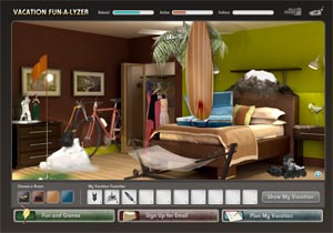
If you want to get away from it all, you should check out http://www.hungrysuitcase.com/ . Here you will find a site full of fun and great design. The main part of the site is their "Vacation Fun-A-Lyzer"where you pack different items into "the hungry suitcase." Based on the items you choose to pack, the program will come up with a destination the Carnival Cruise Line offers as a vacation. The artistry is excellent. Everything is top notch as far as design and functionality. As you are deciding what to pack, you go from room to room. There is a neat effect of the room spinning to the next. If you are idle in one room, the suitcase will prompt you to keep packing. Once you have chosen 10 items, you will click on "show my vacation" and then it will analyze your choices. You will have a somewhat personalized song at the end inviting you on your dream cruise. As an added touch, you receive a little fortune at the end that says what type of suitcase you are and why. Each of the items you pack have a value related to them such as relaxin', action, and culture. This site is very interactive and really leads the player through the process. Sometimes it does take awhile to load each stage of the game but the humor and interactivity makes it well worth the wait. I kept wanting to see what Sammy the suitcase would say next! While you are browsing the room, as you hover over an object, it will get bigger and a little dialogue will appear with a witty little comment. Sammy will usually pipe in, too. Of course, you can mute it but then you would miss half the fun.
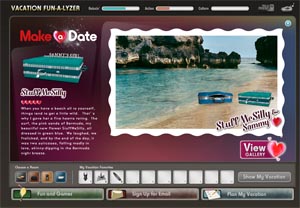
Another fun part of the site is "Make A Date" where you can make up a suitcase for Sammy. You choose the color style, accessories, etc and then, you are off to whatever romantic scene awaits! (we got to go skinny dipping in Bermuda!-) Try it ! it's funny! Of course there is a tab on the site to fill out an email form but they make that fun, too and say "lets be pen pals. I'll send you my news." The whole site is geared toward a younger crowd of cruisers. It is put together to keep you on the site and ultimately get your info so that they can target advertise to you. They know your interests and see a slice of what people are most interested in for vacation. it is a really fun way to get free marketing census information.
By Jana Pierce final post

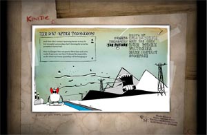
Kinetic By Jana Pierce

Kinetic Singapore is a design company in , wait for it... Singapore! In a word, flair! They've got it.


http://www.kinetic.com.sg/main.html


They don't take themselves too seriously and yet manage to hook clients including Lotus: http://www.lotuscars.com/ This site, I love, as supercar sites go. The only problem is that when you click on a menu item at the top of the page, the whole page refreshes. Maybe we should shoot them some code for a dynamically loading movie clip...


Nike: http://www.nike.com.sg/niketribes/page2.htmlOn the opposite extreme, They have today's trendy grunge/paint splot design nailed. This site really hits the target so to speak.
motorola : http://motorola.theadventus.com/merrymoto/Since it is Holiday themed, I though it appropriate to highlite. cute holiday animations, very simply done and short but you can still appreciate the clean vector look that stays fresh even three years later.
With all this high profile publicity, they still find time to do what seems non-profit org work. I find that fantastic! And there are actually quite a few projects.
what noise?: http://www.whatnoise.org/An interactive site that attempts to raise funds for hearing impaired children from disadvantaged families through a series of games and opportunities to donate.


I found this design company through the webby awards. They were nominated in 2006 for the best use of animation or motion graphics.Their site is out of this world. As self proclaimed design team not of this planet, the site is themed around robots from outer space who animate each transition. One critique I have is their style of animation is that which never stops moving (like you spun around the tire swing for too long in one direction and then tried to focus on the robot's squiggly arm.) It distracts a little from the content of the site but navigating around the site (from scene to robot scene) as you learn about the company is really the fun of it. And you can tell that they had fun making it! Anyone who uses their creativity to make a living can probably relate that when you get the chance to make something your own without the constraints of a client, things can get really out of control and quick. Take it from Kinetic and Keep the creative juices flowin'!

by Jana, two!

web graffiti by Jana Pierce


And no, I'm not just talking about blowing up someones website by dropping bombs on it. This could be the next level of the free flow of information. It adds a sort of z order to the whole free-flow of info.

I found a great overview of some of the top contenders at
http://www.techcrunch.com/tag/stickis/

Diigo
http://www.diigo.com/ is a research tool that allows you to share bookmarks and annotations.
Fleck http://fleck.com/ is basic and lets you post public or private notes on a page.
ShiftSpace.org a bunch of nerds! I watched some of their videos on the way their plugin works (boy could they use some of the creative minds in this class!) Anyway, the way it works is the plugin allows you to live edit any web page by pressing Shift + Space (clever ;-) and then the modified pages are called "shifts" and made available on the SSwebsite. The team plans on implementing "trails" which are hyperlinked collections of related shifts. With linking becoming the #1 traffic ranking draw, this can prove invaluable.
I think that this is the idea behind trailfire http://trailfire.com/ where you post notes on a webpage and string them together with hyperlinks making "trails."

This article goes into much more depth (and of course is linked to even more info!) and is definately worth checking out!

p.s. ShapeShift update...I think they heard my plea from the start of the semester. Their site is much more stylized since my first introduction. They even have a cool logo!


Video thumbnail. Click to play.
By Jana (not pete!)

Web 2.0 and bandwagon design.

I get it, I really do... Its just that I hate it.

Anytime creativity has a price put on its head and designers are pressured into a "fashionable" because someone defined it as "NEW!" and whats "in" or "c00l" or whatever (I ran out of quotes) I want to bleed from my eyes, throw my computer out the window and focus my creative career on painting with mud on cave walls. At least in my cave there wont be some monstrous corpulent corporate entity thats so large it cant see where its going wont have the power to influence and subjugate those ache to do something different.

I get that web 2.0 is supposed to be all about some new magic software that makes the web more seamless, interactive, and aversive... but its not. Its just a bunch of old dogs that have been there wanting to play all along except someone has tied them together and painted them with fluorescent stripes and said HERE, I have brought you a eight legged zebradog from mars and it cures cancer!

The masses look and say hey wow... that seems familiar... like something I used to like... but I've never had a zebradog from mars! I'll take it! Soon everyone is trying to keep up and the poor dogs cant run so well with half their legs in the air and all tied together but people need something new. Even if its not.

O.k. I get it. Vista with its triple glazed "glasstic" (I just made it up TM!) look has all the hallmarks of something new, I mean look, its glossy! Right? Reflective! Yea! That means its clean like a new car or a clean window, just be careful you dont walk right into it. The interface can get in the way when its compromised.

Art and creativity are ripe for compromise and even corruption. They are by definition what people perceive them to be and will be judged as such. So when you are creating, writing, cooking, doing anything that involves part of you in the process... every once in a while... dont draw from what is fed to you, look away from the neon and the commercials, look within and pull out something that is uniquely you. Its a great way to grow.

-Peter Ochabski
http://www.ArtScientific.com

The art of life with the internet.

My tech exploration is of something that may seem so obvious as to be done to death. However I really dont think people are aware of the unique moment in time that we have the privilege of experiencing. Never in all of human history has so much information been so available to so many people, not even close. Information and knowledge have found a radical catapult in the seemingly infinite web of computers and people. This shift in the control and flow of facts and fiction has stripped many of those who once used information for their malevolent gain.

With this unique freedom comes the responsibility to defend its uncontrolled and uncensored use with zealous and religious fury because I know that this interconnecting of human beings will be the most significant milestone in our evolution since we noticed our oposable thumbs.

We have not even begun to feel the effects of what happens when we are all able to learn any skill, research any location, any action, learn any history, find any cure, and solve any problem with a simple question to a virtual library of knowledge that eclipses anything we can currently comprehend. Scientists will solve all problems faster, artists will find inspiration and technique at will, and humanity will swell with empathy, unity, and enlightenment.

Its all about the whole being greater then the sum of its parts but NOW those parts can finally become one on a global scale. With each individual carrying unique insight to the world as a lone and isolated puzzle piece we now have a path into the future that offers us a way out and a way in at the same time.

Of personal interest to me as an artist will be the ability to present my creative concepts without the filters and shackles of reality.

Watch for it, the next giant leap will be the direct connection the the brain, bypassing the warm but heavy flesh. Once the electric pulses that currently pump information across the world on cold hard steel and plastic can be interacted with directly by the electrical impulses that carry our thoughts and feelings the full potential and our future will be realized.

See you then,
-Peter Ochabski
http://www.ArtScientific.com

Design Exploration: Rapp Collins Worldwide & Schematic

I chose to do my Design Exploration on Rapp Collins Worldwide and Schematic. They are both marketing companies that have major companies for clients. They focus on creating branded experiences; and both their websites are just that!

I have some nice screenshots of the websites to show, but for some reason Blogger won't upload the images...??

I really like the design of the Rapp Collins site, for its originality, consistency, and attention to detail. The design strays from the template style for most websites, by using an interface that is not only unique, but also clean, artistic, and visually interesting. It does this while still keeping the possibly less intuitive user in the loop, with the option to use a more conventional nav menu.

The layout is very clean. In the intro, we are introduced to our site guide, a little humming bird, who is actually the result of the animated preloader. Then we head into the main site, which does not seem like a standard website at all, but more of an exploration of artistic expression. The site is still easy to navigate because it presents you with the nav menu from the beginning, which gives you clues on how to navigate the different locations. When you go to a particular location either by moving the mouse down the page or via the menu, you are greeted with a nice animated preloader that loads the visuals for that location. The visuals for each location are playful animations that are just awesome. Then if you choose to enter that location a really cool thing happens. The main page blurs out into the background and flowing vines of cables, coming from the main page, connect you to a new window with more info on that topic.

The feeling that one gets is that you are never really leaving the main page, all while still getting the info you want. The whole site and the windows themselves are an awesome combination of crisp raster graphics and stunning 2D vector illustration. THE CONTINUITY IS AMAZING!!!! This site is a brand experience in itself. It is inspiring design work! The amazing thing is, is that all this does not overpower or detract from the goal of the site, but only lends to the experience.


The website for Schematic is just as well designed, but with a completely different style. The whole website is on one huge page that the user navigates, one tile at a time. So, when the page loads, you start at the Home tile, but you can see that their are more tiles surrounding it because they are partially visible and are allowed to run off the screen. They still give you a nav menu that travels with you to each tile, but its content changes to suit the current location. Going to main categories of the page is a cinch, and going the home tile is just as easy. You also have the option to zoom out at any time to see all tiles/pages that you can navigate to. THIS IS AWESOME!! I am amazed at how easy and quick it is to move from page to page. On each tile you can read the written content, admire the graphics and design, or you can view videos/images that are present on that page. The attention to detail and level of consistency, which is very important, is top level.

Both these sites are amazing! They are an inspiration for new and cutting edge design. YOU HAVE GOT TO CHECK THEM OUT! I can see now, why Karl wanted us to do these explorations. Thank You Very Much.

Thursday, December 13, 2007

New Media Exploration:Andy Howell and Converse

Today I think multimedia has a big influence on the interaction of visuals and people. Just by the different colors,images,audio,and other elements of a multimedia product affects a persons reaction. Subconciously or not a person reacts to a product based on its advertising. A good example would be converse.com. This website gives you a lot more than just shoes. The different types of flash based interactions and the graphics are amazing. When you enter the page there are several people standing holding letters that spell out HAPPY HOLIDAYS. When you click on each one a different type of shoe is presented. There are several different types of interactive media in this page, and all of it "pursues" the consumer to stay longer and actually check out the shoes, rather than just clicking next to see one shoe at a time.

Multimedia not only helps agencies promote their products but it also helps artists show their work in interesting ways. For example, in Andy Howell's website andyhowell.com the flash based website helps his sketches and paintings come alive. In the intro he has one of his main characters which is a colorful monster randomly running around the screen while his other flying character is slicing the monster to pieces. Then a city pops in and out of the screen and his table of contents suddenly appears. All that just gave an animated, interesting look of what his art is like. He continues the excitment in his website by making the buttons animate the city when you click on them and also by making slide shows for his different types of art and more.

Overall, multimedia is really the future in advertising and art because it is the ultimate way to present "art" and you can use it to express or portray any other media.

Wednesday, December 12, 2007

Design Exploration

Neostream creates compelling interactive media designs for many companies using flash. Their clients include Samsung, LG, Fujitsu, Unchs, Volvo, OXO art, New Pencil, James & Taylor, Cilek, KOCCA, Dead Game, Botany Bay Council and KITA. I chose Neostream because when you enter the site they immediately engage your curiosity with a flash developed cartoon character. The character then tosses flames around his head each flame then directs you to a different page. The first flame takes you to the client’s page. The second flame redirects you to the showroom page this page images you by allowing you to pick where you want to go you then need to click on the word of where you would like to go then drag it over to the character where he then smashes the word to pieces and you are redirected to where you would like to go. The other flames take you to the company skills, news, future products and more. I like how they have made a very simple looking but extremely complicated character that interacts with your mouse. The site is very simple and does not take away from the main focus of the site, which is the animated character. The animated character is very appealing and just asks you to see what it can do. The character engages you in the site and its activities.


This site is not only clean looking but it is also very easy to navigate. This site is consistent but also very different on every page. Every page is simple and has as little distractions as possible. On every page there is the cartoon flash character along wit some other flash design that is not used on any other page. For example on the clients list the page opens up with a tree, the clients are spread all around the tree. When you click on a client leaves fall off of the tree.


I believe that the artist idea was to create a simple way for people to explorer what Neostream can do for its customers. The artist wanted to make the site interactive and fun, to cause you to want to explorer every page. For every page to be as different as the next. The artist accomplished this idea very well. The site is very simple with a plain white background; the only color, visual, or animation is the main display along with the animated character.

Studio/Artist Exploration

Screenvader has created a very compelling website using flash. The site is very simple but creative at the same time. There is a white background with black lettering. When u move your mouse the main menu moves allowing you to look through the many different sections that you can visit. when you role your mouse over one of the navigation buttons a picture pops up showing a small thumbnail to the page that you would be redirected to once that button was clicked. In the music navigation is a similar thing; pictures do not pop up rather the name of the song that begins to play when you roll your mouse over the button. The contents of the buttons that link you to other pages are a variety of things. The section is called media and algorithms, some of the links take you to images of blueprints all jumbled together. When you click on the picture the view changes, there is never the same view twice. The rest of the links take you to flash videos, which seem almost as if they are those types of videos that Hollywood always depicts as a brain washing video. The videos are strange and don’t make sense but you just don’t want to look away, you want to know what comes next. I like this artist style there is something different about his way of expressing himself. Each video or picture that you go to is never the same. The pictures when loaded every time you click are tossed around to random areas giving different designs every time. When the videos load the sequence of images that appear are randomly selected, it never starts the same. And on the left side of the screen you are shown which pictures are being loaded and mp3s all in random order every time. I think that the artist made everything so random because life is random. Things go by so fast that you need to pay attention to what is right in front of you because you may never see that image again.

Monday, December 10, 2007

Design Studio Exploration - Preloaded

Finding a really impressive design studio can be a bit daunting, as you swim through the sea of “award winning” designers producing something akin to what we learned our first month in class - good for a laugh, if nothing else.
Somehow (Flash Forward?), I found Preloaded Studios (http://www.preloaded.com). According to their website, Preloaded aims to push the boundaries of creativity in order to fulfill client goals and users needs ("We do nice things, we could do them for you, too"). I found the studio after researching the origins of a game called CDX (http://www.cdx-thegame.com/). The game is compelling and well put together - although I didn't have nearly enough time to explore it. Preloaded’s website, however, was stunningly understated. For a company that pushes the envelope of creativity, this website seemed somewhat underwhelming – at least until I used it. It is a clean and effective site, even if it seems to understate their work.
Under the company’s clients (“what we do”) page, the clients were laid out as “case studies”. Visiting a study not only introduced to the work, but the reasoning behind the design. “Cases” can be searched by client, market, platform or service, allowing for several options to see why and how they do what they do. Within each case study, they outline the Goals of the project, followed by the studio’s “solution” and finally the result of the campaign/site/project. Of course, you can link to the project from the case study, as well.
From these case studies (there were many), it seemed evident that Preloaded,works very closely with its clients to meet their goals and visions. They focus heavily on branding and on creating the vision set forth by their clients, then going beyond that to impress the users of the site. Preloaded focuses very much on user impressions and interactivity, with a goal of keeping users coming back. The idea of creating a site that immerses the user and makes them a part of the site seems paramount to this group.
Preloaded seems to excel in user interactivity. Several of the sites that I visited invited the user to participate, rather than just watch. A fine example is a site that they created for a BBC espionage drama called “Spooks”. In the site developed for the second season, they created a Grid Ops (http://www.bbc.co.uk/drama/spooks/. The site invited users to participate in “missions” (games) and tracked their progress. New missions were rolled out over a 10-week period, inviting users to come back. The site looks like a police station, using video clips and Flash to give it a realistic feel. To make the site even more compelling, the site tracked users’ progress and gave them scores based on several dimensions. At future logins, those scores were used to determine which tasks the user might do better in, etc. This not only made the website interactive, but personalized as well. According to the “case study” this site ended up achieving double the target user registrations desired by BBC.
Another really fun site created by Preloaded was for another BBC series http://www.bbc.co.uk/history/interactive/games/death_sakkara/. This was a historical drama taking place in the 1920s and dealt with the fad of Egyptology and the discovery of the tombs of Egypt. The site was created to go along with the site, but to be a stand-alone narrative in its own right. This ended up being a game, called "Death in Sakkara", that follows the same subject matter as the television show. The site asks the user to log in a they are given a “secret code”. This allows their progress to be saved, again encouraging users to return to the site. Because the site is historically accurate, the game provides both “value added” content to the TV series, and is an educational experience.
Looking at these (and other) sites, it is apparent that Preloaded Studios excels in user interactivity with their projects. Their goal is not only to meet clients’ expectations and advertise a product, but to give users reasons to return to the site. This makes their clients’ websites not only informative, but actually exciting and immersive. In many cases, users may only return to a website once, to gain or clarify information; in the case of many of the sites by PreLoaded, the user has good reason to return and interact with the site (and ultimately, the product) over and over again

Thursday, December 06, 2007

TASTEFUL SITE DESIGN Chipotle.com

Chipotle.com
This little burrito manufacture has created a very tasteful flash site. I never gave this fast food joint much thought, but after visiting their web site. I wanted to make weekly visits. So it scores high on an effective marketing plan.
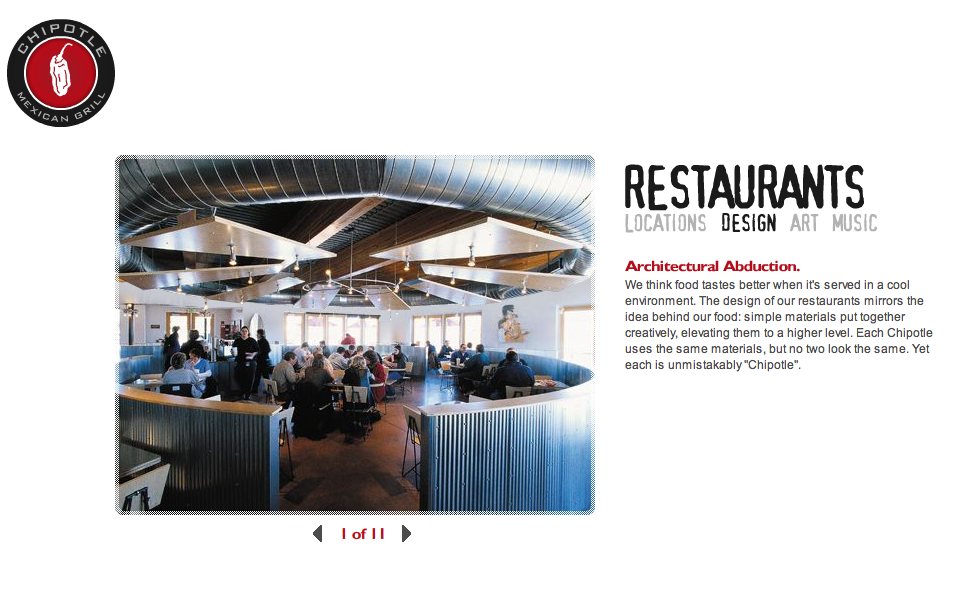
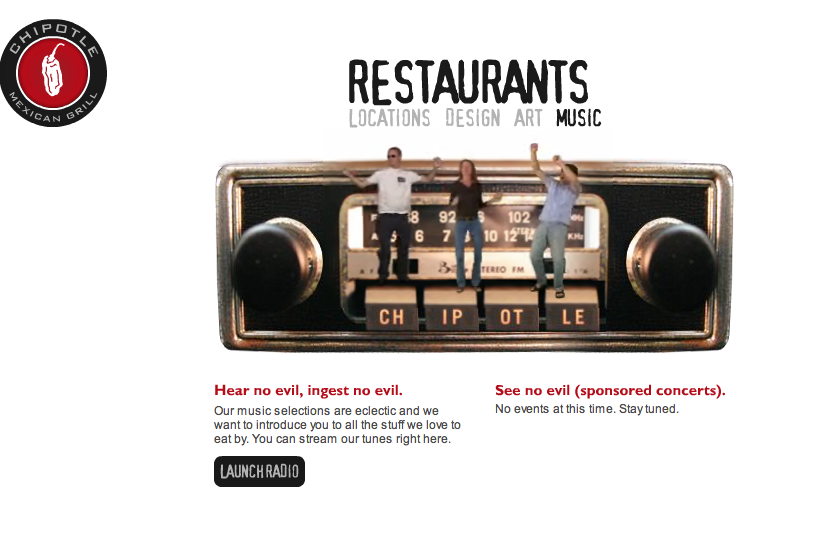
The sites design is crisp, clean and well balanced and hip, just like their food. I was as inspired to check out every link to see what creative flash surprise was hidden behind it. Very entertaining. The site has a great sense of humor, interesting photos, strange and humorous sound bites on each page, a link that featured artist, Bruce Gueswel who design the art in the restaurants, a radio station, which plays the eclectic world music that is piped into their restaurants, a live cam on the food preparation, video contests that utilizes youTube, allowing you to watch the finalist from the commercial contest, free downloads, an apparel store, a pen tapping page, an employee pet dog page, and more.
You learn so much about the company, their architecture, the art, the tribal music, and the food. They are a green restaurant using organically grown vegetables and meat. Fast food with integrity.


The location, design, www.chipotle.com/#flash/restaurants_design

the Art: www.mayatekinc.com/,
Bruce Gueswel artist for Chipotle restaurants


and the music, www.chipotle.com/#flash/restaurants_music, of the restaurant.

The use of human video in flash site gives you a connection to the restaurant, you feel like you know so much about them. So you are happy to spend your money there. A very entertaining clean site that I find my self going back to and wanting to share with friends. Their Fash website gave me a newfound respect for a restaurant I may have never visited.
(although architecture of the Chipotle in Vista looked nothing like the restaurants shown on the web site, the burrito was still fresh and delicious.)
bryn best
site design blog

The New Generation of Marketing

For most of all of our lives, traditional advertising has been set up to essentially to catch our attention while we are going about doing *other* things in our daily lives-- watching TV (commercials), driving down the street (signs and billboards), reading the newspaper (classifieds), listening to the radio (commercials), and more recently while surfing the web (popups, banner ads and spam).

Traditional "interruption" advertising is far from going away. It seems that the space between commercial breaks is shrinking, commercials themselves are getting longer, and in places like myspace and ebaumsworld you can usually find three times more sponsored ads and links than actual website content. However, we are seeing more companies making a subtle shift AWAY from "interruption" marketing to actively ENGAGE consumers in surprisingly positive ways. The new generation of marketing is no longer about distracting consumers from their destination long enough to ingrain your brand in their brains; the new generation of marketing is to BECOME the destination.

The New York Times released an article in October that underscores this exact shift in Nike: http://query.nytimes.com/gst/fullpage.html?res=9503EFD81E3CF937A25753C1A9619C8B63.

Stefan Olander, the global director for brand connections at Nike, sums up their new marketing goals pretty well: ''We want to find a way to enhance the experience and services, rather than looking for a way to interrupt people from getting to where they want to go" (qtd. in article above). They're allocating much less of their advertising budget to traditional marketing (like television and billboards), and more of it in very nontraditional marketing, like creating a fitness-centric social network (Nike Plus) that may someday give Weight Watchers a run for their money. (I don't think anyone here will be surprised to see that nike.com is developed almost exclusively in flash.) http://nikeplus.nike.com/nikeplus/

Other companies are taking a page out of YouTube's book and creating websites that seem to be dedicated to just to entertaining consumers. We've already looked at Altoids.com, and this is really another great example. You're not going to altoids.com to actually buy altoids, or even to look at the nutrition content. You're going to altoids.com so you can send your buddy a singing telegram, watch funny videos, and play games. The altoid brand is firmly established in their mind; but because he is being entertained, the consumer really doesn't mind this one bit.