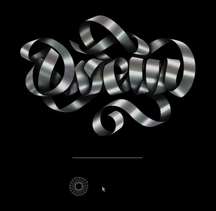
The look of this website is so clean, organized, and intriguing. The usage of just black and white really makes the images pop and gives off a very professional feeling. The page is very easy to navigate. It has a wonderful way of being simple, but not boring. I really like how each subgroup's web design pertains to the topic of the group. For example, under the grafitti tab, the page is set up as a cityscape with changing the billboard fronts each time you click on a different type of grafitti. While there are differences in all of the pages, there is a very cohesive and obvious theme running throughout them all.
Saturday, October 31, 2009
Studio/Artist Exploration :: Becca Patterson
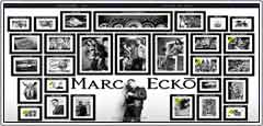
I chose to looks at Mark Ecko's artist website. He is an artist for the brand "Ecko" as well as works on many side projects for a variety of clients, including magazines, cars, sneakers, tv shows and philanthropies. This first thing that drew me to his website was the homepage. It is comprised of a background that looks like a room in an art gallery with him standing in front of his exhibition. His name is boldly written on the wall and there are plenty of framed images "hanging" on that same wall arranged very neatly. When you drag your mouse around the page the images shift to follow the direction your going. You can click on each "frame" to enter into a more specific gallery pertaining to whatever that frame's title says. When the website is changing from one gallery to the next the frames drop off the side of the page and are replaced by new ones, great animation. Once inside of that gallery, it is easy to navigate back to home, or even to keep exploring deeper into that topic. The headline is continuous and serves as the constant navigational bar no matter which page you are currently on, and gives you options to jump not only back to the home page but to any other subgroup.

The look of this website is so clean, organized, and intriguing. The usage of just black and white really makes the images pop and gives off a very professional feeling. The page is very easy to navigate. It has a wonderful way of being simple, but not boring. I really like how each subgroup's web design pertains to the topic of the group. For example, under the grafitti tab, the page is set up as a cityscape with changing the billboard fronts each time you click on a different type of grafitti. While there are differences in all of the pages, there is a very cohesive and obvious theme running throughout them all.
Monday, October 26, 2009
Studio/Artist Exploration
The website know as "creaktiff" was created by four designers; casura, jocker, karl, and deus. These designers who created the site are all from France. Their started out with phtography and still to this day have a wide imagination to do the artistic things they do. The website has a very appealing front page which draws your attention to a house on a one way street which all appear to be sitting on a cliff. its obviously a great creation. The colors blue, orange, red, and green were used in arrows and are very appealing and stick out almost to be the main focus. These designers have caught the eye of many people and will continue to.
I liked one of their short movies they created on this website. its very simple but creative, its funny though how they drew this characters on this movie. also there's a short movie of a chair, designed by karl. its fun how these designer designed this site in a house of no where where the links are on each windows. they have everything to check out such as; links, websites, photos, streetart, design 3d and print. they don't have much information about them, but its an amazing work they have done.
I found this amazing website site of Disney, its a Disney chanel TV. show made at soleilnoirr. it has links to either watch their favorite shows or play their favorite games. I think this website was create for childrens. also on this page has tabs to click, such as TV, Film, Music, and there's a lot of options to choose where to watch videos, cartoons, or films, very nice creative for childrens.
Photos: these photos were taken in france, paris, and roma. they also have some photos in design 3D that seems they were create in very strong colors. their outlines are straights and fancy.
I think these designer came up with this amazing idea and excellent job for the people to explore their work. is fun also for the kids to check out this sites of disney to watch and click any links of disney sites to have fun.
Tuesday, October 20, 2009
Design Exploration :: Sean Ashcraft
1 :: Organic Grid - Portfolio Site

It's a pretty simple site, but what I liked immediately was the graphic appeal. And when I started mousing around, the addition of the sound took it to another level. I probably moused over the sequence of bars 10 times before actually clicking on one.

I thought it was a pretty fresh take on site navigation. Of particular interest was that each nav bar seemed to be its own little Flash movie, each with its own loading script. Pretty slick.

Once you click in, you've got a couple different options to get around the site. You can either use your arrow keys to check out the content, or the bar across the bottom that comes up when you mouse over that area.

You can even check out the older version of the site, which is in itself a pretty cool Flash exercise.
------------------------------------------------------------
2 :: Yo Gabba Gabba! - Kids TV Show Site

Where do I even start with this one?! There is so much fun stuff going on with this site, all courtesy of creative minds and our pal Flash.

First, when you come to the site, you immediately know you're getting into something fun. From the use of colors to the fonts and graphics, it all speaks to the intended audience. And is even cool for older peeps to explore.

The loading script is even fun, and the way it transitions to the home page is really nice, as if it were peeling back the cover to reveal even more good stuff. Once you're in, the layout is pretty basic, but the content is far from. You can check out videos, play games, and interact in countless ways. They even have a separate area that takes you to news and their blog.

The interactivity at the bottom that allows you to identify each of the characters is a particularly nice touch. So get in there, check it out, explore. It's pretty addicting really, and I'm way older than 10.
It's a pretty simple site, but what I liked immediately was the graphic appeal. And when I started mousing around, the addition of the sound took it to another level. I probably moused over the sequence of bars 10 times before actually clicking on one.
I thought it was a pretty fresh take on site navigation. Of particular interest was that each nav bar seemed to be its own little Flash movie, each with its own loading script. Pretty slick.
Once you click in, you've got a couple different options to get around the site. You can either use your arrow keys to check out the content, or the bar across the bottom that comes up when you mouse over that area.
You can even check out the older version of the site, which is in itself a pretty cool Flash exercise.
------------------------------------------------------------
2 :: Yo Gabba Gabba! - Kids TV Show Site
Where do I even start with this one?! There is so much fun stuff going on with this site, all courtesy of creative minds and our pal Flash.
First, when you come to the site, you immediately know you're getting into something fun. From the use of colors to the fonts and graphics, it all speaks to the intended audience. And is even cool for older peeps to explore.
The loading script is even fun, and the way it transitions to the home page is really nice, as if it were peeling back the cover to reveal even more good stuff. Once you're in, the layout is pretty basic, but the content is far from. You can check out videos, play games, and interact in countless ways. They even have a separate area that takes you to news and their blog.
The interactivity at the bottom that allows you to identify each of the characters is a particularly nice touch. So get in there, check it out, explore. It's pretty addicting really, and I'm way older than 10.
Wednesday, September 30, 2009
Donna Ackermann
This is a interactive game site. I love how simple the site is. It is very easy to use and kills lots of time when you are bored. You can play different games in real time with other people all over the world.
Some of the games are just for fun with no point to them at all. Like Letters and Scratchpad. With these two games you can ether play around and do what the game is intended for or you can just mess with people. You can draw over their drawings or you can move their letters around while they are trying to spell a word.
Some of the other games you can play with just one other person. Such as 8 Ball Pool, Checkers and Tetris.
You also have the choice to play single player games. Those ones are Extreme Heli Boarding, Elite Base Jumping, Base Jumping, FWG Knight II, Rodent Tree Jump, Mini Golf and Crazy Cone 2.
The last game is my favorite game. I can play Jigsaw for hours. They have three different levels you can play Easy, Medium and Hard. The puzzles also change every day. They have about ten different puzzles that will rotate throughout the day. Then the following day those ten puzzles are all different. So the more dedicated players are not doing the same puzzles over and over. Most of the time people just play the game, but every now and then you will get a person that wants to take the puzzle pieces and move them around and mess up everyone's hard work. If they do this for to long then the can be blocked from the game for three puzzles.
There is an option to have an account with Lunchtimers. But the only difference between a member and a nonmember is that you can have a cute little avatar.
Infamous
http://www.infamousthegame.com/#/en_US/home
Well I am a pretty big gamer and i have recently been playing this game called Infamous on my Ps3 platform. So i decided to check out the web site for the game and the first thing i noticed about the site is that when you scroll over any of the tabs you get a lightning effect which is the main power of the hero in the game. The site is done in a graphic art style that the game is also built around instead of using 3d animation for cut scenes. I cant get the pictures i got of the site to get on here so Ive posted the link. But what i also noticed that was really neat was that it was entirelly build in flash. It even has a built in mini game that was really fun to play which is basically a flash version of the game in a fun little game.
Sunday, September 27, 2009
Design Exploration: Sonny Sachs
I am a Lover of Exotic and Luxury Cars, so I decided to Explore the Design of Ferrari's Website for their new take on the Classic Ferrari California.
The first feature I noticed was the clean Showroom kind of feel, with Navigation Tabs that Include, Downloads, Register, and the Main Ideas which are Hear, See, and Feel.
In the Feel Tab or Configurtor, the center Image which you cant miss, of the Ferrari Red California has buttons that let you click to view the front, back, and sides of the car, and Tabs located at the bottom right that pop up to let you put the Top down, view the interior, choose a colour for the car, the trim of the car, and wheels for the car, making the website have a more Warm feel making you feel like the car is yours and you can choose what you like. This had to be one of the most time consuming parts for the designer as, he had design it where you could make the car you like.
In the Hear Tab, You will notice what looks like a Ferrari California Hidden in the Dark, and you will see Four Different Tabs Labeled, "Awaken The Soul", "Release The Spirit", "FeelThe Rush", and "Embrace The Thrill." When you click Play on each of these you will notice diffrent Sounds from the Ferrari California that make you feel as if you are driving the car yourself.
The See Tab, I thought definitely Described the Car as it looks as if it is in a showroom or Garage somewhere in California with the sun setting and Tranquil music. See features a Slideshow of the car, and another Tab labeled Equipment which opens into more navigation features, Design, Performance, and Innovation, with more features for each of those.
I thought this Website Has tons of information, but at the Same time the Designer made everything so Neatly Organized, and clean with not to many crazy effects, and easy to navigate around when you roll over Tabs the Designer made more of an Accordion type Navigation to let you know what your on and add Clicking Noises to show Links are active. I think some goals and objectives the Designer was trying to get out was to show that this Ferrari is a classic and at the same time trying to give you a personal experience of what it would be like to own this Car. The Designer definitely made the website feel warm and welcoming.
2.) Gatorade
The page loads with a Gatorade Bottle Slowly being what looks to be consumed with different Actions being said, and when its finished it says "Thats Gatorade." Which had to probably take the Designer a little more time to make it look realistic.
The Product Page is in Black and White with all the Drinks lined up horizontal and when you scroll right or left over the drinks, They turn into their liquid colors, with a description of what your about to click on. When you click on a Drink there is a widescreen video of athletes, description and benefits of the drink, and other flavors with colors to pick on.
The Athletes Page and Player of the Year Page, are also in black and white until you roll over a person and their description shows up and they are in color, but instead the Designer gave these pages a Carousel feel instead of just horizontal. Each Athletes has their own page when you click on them with a video and description.
The Designer again had to take a lot of information from the different Drinks, and Athletes and figure a way to make everything easy to navigate through and also be easy to get back to something else. Also, making an effect on each word or thing to show that it is active to click on. Gatorade.com is another clean website with lots of information but kept well organized.
Friday, September 25, 2009
Blog One: "Luovo"
(Sorry but my screen shots seem to not be working, but here's a link to the site: http://www.luovo.com/eng/mainPage.html)I chose a website called "Luovo" for my first blog. "Luovo" is a website built for an Italian animation film directed by Dario Picciau. I find the animation of the film very interesting. This site gives many interesting facts on the filmmakers and history. The design is rather simple and very easy to navigate through so users of all levels can use it. After you get passed the splash screen, there is a slide show of images from the film and what seems like light snow going across the screen. At the bottom of that, there is an arrow repeatedly pointing to the left side of the slide show and when you roll the mouse to the left a menu comes up. There, you can view the trailer, news, read an introduction of the film, learn about the author or director, and they even let you view information on each of the animated characters from the film.

They also allow you to view drawings they did for the film.In the background there are very interesting abstract designs. Above the slideshow, there is a list of awards they won and were nominated for. The background music is very beautiful and plays well with the website design, giving the site a mystic and surreal mood.
DAFFY'S website!!
Daffy's website is interesting. It uses allot of flash functions and a variable cuser function, that tracks your mouse curser on the web page. The main web page has a large image of a person modeling one of there latests clothing outfits. In the center of the main web page has seven
small rectangle menus of radom sizes. As the curser moves over one of menus, it automatically
expands by approxiately twice its orginal size and displays more information about the next
web page like a context page of a text book without actually selecting the menu. The back ground page also changes to an image that fits the subject matter of the menu. When you select
one of these small menus by clicking once, the web page jumps to a new set small rectangler
title pages with more information. After this there are the standard set of web links around the web page. I though how that menu page is presented was very attractive to the visitor and displays the most common that weman are insterested.
Design Exploration: Becca Patterson
The website I chose is http://www.starbuckscoffeeathome.com/. I found this website on FWA and was drawn to it because I'm an avid coffee drinker. Starbucks brings in all types of customers and can really appeal to just about everyone. That's where this website comes in.
The site is very clear and organized, incorporating the chalkboard feel as if you were in a Starbucks coffeeshop. The first three choices are: "Explore our Coffees", "Find My Perfect Coffee", and "Visit the Barista Gallery."
As you scroll over each option, the text animates itself and becomes a lifelike drawing. The sounds include chalk on a chalkboard as well as coffeehouse chatter. When you select your option the current screen erased as a chalkboard would, even leaving a little hint of the most previous artwork. Starbucks gives you an interactive way to decide what coffee fits your personal taste. It goes through 5 steps, asking thinks like how much acidity:
Everything about this website is very uniform, you know that it belongs together and you know that it belongs in Starbucks. If you don't want to chose any of the three options on the start screen there are always the blends shown below that you can click on to discover more information:
This website is a great link between the customer and the store and provides necessary information without having to go in and inquire. It also builds a fun relationship between the consumer and their coffee.
Studio/Artist Exploration
Design Exploration: Sean Wilkinson
www.sketch.odopod.com
For my site, I chose Odosketch. This is a very interesting flash site I found on the FWA. The site itself seems very simple; when you first open all you get is a button that says "New Sketch" and thumbnails of various pictures. The various pictures were drawn by everyday people, but with the help of the digital canvas their images have a certain look to them that allow each picture to come out different.
Odosketch, created by the design company Odopod for Adobe says, "Odosketch seeks to recreate the decidedly non-digital experience of working with a sketchbook. Its papery textures, variety of brushes and intentional imperfections make you forget you're working on a screen." And coming from a company that has worked with Nike, MTV and Playstation it is nice to see a project that is not commercial.
When you first go to Odosketch, it is recommended you make an account and from then all all of your sketches will be saved, and if they come out well they could be featured on the homepage. Now, the use of flash and what I think is the best part of the website is the recreation of every image drawn. You can click on one of the thousands of sketches and see from the very beginning exactly how the person created it; which not only helps you learn the process but give you great ideas.
The Finished Product:
The Process: www.sketch.odopod.com/sketches/60418
So, this is a site that from the start doesn't look like a very heavy flash site, but once you get in the finite details of it you find a wide use of flash. Not only does the site record every stroke that goes into a painting, they also allow the artist or fans to copy and paste the html code that allows for the process flash to go on your own site.
Thursday, September 24, 2009
Design Exploration :: Sean Ashcraft
1 :: Vitamin Water :: Consumer Site
This is one of my favorite consumer-oriented web sites. The design is very crisp and modern, the site is easy to navigate, and there's just enough interactivity to make you want to explore further. Vitamin Water isn't even the healthiest of flavored water drinks available, but the site gives you the feeling it is.

For starters, I think what this site does very successfully is to give you the sense that you're interacting with a 3D object in 2D space. The way the bottles fly in, then re-orient in a twisting, vanishing perspective is very effective. That, coupled with the use of scale and selective focus really gives you that sense of dimension. Although this can never replace the sensation of holding the bottle in your hand, it puts the consumer squarely in the metaphorical aisle and allows them to explore the product.

The site has a very organic feel even when you're just looking at, but when you start to mouse around, it becomes even more organic in nature. The way the top nav moves when you mouse over it, the vignettes in either corner, the way the bottles react as you move the mouse over them, this all encourages the consumer to dig deeper. I found myself moving the mouse back and forth on the bottles just because it was fun to make them move.
You can click a bottle for more info, click the "go for more" button, scroll through the flavors, there's just so many ways to get what you want out of this site. Once you click in, the transition of the bottles flying at you is a nice touch, furthering the notion that you're delving into the site. When you get to the page of the chosen flavor, the addition of the design elements reinforces for the consumer what the flavor is all about. Plus, you can dig even deeper and find out how the particular flavor benefits you with the various vitamins it contains. Pretty cool.

I could go on and on but you should give the site a spin, you won't be disappointed, even if you don't like sugar water, I mean Vitamin Water.
-----------------------------------------------------------------------
2 :: Inglorius Basterds :: Movie Site
This site really gives you a sense for the gritty nature of this movie from the moment it loads. The weathered and scarred bat with the helmet hanging from it, the textures in the the type, the little splats of blood, all clues as to what's going on with this flick. And let's be honest, who wouldn't like the idea of a bunch of Army guys wasting Nazis for sport during WWII?

But I digress... the site makes really nice use of layering and depth with the foreground, mid-ground and background images, and the way each of the various elements loads in keeps your interest and encourages you to dig for more.

One pretty slick feature is the customizable wallpaper generator, or "Basterds Builder" you can explore in the downloads section. It gives you the ability to select from different backgrounds, characters, objects, etc. to create a custom wallpaper. Super cool use of Flash that I can't wait to figure out how to do.

Check out the site, check out the movie. They both rock.
This is one of my favorite consumer-oriented web sites. The design is very crisp and modern, the site is easy to navigate, and there's just enough interactivity to make you want to explore further. Vitamin Water isn't even the healthiest of flavored water drinks available, but the site gives you the feeling it is.
For starters, I think what this site does very successfully is to give you the sense that you're interacting with a 3D object in 2D space. The way the bottles fly in, then re-orient in a twisting, vanishing perspective is very effective. That, coupled with the use of scale and selective focus really gives you that sense of dimension. Although this can never replace the sensation of holding the bottle in your hand, it puts the consumer squarely in the metaphorical aisle and allows them to explore the product.
The site has a very organic feel even when you're just looking at, but when you start to mouse around, it becomes even more organic in nature. The way the top nav moves when you mouse over it, the vignettes in either corner, the way the bottles react as you move the mouse over them, this all encourages the consumer to dig deeper. I found myself moving the mouse back and forth on the bottles just because it was fun to make them move.
You can click a bottle for more info, click the "go for more" button, scroll through the flavors, there's just so many ways to get what you want out of this site. Once you click in, the transition of the bottles flying at you is a nice touch, furthering the notion that you're delving into the site. When you get to the page of the chosen flavor, the addition of the design elements reinforces for the consumer what the flavor is all about. Plus, you can dig even deeper and find out how the particular flavor benefits you with the various vitamins it contains. Pretty cool.
I could go on and on but you should give the site a spin, you won't be disappointed, even if you don't like sugar water, I mean Vitamin Water.
-----------------------------------------------------------------------
2 :: Inglorius Basterds :: Movie Site
This site really gives you a sense for the gritty nature of this movie from the moment it loads. The weathered and scarred bat with the helmet hanging from it, the textures in the the type, the little splats of blood, all clues as to what's going on with this flick. And let's be honest, who wouldn't like the idea of a bunch of Army guys wasting Nazis for sport during WWII?
But I digress... the site makes really nice use of layering and depth with the foreground, mid-ground and background images, and the way each of the various elements loads in keeps your interest and encourages you to dig for more.
One pretty slick feature is the customizable wallpaper generator, or "Basterds Builder" you can explore in the downloads section. It gives you the ability to select from different backgrounds, characters, objects, etc. to create a custom wallpaper. Super cool use of Flash that I can't wait to figure out how to do.
Check out the site, check out the movie. They both rock.
Blogging Exploration: Silvia Lopez
I liked this website, zune journey is very unique creative. It has many different colors and shapes. The menu is the hand with the zune on it, that takes you through different directions inside the scenarios. It's very simple but nice and fun. I enjoyed clicking it through the animals and takes me to a different island. While you're moving it you can enjoy the music, actually the song goes together with the scene because it talks about island and animals. The first scenario is colorful and then it takes you to black and white graphics. I really like the graphics and I think everything is illustrator or photoshop. The colors are interesting that makes the audience want it to watch it.
Zunejourney.net has six scenarios that you can view and explore the scenes of each one of them. Each menu link is related to a scene. It's interesting how you can move the cursor and that the hand is the main menu. The designer drew the characters in a dynamic form. This can be use for teenagers to explore the different elements of the colors and shapes.
Zunejouney.net is a very well done website. It does what a website should do, which is to grab your attention for more than a few minutes. Artistic graphics, good music and a feeling that you're traveling through different dimensions makes this website in my opinion a very good website.
Blogging Exploration: Sean Dianda
I love branding and advertising agency sites. There are some truly great ones out there. Cloudraker is...well not the best I have ever seen but fun and interesting none the less. I liked their use of a simple color palette (mostly black and white) and the use of hand drawn images with roughly clipped bitmapped images. The site it’s self doesn’t offer a whole lot of interactivity but what it does offer is displayed in an engaging way. Information isn't overwhelming. It’s succinct but informative. The site can be navigated by the simple clean menu at the top or by using your keyboard arrows.
One aspect of the design I really like, is when you reach a destination, text drops down from the top as though it was on strings and gently swings, then comes to a stop. It also uses background and foreground elements that move at different speeds to convey dimension.
It’s not the greatest site in the world but it does a good job of conveying it’s message as an agency. I think it did a good job of not falling down the hole of OVER interactivity. They kept it simple and in my book, simple is often a very good strategy.
One aspect of the design I really like, is when you reach a destination, text drops down from the top as though it was on strings and gently swings, then comes to a stop. It also uses background and foreground elements that move at different speeds to convey dimension.
It’s not the greatest site in the world but it does a good job of conveying it’s message as an agency. I think it did a good job of not falling down the hole of OVER interactivity. They kept it simple and in my book, simple is often a very good strategy.
My second site is Magnivate
Magnivate Is a small boutique agency in Jakarta Indonesia. The site, although a bit busy and chaotic at times, still managed to be pleasing. With the non threatening music and graphics, I thought they conveyed the message in a fun and fresh way. I liked the use of the simple graphics. There wasn’t a whole lot of detail and all the shapes were pretty simple but their use of color was nice to bring it all together. Also the use of “paper style” graphics gave the site some dimension in a very simple way using layers and basic drop shadows. This is a style of design I like very much and have used in my professional career. What was also cool, was that you could customize your little character before you enter the magnivate world.
When your Browser is maximized, the site will take up the whole window and uses the principle of “white space” which is something I also like. All in all, it was a fun and interesting site that draws the user in to learn more about the company, and that’s a key part of marketing.
Wednesday, September 23, 2009
Site Exploration #1
This is a website I found quite interesting to look at, and it retaught me some physics as well.
http://www.msichicago.org/fileadmin/Activities/Games/simple_machines/
As soon as I clicked the link to the website, I was greeted with this little robot dude bumpin to it's music. I found that was an interesting use of a loop to keep the audience entertained while the flash site/game loaded. I saw examples of useful animations for the buttons when it loaded all the way, and liked the color scheme that the programmers used. I especially liked how the environment around the flash game was connected to it, how the blue guy outside watched little Twitch perform his tasks to reach his goal, and told the audience how to function with Twitch using the keyboard. I also noticed how the banner "Simple Machines" had it's own animations going on while you played, making it interesting and more lively. I also like that the level select was an etch-a-sketch pad and there was an animation that showed Twitch walking towards the next level "box".
While waiting for the section/level to load, I was very much amused with the preloader game you played with Twitch, turning your mouse into food that Twitch would chase after around the screen. I liked that I could torture poor Twitch by holding the lovely morsel of chocolate right out of his reach, and that he jumped up to try and grab it. I liked that part of the mouse stayed behind afterwards, but most of the food was savored by Twitch who gobbled it up. It was still interactive enough with Twitch to almost feel like you really were feeding him so he could have enough energy to accomplish the next goal.
Upon finishing the game, Twitch comes out from the middle of the screen and comes into the outer environment to return the items he collected on his quest.I found that quite creative because it really broke the boundary you held within the game quite well enough to notice the boundary again.
All in all, I found this little site quite amusing, and found myself playing it again and again to use as little force as possible to achieve the end result, seeing as a grade came up after the game was finished. I liked the style the designer went with, it was simple but the use of real objects in the background of levels made it seem quite believable.
(Also, use the Leaning Tower of Pisa on the first level. Even if Bad Twitch looks a little devilish.)
http://www.msichicago.org/fileadmin/Activities/Games/simple_machines/
As soon as I clicked the link to the website, I was greeted with this little robot dude bumpin to it's music. I found that was an interesting use of a loop to keep the audience entertained while the flash site/game loaded. I saw examples of useful animations for the buttons when it loaded all the way, and liked the color scheme that the programmers used. I especially liked how the environment around the flash game was connected to it, how the blue guy outside watched little Twitch perform his tasks to reach his goal, and told the audience how to function with Twitch using the keyboard. I also noticed how the banner "Simple Machines" had it's own animations going on while you played, making it interesting and more lively. I also like that the level select was an etch-a-sketch pad and there was an animation that showed Twitch walking towards the next level "box".
While waiting for the section/level to load, I was very much amused with the preloader game you played with Twitch, turning your mouse into food that Twitch would chase after around the screen. I liked that I could torture poor Twitch by holding the lovely morsel of chocolate right out of his reach, and that he jumped up to try and grab it. I liked that part of the mouse stayed behind afterwards, but most of the food was savored by Twitch who gobbled it up. It was still interactive enough with Twitch to almost feel like you really were feeding him so he could have enough energy to accomplish the next goal.
Upon finishing the game, Twitch comes out from the middle of the screen and comes into the outer environment to return the items he collected on his quest.I found that quite creative because it really broke the boundary you held within the game quite well enough to notice the boundary again.
All in all, I found this little site quite amusing, and found myself playing it again and again to use as little force as possible to achieve the end result, seeing as a grade came up after the game was finished. I liked the style the designer went with, it was simple but the use of real objects in the background of levels made it seem quite believable.
(Also, use the Leaning Tower of Pisa on the first level. Even if Bad Twitch looks a little devilish.)
Wednesday, September 09, 2009
Wednesday, September 02, 2009
Studio Exploration: Big Spaceship
Big Spaceship is a digital creative agency that develops extensively using Flash. They serve a number of high-profile clients, like Sony, Miramax, and HBO. Often, they create branding experiences for movie studios.
A couple great projects from their portfolio include:
30 days of Night
They created an interactive site for this vampire movie complete with a fun game.
A couple great projects from their portfolio include:
30 days of Night
They created an interactive site for this vampire movie complete with a fun game.
Sunday, May 24, 2009
New Media/Technology Exploration
Hi all,
Here is my last post. It's about a video game called Atmosphir that is in development. In an earlier blog I talked about one of the creators of this game, Dave Werner. The game is actually a game within a game. What I mean by that is the point of the game is to design your own adventure games. It's a great idea. I mean who doesn't get tired of playing the same levels and scenarios in a video game over and over. Now you can create different adventures play them, destroy them and build new ones. So not only do you get to enjoy the creation and hard work that goes into creating a fun interesting game; you also get to play the adventure you create! I encourage everyone to check out the website. There's some cool videos about it. http://atmosphir.com/
Thursday, May 21, 2009
New Media Exploration - Cloud Computing
Cloud computing is one of hottest buzzwords in computer and internet technology from the past few years. What is cloud computing and how may it affect the average person in the future?

Cloud computing is not an entirely new concept. It is a basic extension of a prior concept called grid computing. Grid computing is essentially the use of multiple computers at the same time to solve a single problem, or to perform a single process. Rather than one single supercomputer providing the processing power, multiple computers combine their processing power to handle the same task. Grid computing has been used successfully for years to tackle major problems such as earthquake simulations, climate modeling, protein folding and other massive scientific tasks. It has also been used by popular programs such as the SETI@Home program. Millions of individual computers have provided their power to SETI in an attempt to locate intelligent life outside of Earth. Grid computing systems generally use a centralized infrastructure with external computers providing the processing power.
So how is cloud computing different? One of the main differences is that cloud computing has little or no centralized infrastructure. They also usually have no billing systems in place, where computing power is sold similar to that of electricity or other utilities. Cloud computing is instead a loose connection between users where computing resources are shared among the users. Some current examples of cloud computing include BitTorrent, where users connect to the cloud and their computers are then used as part of the processing power of the entire cloud.
There are many arguments on where cloud computing will take us in the future. Some see cloud computing changing the electronic landscape the same way that the electricity grid changed the power landscape in the early 1900s as it replaced localized electricity generators. In this metaphor, the old electricity generators are the personal computers individuals currently use, while the new electricity grid is cloud computing. So in the future, will users simply have a user interface (monitor and keyboard, virtual reality with voice control, etc) and simply plug into the cloud for their computing needs? If so, this would dramatically change the IT landscape. In this vision, personal computers would disappear and individualized software would be gone forever. Users would likely pay for their usage, whether by time, processing power required, or maybe bandwidth usage. There would likely also be costs for use of certain "programs", as software companies would likely provide licenses or sell users access to the programs by time. In addition, users would need space to save their personal data.
This would also bring about major privacy issues, as individuals data would suddenly be located outside of their home computer. Governments would suddenly have even greater ability to see what individuals are doing. Data privacy would suddenly become extremely valuable...
The next decade will likely determine if the cloud computing model will take over the current structure, or if it will stay on the sidelines and continue to serve a niche purpose.
The following resources were used in writing this article:
Cloud Computing: A New Horizon
Cloud Computing on Wikipedia
Cloud computing is not an entirely new concept. It is a basic extension of a prior concept called grid computing. Grid computing is essentially the use of multiple computers at the same time to solve a single problem, or to perform a single process. Rather than one single supercomputer providing the processing power, multiple computers combine their processing power to handle the same task. Grid computing has been used successfully for years to tackle major problems such as earthquake simulations, climate modeling, protein folding and other massive scientific tasks. It has also been used by popular programs such as the SETI@Home program. Millions of individual computers have provided their power to SETI in an attempt to locate intelligent life outside of Earth. Grid computing systems generally use a centralized infrastructure with external computers providing the processing power.
So how is cloud computing different? One of the main differences is that cloud computing has little or no centralized infrastructure. They also usually have no billing systems in place, where computing power is sold similar to that of electricity or other utilities. Cloud computing is instead a loose connection between users where computing resources are shared among the users. Some current examples of cloud computing include BitTorrent, where users connect to the cloud and their computers are then used as part of the processing power of the entire cloud.
There are many arguments on where cloud computing will take us in the future. Some see cloud computing changing the electronic landscape the same way that the electricity grid changed the power landscape in the early 1900s as it replaced localized electricity generators. In this metaphor, the old electricity generators are the personal computers individuals currently use, while the new electricity grid is cloud computing. So in the future, will users simply have a user interface (monitor and keyboard, virtual reality with voice control, etc) and simply plug into the cloud for their computing needs? If so, this would dramatically change the IT landscape. In this vision, personal computers would disappear and individualized software would be gone forever. Users would likely pay for their usage, whether by time, processing power required, or maybe bandwidth usage. There would likely also be costs for use of certain "programs", as software companies would likely provide licenses or sell users access to the programs by time. In addition, users would need space to save their personal data.
This would also bring about major privacy issues, as individuals data would suddenly be located outside of their home computer. Governments would suddenly have even greater ability to see what individuals are doing. Data privacy would suddenly become extremely valuable...
The next decade will likely determine if the cloud computing model will take over the current structure, or if it will stay on the sidelines and continue to serve a niche purpose.
The following resources were used in writing this article:
Cloud Computing: A New Horizon
Cloud Computing on Wikipedia
Design Exploration - Bioshock 3, Nissan
In the design exploration I will look at two different flash websites and explore and analyze the how and the why of the design. The first website I will explore is the flash website for Bioshock, a hugely successful and critically acclaimed game from 2K Games.

The website is designed for a very specific audience... gamers. To this end it uses high quality graphics, immersive sound, podcasts, video and the latest technology to wow the gamer and convince him or her to purchase the game. The main goal of the website is to sell the video game, while secondary goals would include getting the visitor to join their mailing lists and to sell the 2K games brand.
So when designing the website, the designers attempted to create an experience similar to what the visitor would experience in the game. This is not an easy feat, as video game consoles are designed to handle graphics and sound that the average computer would have great difficulty with over the internet. So the designers had a very difficult challenge of trying to recreate the game experience while minimizing the size and bandwidth requirements of the website. They were able to do this using flash and creating a mini environment where the visitor could experience the basic gameplay interactively, or where they could watch videos and trailers of the gameplay. The designers used ominous sounds from the game, as well as very dark colors to relate to the dark, underwater environment the game takes place in. Overall it appears as though the designers were very successful in this design. If sales are any indicator of their success, they did very well indeed.
The second website I will explore is from Nissan. I have always noticed that car companies seems to be along the cutting edge of flash design and technology. Why do car companies spend so much time and money on flash and other highly interactive websites? I believe it all comes down to the need to create and design an experience for the visitor where they can actually feel as though they are seeing, feeling and interacting with the vehicle. It is as if the designers are attempting to create a virtual test drive of the vehicle. This makes perfect sense from a marketing and sales standpoint. When a potential buyer of a car actually test drives a vehicle, their chances of purchasing the vehicle goes up dramatically compared to a potential buyer who does not test drive the vehicle. So if designers are able to recreate the experience of test driving the vehicle, they might be able to increase the sales conversion rate dramatically. So what did Nissan do to create this virtual test drive?

The opening page has two vehicles on moving treadmills, creating the look of live vehicles in action. There are small strings attached to each vehicle and as you mouse over them, you seem to be able to move the vehicle somewhat. This interaction with the vehicles may be minor, but it does much more compared to looking at images of the vehicle. Once you click on one of the vehicles, you go to the next page where you can "experience" the vehicle and control it through keyboard or mouse presses. It also has an interactive gallery where you can turn the vehicle and then look at various images from that angle. With these design features, they are able to recreate the test-drive experience, at least to a certain extent.
From these two explorations, it is obvious that for some companies, creating an experience of the product is one of the most design goals. If the customer cannot be there and experience the product in person, creating an experience that most closely resembles the real thing will surely lead to a positive visitor experience (and sales!).
The website is designed for a very specific audience... gamers. To this end it uses high quality graphics, immersive sound, podcasts, video and the latest technology to wow the gamer and convince him or her to purchase the game. The main goal of the website is to sell the video game, while secondary goals would include getting the visitor to join their mailing lists and to sell the 2K games brand.
So when designing the website, the designers attempted to create an experience similar to what the visitor would experience in the game. This is not an easy feat, as video game consoles are designed to handle graphics and sound that the average computer would have great difficulty with over the internet. So the designers had a very difficult challenge of trying to recreate the game experience while minimizing the size and bandwidth requirements of the website. They were able to do this using flash and creating a mini environment where the visitor could experience the basic gameplay interactively, or where they could watch videos and trailers of the gameplay. The designers used ominous sounds from the game, as well as very dark colors to relate to the dark, underwater environment the game takes place in. Overall it appears as though the designers were very successful in this design. If sales are any indicator of their success, they did very well indeed.
The second website I will explore is from Nissan. I have always noticed that car companies seems to be along the cutting edge of flash design and technology. Why do car companies spend so much time and money on flash and other highly interactive websites? I believe it all comes down to the need to create and design an experience for the visitor where they can actually feel as though they are seeing, feeling and interacting with the vehicle. It is as if the designers are attempting to create a virtual test drive of the vehicle. This makes perfect sense from a marketing and sales standpoint. When a potential buyer of a car actually test drives a vehicle, their chances of purchasing the vehicle goes up dramatically compared to a potential buyer who does not test drive the vehicle. So if designers are able to recreate the experience of test driving the vehicle, they might be able to increase the sales conversion rate dramatically. So what did Nissan do to create this virtual test drive?
The opening page has two vehicles on moving treadmills, creating the look of live vehicles in action. There are small strings attached to each vehicle and as you mouse over them, you seem to be able to move the vehicle somewhat. This interaction with the vehicles may be minor, but it does much more compared to looking at images of the vehicle. Once you click on one of the vehicles, you go to the next page where you can "experience" the vehicle and control it through keyboard or mouse presses. It also has an interactive gallery where you can turn the vehicle and then look at various images from that angle. With these design features, they are able to recreate the test-drive experience, at least to a certain extent.
From these two explorations, it is obvious that for some companies, creating an experience of the product is one of the most design goals. If the customer cannot be there and experience the product in person, creating an experience that most closely resembles the real thing will surely lead to a positive visitor experience (and sales!).
Subscribe to:
Posts (Atom)